Object
wijmo.chart.wijbarchart.options
Wijmo UI for the Web
options type
Object
wijmo.chart.wijbarchart.options
| Name | Description | |
|---|---|---|
 | animation | The animation option determines whether and how the animation is shown. It defines the animation effect and controls other aspects of the widget's animation, such as duration and easing. Set the enabled attribute to false in order to disable the animation effect. See Animation for more information about supported animation effects and easing. Type: object Default: {enabled: true, duration: 400, easing: "easeinCubic"} |
| annotations | Default value: [] Creates an array of AnnotationBase objects that contain the settings of the annotations to display in the chart. |
| autoResize | A value that indicates whether to redraw the chart automatically when resizing the chart element. Type: Boolean Default value: true |
| axis | An object that contains all of the information to create the X and Y axes of the chart. Type: wijmo.chart.chart_axes object Default value: x:{
alignment: "center",
style: {stroke: "#999999", "stroke-width": 0.5},
visible: true,
textVisible: true,
text: "",
textStyle: {fill: "#888", "font-size": 15, "font-weight": "bold"},
labels: {
style: {fill: "#333", "font-size": 11},
textAlign: "near",
width: null
},
compass: "south",
autoMin: true,
autoMax: true,
min: null,
max: null,
origin: null,
autoMajor: true,
autoMinor: true,
unitMajor: null,
unitMinor: null,
gridMajor: {
visible: false,
style: {stroke: "#CACACA", "stroke-dasharray": "- "}
},
gridMinor: {
visible: false,
style: {stroke: "#CACACA", "stroke-dasharray": "- "}
},
tickMajor: {
position: "none",
style: {fill: "black"},
factor: 1
},
tickMinor: {
position: "none",
style: {fill: "black"},
factor:1
},
annoMethod: "values",
valueLabels:[]
},
y:{
alignment: "center",
style: {stroke: "#999999", "stroke-width": 0.5},
visible: false,
textVisible: true,
textStyle: {fill: "#888", "font-size": 15, "font-weight": "bold"},
labels: {
style: {fill: "#333", "font-size": 11},
textAlign: "center",
width: null
},
compass: "west",
autoMin: true,
autoMax: true,
autoMajor: true,
autoMinor: true,
gridMajor: {
visible: true,
style: {
stroke: "#999999",
"stroke-width": "0.5", "
stroke-dasharray": "none"
}
},
gridMinor: {
visible: false,
style: {stroke: "#CACACA", "stroke-dasharray": "- "}
},
tickMajor: {
position: "none",
style: {fill: "black"},
factor: 1
},
tickMinor: {
position: "none",
style: {fill: "black"},
factor:1
},
annoMethod: "values",
valueLabels:[]
}
|
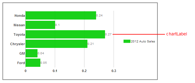
| chartLabelFormatString | Sets the numeric format of the chart labels that show the value of each chart element. You can use Standard Numeric Format Strings. Type: String Default value: ""
|
| chartLabelFormatter | Default value: null A value that indicates a function which is used to obtain the content part of the chart label for each chart element. |
| chartLabelStyle | Sets all of the style options of the chart labels that show the value of each chart element. Type: Object Default value: {} |
| clusterOverlap | Sets the amount of each bar to render over the edge of the next bar in the same cluster,as a percentage of the bar width. Type: Number Default value: 0 Valid values: -100 to 100 |
| clusterRadius | Sets the number of pixels by which to round the corner-radius for the bars in the chart. Type: Number Default value: 0 |
| clusterSpacing | Sets the amount of space in pixels between the bars in each cluster. Type: Number Default value: 0 |
| clusterWidth | Sets the percentage of each cluster's allocated plot area that the bars in each cluster occupy. Type: Number Default value: 85 |
| culture | A value that indicates the culture ID name to use in formatting chart text, dates, and numbers. Type: String Default value: ""
|
| cultureCalendar | A value that indicates which calendar in a culture with multiple calendars to use in formatting any dates in the chart. This option only takes effect if the specified culture contains the specified calendar. Type: String Default value: "" |
| data | A wijmo.data object that binds a field to the data x array for each series. Type: Object Default value: null |
| dataSource | The datasource Option is deprecated as of v3.20131.1. Instead, use the updated data option that supports several types of DataView. |
| disabled | Gets or sets whether control is disabled. |
| disableDefaultTextStyle | Sets a value indicating whether you can set the font-family of the text using a class instead of options. If set to true, the textStyle option is no longer used for the fallback style. Type: Boolean Default value: false |
| footer | Sets up the object to use as the footer of the barchart. Type: wijmo.chart.chart_title object Default: {
compass:"south",
orientation:"horizontal",
style: {fill: "#fff", stroke: "none"},
text: "",
textStyle: {fill: "#000", stroke: "none"},
visible: false
}
|
| header | Sets up the object to use as the header of the barchart. Type: wijmo.chart.chart_title object Default: {
compass:"south",
orientation:"horizontal",
style: {fill: "#fff", stroke: "none"},
text: "",
textStyle: {fill: "#000", stroke: "none"},
visible: false
} |
| height | Sets the height of the chart in pixels. Type: Number Default value: null |
| hint | Creates an object to use as the tooltip, or hint, when the mouse is over a chart element. Type: wijmo.chart.chart_hint Default: {
animated: "fade",
calloutFilled: false,
calloutFilledStyle: {fill: "#000"},
compass: "north",
content: null,
contentStyle: {fill: "#d1d1d1", "font-size": 16},
duration: 120,
easing: "easeOutExpo",
enable: true,
hideAnimated: "fade",
hideDelay: 150,
hideDuration: 120,
hideEasing: "easeOutExpo",
offsetX: 0,
offsetY: 0,
showAnimated: "fade",
showCallout: true,
showDelay: 150,
showDuration: 120,
showEasing: "easeOutExpo",
style: {fill: "270-#333333-#000000", "stroke-width": "2"},
title: null,
titleStyle: {fill: "#d1d1d1", "font-size": 16},
}
|
| horizontal | A value that determines whether the bar chart renders horizontally or vertically. When set to false, the bar chart becomes a column chart. Type: Boolean Default value: true |
| indicator | Sets up an object that can display an indicator line running horizontally/vertically through the center of each chart element in the chart when the user clicks the chart element. Default: {visible: false, style: {stroke: "#000000"}} |
| is100Percent | Sets a value that determines whether to present stacked bars as a total value of 100 percent, illustrating how each value contributes to the total. Type: Boolean Default value: false
|
| legend | Creates a legend object to display with the chart. Type: wijmo.chart.chart_legend object Default: {
compass: "east",
orientation: "vertical",
style: {fill: "#none", stroke: "none"},
text: "",
textMargin: {left: 2, top: 2, right: 2, bottom: 2 },
textStyle: {fill: "#333", stroke: "none"},
titleStyle: {"font-weight": "bold", fill: "#000", stroke: "none"},
visible: true
}
|
| marginBottom | Sets the amount of space in pixels between the chart area and the bottom edge of the <div> that defines the widget.
Type: Number Default value: 25 |
| marginLeft | Sets the amount of space in pixels between the chart area and the left edge of the <div> that defines the widget. Type: Number Default value: 25 |
| marginRight | Sets the amount of space in pixels between the chart area and the right edge of the <div> that defines the widget. Type: Number Default value: 25 |
| marginTop | Sets the amount of space in pixels between the chart area and the top edge of the <div> that defines the widget. Type: Number Default value: 25 |
| seriesHoverStyles | Sets an array of styles to use in rendering bars in the chart when you hover over them. Default value: [] |
| seriesList | Creates an array of series objects that contain data values and labels to display in the chart. Each series object consists of a label attribute and a data attribute with its own array of X and Y values. X values are generally text values, while Y values are generally numeric. You can also use the legendEntry attribute to determine whether to show each series object in the legend. Type: Array Default value: [] |
| seriesStyles | Sets an array of style objects to use in rendering the bars for each series in the chart. Type: Array Default value: [] |
| seriesTransition | Creates the animation object to use when the seriesList data changes, allowing you to visually show changes in data for the same series. Type: wijmo.chart.chart_animation object Default value: {enabled:true, duration:400, easing: "easeInCubic"}
|
| shadow | A value that indicates whether to show a shadow around the edge of the chart. Type: Boolean Default value: false |
| showChartLabels | A value that indicates whether to show a label with the value of each chart element. Type: Boolean Default value: true
|
| stacked | Sets a value that determines whether to stack bars in the chart to show how each value in a series contributes to the total. If you want each bar to fill up 100 percet of the chart area, you can also set the is100Percent option to true. Type: Boolean Default value: false |
| textStyle | Creates an object to use for the fallback style of any chart text that does not have other style options set. Type: Object Default value: {fill:"#888", "font-size": 10, stroke:"none"} |
| width | Sets the width of the chart in pixels. Type: Number Default value: null |
| Name | Description | |
|---|---|---|
 | beforePaint | This event fires before the canvas is painted. You can cancel the event using "return false." Type: Function Default: null |
| beforeSeriesChange | This event fires before the series changes. You can cancel the event using "return false." Type: Function Default: null |
| click | Fires when the user clicks the chart element. Type: Function Default: null |
| mouseDown | This event fires when the user clicks a mouse button. Type: Function Default: null |
| mouseMove | Fires when the user moves the mouse pointer while it is over a chart element. Type: Function Default: null |
| mouseOut | Fires when the user moves the pointer off of the chart element. |
| mouseOver | Fires when the user first places the pointer over the chart element. |
| mouseUp | Fires when the user releases a mouse button while the pointer is over the chart element. |
| painted | This event fires after the canvas is painted. |
| seriesChanged | This event fires when the series changes. |