Wijmo UI for the Web
clusterOverlap Option
wijmo.chart.wijbarchart Namespace > options type : clusterOverlap Option

Sets the amount of each bar to render over the edge of the next bar in the same cluster,as a percentage of the bar width.

Type: Number

Default value: 0

Valid values: -100 to 100

Syntax
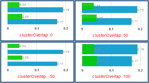
$(function () {
    
    // Get value
    var returnsValue; // Type:  number
    returnsValue = $(".selector").wijbarchart("option", "clusterOverlap");
    
    // Set value
    var newValue; // Type:  number
    $(".selector").wijbarchart("option", "clusterOverlap", newValue);
        
});
var clusterOverlap : number;
Example

A cluster occurs when you have two or more series in your seriesList that have the same x data, but have different y data and different labels, for example, if you have sales data for the same car manufacturers for two years, as in the code example below. This code yields a chart that looks like the image below.

<script id="scriptInit" type="text/javascript">
    $(document).ready(function () {
        $("#wijbarchart").wijbarchart({
            clusterOverlap: 50,
            seriesList: [{
                label: "2012 Auto Sales",
                legendEntry: true,
                data: { x: ['Ford', 'GM', 'Chrysler', 'Toyota', 'Nissan', 'Honda'], y: [.05, .04, .21, .27, .1, .24] }
            },
           {
                label: "2011 Auto Sales",
                legendEntry: true,
                data: { x: ['Ford', 'GM', 'Chrysler', 'Toyota', 'Nissan', 'Honda'], y: [.17, .19, .12, -.06, .17, -.07] }
            }],
        });
    });
</script>
Remarks

Here is an image showing how the chart looks with different clusterOverlap values.

See Also

Reference

options type
clusterSpacing Option
clusterWidth Option
wijbarchart Method

Concepts

Clustering Data