This section describes the new features of the Grid control in MultiRow. Refer to New Cell Types, for the new cell types added in 7.0.
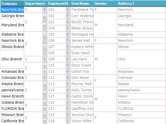
Automatic Merging of Cells
You can specify to merge cells automatically if the same value is set in vertically adjacent rows.
For details, refer to Automatic Merging of Cells.
Expanding or Collapsing Columns
Methods for expanding, collapsing columns, and properties for getting the open and close status of the columns have been added. You can expand or collapse columns by combining these functions.
For more information, refer to Expanding Or Collapsing Columns.
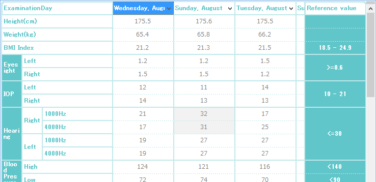
Column Mode Template
Rather than setting the conventional expanding direction of the row, which is top to bottom, you can also set it to the horizontal direction, which is left to right. Rows can be displayed as columns, by repeating rows in the horizontal direction.
When using the column mode template, set the Template.LayoutMode property to LeftToRight.
For details, refer to Column Mode Template.
Cell Notes
MultiRow provides cell notes for displaying additional information on the grid. The end-user can add, delete, and edit cell notes.
For details, refer to Cell Note.
Enhancement of Print Features
In the print features, the following features have been enhanced:
- Specifying the Page Break Position
- Specifying Empty Rows for Print
- Printing Watermarks
- Print Settings for each Column Header Section
Enhancement of Style Settings
Borders of the Current Row
You can set the border style for the current row. You can highlight the current row by setting the color and style of its borders.
For details, refer to Current Row.
Default Header for Alternating Rows
The default cell style used in the header cell of alternating rows can be set by the GcMultiRow.AlternatingRowsDefaultHeaderCellStyle property.
Mouse Hover
You can set the style when the mouse is over sections and cells.
For details, refer to Mouse Hover Styles.
Cell being Edited
You can specify the background and foreground colors to be applied when editing a cell. You can use the CellStyle.EditingBackColor and CellStyle.EditingForeColor properties to specify the background and foreground colors during editing.
For details, refer to BackColor and ForeColor.
Displaying a New Row at the Top
You can specify whether to display a new row at the top, or at the bottom of the grid. If you display it at the top, you can customize the color and width of the separator that separates the new row from the other rows.
For more information, refer to Displaying a New Row at the Top.
Automatic Adjustment of the Cell Width
You can automatically adjust the width of the cells placed in the column header section, column footer section, or row section, to fit the cell contents.
In addition, you can implement the following operations when you double-click on the right edge of the header.
- Automatically adjust the column width of multiple columns simultaneously
- Disable the automatic adjustment of column width
- Customize the column width
For more information, refer to Automatic Adjustment of the Cell Width.
Enhancement of Validation Features
You can use the Cell.Validate method to perform validation for all cells or for the value being edited.
The following built-in cell validators and built-in validation actions have also been added.
- Built-in Cell Validators
- String Comparison
- String Length
- Encoding Format
- Built-in Validation Actions
- Value Processing
- Notification by Message Box
- Notification by 3 Stage Icon
Data Binding in the Column Header Section
Data binding is supported for the cells placed in the column footer section and column header section.
Retrieving the Method Used to Move Cells
The MoveStatus property for retrieving the method used to move cells has been added to the following events:
- GcMultiRow.CellEnter event
- GcMultiRow.CellLeave event
- GcMultiRow.CellBeginEdit event
- GcMultiRow.CellEndEdit event
- GcMultiRow.RowEnter event
- GcMultiRow.RowLeave event
- GcMultiRow.NewCellPositionNeeded event
You can use the MoveStatus property to retrieve the status that indicates the operation that moved the cell.
For details, refer to Retrieving the Method Used to Move Cells.
Selecting All Cells
You can use the GcMultiRow.SelectAll method to select all the cells that can be selected.
Adding Shortcut Key Actions
The following properties for moving the cell on the basis of the tab order have been added to the SelectionActions class.
- SelectionActions.MoveToFirstCellByTabOrder property
- SelectionActions.MoveToFirstCellInRowByTabOrder property
- SelectionActions.MoveToLastCellByTabOrder property
- SelectionActions.MoveToLastCellInRowByTabOrder property
The following properties for canceling the editing operation have been added to the EditingActions class.
- EditingActions.CancelCellEdit property
- EditingActions.CancelRowEdit property
Selection Color in case of Non-selectable or Invalid Cells
You can draw the selection color for cells that are set as disabled or non-selectable when selecting a range of cells, as in row selection.
Setting Coordinates of the Scroll Position
You can use the GcMultiRow.FirstDisplayedLocation property to specify the coordinates to be displayed at the upper left corner of the grid.
Copying the Caption of the Header to the Clipboard
You can specify whether to copy the caption of the header to the clipboard using the GcMultiRow.ClipboardCopyMode property.
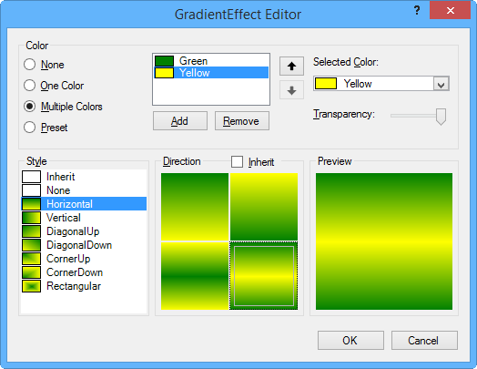
Background Gradation Dialog
A new dialog for setting the background gradation has been added.
User-defined Word Wrap
You can specify the line break position by number of characters, independent of the cell width. You can also make sure that the line break does not occur in the middle of a double-byte number, and it is recognized as one word.
For details, refer to User-defined Word Wrap.
User-defined Auto-fit
You can display single byte values uniformly in the cell, without space-separated justification.
For details, refer to Customizing the Justification of Single-byte Characters.
Zooming Borders
You can specify whether to zoom the cell borders. Set the GcMultiRow.AllowBorderLineZoom property to True to zoom the cell borders.
Displaying the Size Grip
You can specify whether to display the size grip at the bottom right of the grid. Set the GcMultiRow.ShowSizeGrip property to True to display the size grip.
Enhancement of Automatic Generation of Templates
Based on the size of an array or matrix of the cell type, you can automatically set the caption of the column header in the Template.CreateGridTemplate method that automatically generates a template of the basic layout. In addition, the Template.CreateGridTemplateForColumnMode method, which supports the column mode template, has been added.
Display Time of Tooltips
You use the following properties to set the display time of the tooltip which is displayed when the mouse pointer pauses over a cell.
- GcMultiRow.CellToolTipAutomaticDelay property
- GcMultiRow.CellToolTipAutoPopDelay property
- GcMultiRow.CellToolTipInitialDelay property
Retrieving the Position of the Splitter Line
You can use the GcMultiRow.GetHorizontalSplitLocations and GcMulitRow.GetVerticalSplitLocations methods to get the location of the splitter line.
For details, refer to Splitter Line and ViewPort.
Selecting the Section by clicking on the Blank Area
You can specify whether to select a section when you click on a blank area in that section. Set the GcMultiRow.SelectRowWhenClickBlankArea property to True to select a section when you click on a blank area in that section.
Automatic Restoration of Values of Cells in the Column Header Section
When you change the template at run-time, the values of cells placed in the column footer section and column header section before the change can be replaced by the cells after the change. Set the RestoreColumnHeaderFooterValue property to True to enable this feature.