Object
wijmo.chart.wijchartcore.options
Wijmo UI for the Web
options type
Object
wijmo.chart.wijchartcore.options
| Name | Description | |
|---|---|---|
 | annotations | Default value: [] Creates an array of AnnotationBase objects that contain the settings of the annotations to display in the chart. |
| autoResize | A value that indicates whether to redraw the chart automatically when resizing the chart element. Type: Boolean Default value: true |
| axis |
A value that contains all of the information to create the X and Y axes of the chart |
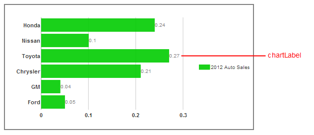
| chartLabelFormatString | Default value: "" Sets the numeric format of the chart labels that show the value of each chart element. You can use Standard Numeric Format Strings. |
| chartLabelFormatter | Default value: null A value that indicates a function which is used to obtain the content part of the chart label for each chart element. |
| chartLabelStyle | Sets all of the style options of the chart labels that show the value of each chart element. |
| culture | A value that indicates the culture ID name to use in formatting chart text, dates, and numbers. Type: String Default value: ""
|
| cultureCalendar | A value that indicates which calendar in a culture with multiple calendars to use in formatting any dates in the chart. This option only takes effect if the specified culture contains the specified calendar. Type: String Default value: ""
|
| data | Default value: null Bind a field to each series's data x array |
| dataSource | Default value: null Sets the array to use as a source for data that you can bind to the axes in your seriesList. |
| disabled | Gets or sets whether control is disabled. |
| disableDefaultTextStyle | Sets a value indicating whether you can set the font-family of the text using a class instead of options. If set to true, the textStyle option is no longer used for the fallback style. Type: Boolean Default value: false
|
| footer | Sets up the object to use as the footer of the barchart. Type: wijmo.chart.chart_title object Default: {
compass: "south",
orientation: "horizontal",
style: {fill: "#fff", stroke: "none"},
textStyle: {fill: "#000", stroke: "none"},
visible: false
} |
| header | Sets up the object to use as the header of the barchart. Type: wijmo.chart.chart_title object Default: {
visible: true,
style: {fill: "none", stroke: "none"},
textStyle: {"font-size": 18, fill: "#666", stroke: "none"},
compass: "north",
orientation: "horizontal"
} |
| height | Sets the height of the chart in pixels. Type: Number Default value: null
|
| hint | Creates an object to use as the tooltip, or hint, when the mouse is over a chart element. Type: wijmo.chart.chart_hint Default: {
animated: "fade",
calloutFilled: false,
calloutFilledStyle: {fill: "#000"},
compass: "north",
content: null,
contentStyle: {fill: "#d1d1d1", "font-size": 16},
duration: 120,
easing: "easeOutExpo",
enable: true,
hideAnimated: "fade",
hideDelay: 150,
hideDuration: 120,
hideEasing: "easeOutExpo",
offsetX: 0,
offsetY: 0,
showAnimated: "fade",
showCallout: true,
showDelay: 150,
showDuration: 120,
showEasing: "easeOutExpo",
style: {fill: "270-#333333-#000000", "stroke-width": "2"},
title: null,
titleStyle: {fill: "#d1d1d1", "font-size": 16},
}
|
| horizontal | Gets or sets whether series are displayed horizontally. |
| indicator | Sets up an object that can display an indicator line running horizontally/vertically through the center of each chart element in the chart when the user clicks the chart element. Type: wijmo.chart.chart_indicator Default: {visible: false, style: {stroke: "#000000"}} |
| is100Percent | Gets or sets whether each value contributes to the total with the relative size of each series representing its contribution to the total. |
| legend | Creates a legend object to display with the chart. Type: wijmo.chart.chart_legend object Default: {
compass: "east",
orientation: "vertical",
style: {fill: "#none", stroke: "none"},
text: "",
textMargin: {left: 2, top: 2, right: 2, bottom: 2 },
textStyle: {fill: "#333", stroke: "none"},
titleStyle: {"font-weight": "bold", fill: "#000", stroke: "none"},
visible: true
}
|
| marginBottom | Sets the amount of space in pixels between the chart area and the bottom edge of the <div> that defines the widget.
Type: Number Default value: 25 |
| marginLeft | Sets the amount of space in pixels between the chart area and the left edge of the <div> that defines the widget. Type: Number Default value: 25
|
| marginRight | Sets the amount of space in pixels between the chart area and the right edge of the <div> that defines the widget. Type: Number Default value: 25
|
| marginTop | Sets the amount of space in pixels between the chart area and the top edge of the <div> that defines the widget. Type: Number Default value: 25
|
| seriesHoverStyles | Sets an array of styles to use in rendering elements in the chart when you hover over them. Default value: []
|
| seriesList | Creates an array of series objects that contain data values and labels to display in the chart. Each series object consists of a label attribute and a data attribute with its own array of X and Y values. X values are generally text values, while Y values are generally numeric. Type: Array Default value: [] |
| seriesStyles | Sets an array of style objects to use in rendering the chart elements for each series in the chart. Type: Array Default value: []
|
| seriesTransition |
Creates the animation object to use when the seriesList data changes. |
| shadow | A value that indicates whether to show a shadow around the edge of the chart. Type: Boolean Default value: false |
| showChartLabels | A value that indicates whether to show a label with the value of each chart element. Type: Boolean Default value: true
|
| stacked | Gets or sets whether series objects are stacked. |
| textStyle | Creates an object to use for the fallback style of any chart text that does not have other style options set. Type: Object Default value: {fill:"#888", "font-size": 10, stroke:"none"} |
| width | Sets the width of the chart in pixels. Type: Number Default value: null
|
| Name | Description | |
|---|---|---|
 | beforePaint | This event fires before the canvas is painted. You can cancel the event using "return false." Type: Function Default: null |
| beforeSeriesChange | This event fires before the series changes. You can cancel the event using "return false." Type: Function Default: null |
| painted | This event fires after the canvas is painted. |
| seriesChanged | This event fires when the series changes. |