Wijmo UI for the Web
chart_hint Interface
wijmo.chart Namespace : chart_hint Interface

Creates an object to use as the tooltip, or hint, when the mouse is over a chart element. By default, it displays the value of the seriesList label and Y data for the element. See Format All Numeric Values for information on creating custom formatted content for the hint.

Type: Function

Default:

{
    animated: "fade",
    calloutFilled: false,
    calloutFilledStyle: {fill: "#000"},
    compass:"north",
    content:null,
    contentStyle: {fill: "#d1d1d1", "font-size": 16},
    duration: 120,
    easing: "easeOutExpo",
    enable: true,
    hideAnimated: "fade",
    hideDelay: 150,
    hideDuration: 120,
    hideEasing: "easeOutExpo",
    offsetX: 0,
    offsetY: 0, 
    showAnimated: "fade",
    showCallout: true,
    showDelay: 150,
    showDuration: 120,
    showEasing: "easeOutExpo",
    style: {fill: "270-#333333-#000000", "stroke-width": 2},
    title: null,
    titleStyle: {fill: "#d1d1d1", "font-size": 16},
}


Example
This code creates a chart like that in the image below with the following settings on the hints:

<script type="text/javascript">
$(document).ready(function () {
    $("#wijbubblechart").wijbubblechart({
        axis: {
            y: {text: "Number of Products"},
            x: {text: "Sales", annoFormatString: "C0"}
        },
        hint: {
            content: function(){
                return this.data.label + '\n' + 
                Globalize.format(this.y1, "p0") + ' ';
            }
        },
        legend: {visible: false},
        seriesList: [
        {
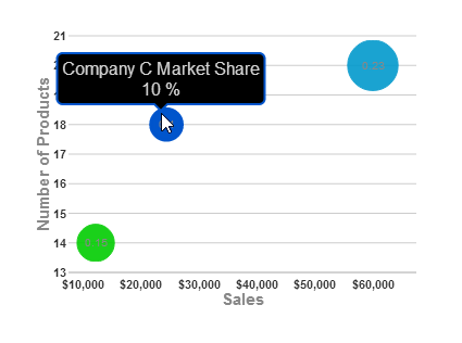
            label: "Company A Market Share",
            data: { y: [14], x: [12200], y1: [.15] }
        }, {
            label: "Company B Market Share",
            data: { y: [20], x: [60000], y1: [.23] }
        }, {
            label: "Company C Market Share",
            data: { y: [18], x: [24400], y1: [.1] }
        }]
    });
});
</script>
Fields
 NameDescription
 Field
A value that indicates the effect to use when showing or hiding the hint when showAnimated or hideAnimated is not specified.
Default: "fade"
Type: String
 
 Field
Determines whether to fill the callout (the small triangle that points from the main hint box to the bubble it describes). If you set it to true, the callout triangle uses the colors you specify in the calloutFilledStyle attribute. Otherwise, it takes on the colors of the style attribute of the hint.
Default: false
Type: Boolean
 
 Field
A value that indicates the style to use in rendering the callout (the small triangle that points from the main hint box to the bubble it describes). In order for this attribute of the callout to take effect, you must also set the calloutFilled attribute to true. Otherwise, it takes on the colors of the style attribute of the hint. For more information on the available style parameters, see the Style Options topic.
Default: {fill: "#000"}
Type: Object
 
 Field

Determines how to close the tooltip. Behaviors include auto or sticky.

 
 Field

A value that indicates the compass position of the callout (the small triangle that points from the main hint box to the bar it describes) in relation to the hint box.

 
 Field
A value that appears in the content part of the tooltip or a function which is used to get a value for the tooltip shown.
Default: ""
Type: String or Function
 
 Field

A value that indicates the style object to apply to text displayed in the tooltip.

For more information on the available style parameters, see the Style Options topic.

Default: {fill: "#d1d1d1","font-size": 16}

Type: Object

 
 Field
A value that indicates the number of milliseconds it takes to show or hide the hint when you mouse over or mouse out of a bubble with the showDuration or hideDuration attribute set to null.
Default: 120
Type: Number
 
 Field

A value that indicates the easing animation used to show or hide the hint when you mouse over or mouse out of a bubble with the showEasing or hideEasing attribute set to null.

Default: "easeOutExpo"

Type: String

 
 Field

A value that indicates whether to show the tooltip.

 
 Field
A value that indicates the animation effect to use when the hint goes away after you mouse out of the bubble. This allows you to use a different effect when you mouse into a bubble than when you mouse out.
Default: "fade"
Type: String
 
 Field
A value that indicates the number of milliseconds to wait before hiding the hint after the mouse leaves the chart element.
Default: 150
 
 Field
A value that indicates the number of milliseconds it takes for the indicated animation effect to completely hide the tooltip.
Default: 120
 
 Field
A value that indicates the easing effect to use when the hint goes away after you mouse out of the chart element.
Default: "easeOutExpo"
 
 Field

Determine whether to use a tooltip in html style.

 
 Field
A value that indicates the horizontal distance in pixels from the mouse pointer to the callout triangle of the hint.
Default: 0
 
 Field
A value that indicates the vertical distance in pixels from the mouse pointer to the callout triangle of the hint.
Default: 0
 
 Field

Determines tooltip should related to mouse or element.

 
 Field
A value that indicates the animation effect to use when the hint appears after you mouse into the chart element.
Default: "fade"
 
 Field
Determines whether to show the callout element, the small triangle that points from the main hint box to the chart element it describes.
Default: true
 
 Field
A value that indicates the number of milliseconds to wait before showing the hint after the mouse moves into the chart element.
Default: 150
 
 Field
A value that indicates the number of milliseconds it takes for the indicated animation effect to completely show the tooltip.
Default: 120
 
 Field
A value that indicates the easing effect to use when the hint appears after you mouse into the chart element.
Default: "easeOutExpo"
 
 Field
A value that indicates the fill color or gradient and outline thickness and color (stroke) of the rectangle used to display the hint. For more information on the available style parameters, see the Style Options topic.
Default: {fill: "270-#333333-#000000", "stroke-width": "2"}
 
 Field
A text value (or a function returning a text value) to display in the hint on a line above the content. In the image below, we set the title to "Title" and set the titleStyle to {fill: "yellow"}.
Default: null
 
 Field

A value that indicates the style to use for the hint title text.

Note: Any style options set in the fallback textStyle option are used for any style options that are not set explicitly (or set by default) in this option.

For more information on the available style parameters, see the Style Options topic. In the image below, we set the title to "Title" and set the titleStyle to {fill: "yellow"}.

Default: {fill: "#d1d1d1","font-size": 16}

 
Top
See Also

Reference

wijmo.chart Namespace
hint Option