


Creating Check Box Cells
- Creating a Check Box Cell and Setting Its Type
- Specifying the Text for a Check Box Cell
- Displaying Pictures in a Check Box Cell
Overview
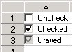
Check box cells provide a check box that can show two or three states, as shown in the following figure.
Check box cells can display text and a check box picture, which you can customize.
For a description of how check box cells validate data, see Data Validation.
In summary, you can use the following properties to customize check box cells. The italicized properties are unique to this cell type. For more information on remembered properties, refer to Cell Type Settings Remembered.
| TypeCheckCenter | TypeCheckType |
| TypeCheckPicture | TypeHAlign |
| TypeCheckText | TypeVAlign |
| TypeCheckTextAlign |
The following methods can be used to load or save pictures.