This section describes the new features of the MultiRow Designer.
Setting User-Defined Objects
You can call derived classes of user-defined shortcut keys and cell styles from the GUI. In 6.0, user-defined objects had to be set in code, but in 7.0, user-defined objects can easily be set using the following setting dialog.
- CellValidator Collection Editor (Cell.Validators property)
- CellValidateAction Collection Editor (CellValidator.Actions property)
- Shortcut Keys (GcMultiRow.ShortcutKeyManager property)
- CellStyle Editor (Cell.Style property)
- SummaryCell Editor (SummaryCell.Calculation property)
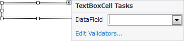
Smart Tags for Cells
Smart tags are supported in each cell that is placed in the template. You can use these smart tags to easily set the key properties of the cells.
Reminder Feature for GDI+ Settings
When you change the following properties to configure GDI +, you can display the GDI + Properties Confirming dialog box, and automatically perform the settings for which GDI+ is enabled.
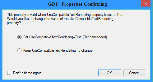
The conditions for displaying the GDI + Properties Confirming dialog are as follows:
| Property | Show Dialog | Hide Dialog |
|---|---|---|
| TextVertical | True | Inherit or False |
| TextAdjustment | Other than Inherit or Near | Inherit or Near |
| LineAdjustment | Distribute or DistributeWithSpace | Inherit or None |
| TextAngle | Other than NaN | Nan or 0 |
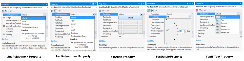
Enhancement of the Property Settings Dialog
You can visually set the position and font effects for the text to be placed in the cell, from the properties window.
- LineAdjustment property
- TextAdjustment property
- TextAlign property
- TextAngle property
- TextEffect property
Enhancement of the Table Feature
The following enhancements have been made in the Table.
- Setting caption for the table header
- Insertion of multiple rows or columns
- Enabling the Snap Line function for each cell in the table
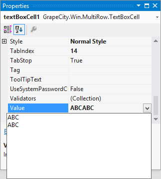
Inline Editing of Cells
You can perform inline editing of the Value property, by double-clicking a cell on the template.
Properties that support inline editing are as follows:
| Cell | Target Property |
|---|---|
| CheckBoxCell | Text |
| RadioGroupCell ListBoxCell ComboBoxCell ListLabelCell DomainUpDownCell |
Items |
| ImageCell SummaryCell |
None |
| Other Cells | Value |
Editing Multi-line Text
You can enter text in multiple rows from the Properties window.
The properties that support multi-line text are as follows:
- TextBoxCell.DesignTimeValue property
- TextBoxCell.Style.NullValue property
- TextBoxCell.Value property
- RichTextBoxCell.DesignTimeValue property
- RichTextBoxCell.Style.NullValue property
- RichTextBoxCell.Value property
- CheckBoxCell.Text property
- FilteringTextBoxCell.DesignTimeValue property
- FilteringTextBoxCell.Style.NullValue property
- FilteringTextBoxCell.Value property
- ShapeCell.DesignTimeValue property
- ShapeCell.Style.NullValue property
- ShapeCell.Value property
- GcTextBoxCell.DesignTimeValue property
- GcTextBoxCell.Style.NullValue property
- GcTextBoxCell.Value property
Conversion from DataGridView
The layout set in a DataGridView control can be converted to a GcMultiRow template. You can freely change the layout of the Template after the conversion, in the designer.
For more information, refer to Conversion from DataGridView.
Focus Flow
The focus flow is displayed in accordance with the tab order of the cell. Since the focus flow can be changed by mouse drag, you can visually set the tab order.
For more information, refer to Changing Tab Order of Cells in the Designer.
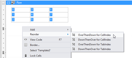
Changing the Index
In the context menu that appears by right-clicking on the designer, you can automatically set the tab order and index of the cell.
Selecting the Data Type
You can select the data type in the Cell.Value property, in the Properties window.
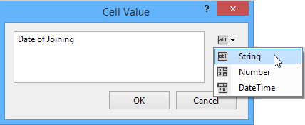
The properties that support selection of data type are as follows:
- ButtonCell.DesignTimeValue property
- ButtonCell.Value property
- ColumnHeaderCell.DesignTimeValue property
- ColumnHeaderCell.Value property
- HeaderCell.DesignTimeValue property
- HeaderCell.Value property
- LabelCell.DesignTimeValue property
- LabelCell.Value property
- RowHeaderCell.DesignTimeValue property
- RowHeaderCell.Value property
Enhancement of the Template Wizard
You can create a basic column mode template, using the Template Wizard.
For details, refer to Create Template using Wizard.
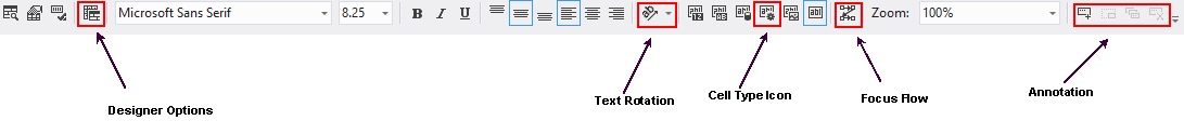
Enhancement of the Toolbar
The following commands have been added to the toolbar:
- Designer Options
- Text Rotation
- Cell Type Icon
- Focus Flow
- Annotation
Annotations
You can use annotations at design time.
For more information, refer to Using Annotations.
Enhancement of Template PropertyList
You can freeze the columns of the Template PropertyList. You can also display CellIndex in the Template PropertyList.
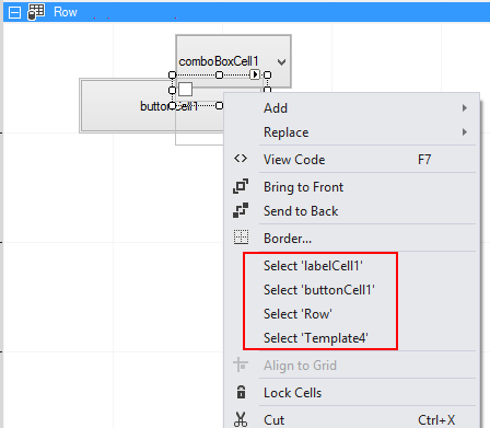
Object Selector
In the context menu that appears by right-clicking on the designer, you can select an object which is in a non-selected state.
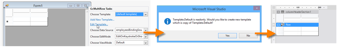
Copy of the Default Template
When the default template is set in the GcMultiRow control, and you select Edit Template from the smart tag of the control, you can specify whether you want to create a copy of the default template.
Cell Selection Range Mode
You can change the range selection mode by selecting the cell by dragging the mouse or ruler.
For more information, refer to Selecting Cells in the Designer.
Zooming Cell Borders
Using AllowBorderLineZoom of Designer Options, you can specify whether you want to zoom the border lines, when zooming the template in the designer.
Named Cell Style Manager
If the named cell style is used in any of the following styles, the usage status is now displayed in the named cell style manager.
- Section.DefaultCellStyle
- Template.AlternatingRowsDefaultCellStyle
- Template.ColumnFootersDefaultCellStyle
- Template.ColumnFootersDefaultHeaderCellStyle
- Template.ColumnHeadersDefaultCellStyle
- Template.ColumnHeadersDefaultHeaderCellStyle
- Template.DefaultCellStyle
- Template.RowsDefaultCellStyle
- Template.RowsDefaultHeaderCellStyle
Recognizing the Cell Name Without Distinction Between Upper or Lower Case
When the Template.AllowCellNameComparisonIgnoreCase property is set to True, the cell name (Cell.Name property) can be recognized without distinction between upper or lower case.
Using Code
This example ignores the case in the cell name.
[VB]
Imports GrapeCity.Win.MultiRow
Dim textBoxCell1 As New TextBoxCell()
textBoxCell1.Name = "textBoxCell1"
Dim template1 As Template = Template.CreateGridTemplate(New Cell() {textBoxCell1})
template1.AllowCellNameComparisonIgnoreCase = True
GcMultiRow1.Template = template1
GcMultiRow1.RowCount = 3
GcMultiRow1.Rows(0).Cells("textBoxCell1").Value = "ABC"
GcMultiRow1.Rows(0).Cells("TextBoxCell1").Style.BackColor = Color.Yellow
GcMultiRow1.Rows(0).Cells("textboxcell1").Style.ForeColor = Color.Red
|
[CS]
using GrapeCity.Win.MultiRow;
TextBoxCell textBoxCell1 = new TextBoxCell();
textBoxCell1.Name = "textBoxCell1";
Template template1 = Template.CreateGridTemplate(new Cell[] { textBoxCell1 });
template1.AllowCellNameComparisonIgnoreCase = true;
gcMultiRow1.Template = template1;
gcMultiRow1.RowCount = 3;
gcMultiRow1.Rows[0].Cells["textBoxCell1"].Value = "ABC";
gcMultiRow1.Rows[0].Cells["TextBoxCell1"].Style.BackColor = Color.Yellow;
gcMultiRow1.Rows[0].Cells["textboxcell1"].Style.ForeColor = Color.Red;
|