Wijmo UI for the Web
Clustering Data
There are a couple of ways that you can code this type of chart.
List all of the X axis data in each seriesList
| Redundant X Data |
Copy Code |
|---|---|
<script id="scriptInit" type="text/javascript">
$(document).ready(function () {
$("#wijbarchart").wijbarchart({
clusterOverlap: 50,
seriesList: [{
label: "2012 Auto Sales",
legendEntry: true,
data: {
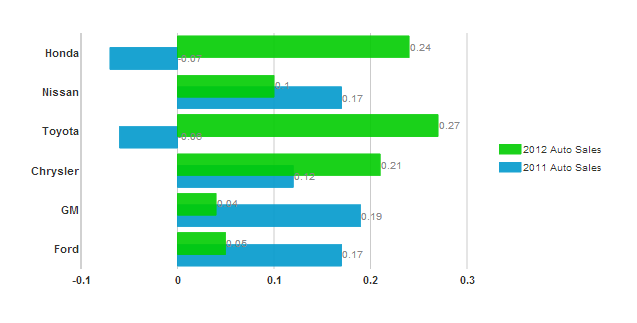
x: ['Ford', 'GM', 'Chrysler', 'Toyota', 'Nissan', 'Honda'],
y: [.05, .04, .21, .27, .1, .24]
}
},
{
label: "2011 Auto Sales",
legendEntry: true,
data: {
x: ['Ford', 'GM', 'Chrysler', 'Toyota', 'Nissan', 'Honda'],
y: [.17, .19, .12, -.06, .17, -.07]
}
}],
});
});
</script>
| |
That method is a bit rendundant, so here is a shorter way to do it.
Put the X data all in one place
| Default value |
Copy Code |
|---|---|
<script id="scriptInit" type="text/javascript">
    $(document).ready(function () {
        $("#wijbarchart").wijbarchart({
            clusterOverlap: 50,
            data: {x: ['Ford', 'GM', 'Chrysler', 'Toyota', 'Nissan', 'Honda']},
            seriesList: [{
                label: "2012 Auto Sales",
                legendEntry: true,
                data: { y: [.05, .04, .21, .27, .1, .24] }
            },
           {
                label: "2011 Auto Sales",
                legendEntry: true,
                data: { y: [.17, .19, .12, -.06, .17, -.07] }
            }],
        });
    });
</script>
| |
Wijmo offers several options to let you control how these data clusters appear: