The wijgrid widget is a tabular datagrid that allows users to interactively select, edit, sort, scroll through, filter, and group data. Highly customizable, the grid can be used to better understand and visualize data more effectively.
The wijgrid consumes a table DOM element. The markup used to create the wijgrid widget should resemble the following:
<table></table>
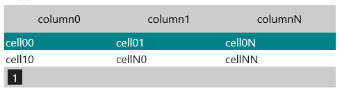
If wijgrid uses the table itself as a datasource, the table should contain data rows and, optionally, a <thead> section with column headers. For example:
<table class = "table1">
    <thead>
            <tr>
            <th>column0</th>
            <th>column1</th>
            <th>columnN</th>
            </tr>
    </thead>
    <tbody>
<tr>
  <td>cell00</td>
  <td>cell01</td>
  <td>cell0N</td>
</tr>
<tr>
  <td>cell10</td>
  <td>cellN0</td>
  <td>cellNN</td>
</tr>
    </tbody>
</table>
Cells should not contain colspan and/or rowspan attributes; cell and row attributes and styles are ignored.
You can add the table above and initialize the wijgrid with the following code in the .cshtml file for the View in which you want to display the grid:
$("#table-element").wijgrid({
  data: [[0, "a"], [1, "b"], [2, "c"]]
});
Here you used the wijgrid's allowPaging and allowSorting options to allow paging and column sorting.
<script type="text/javascript">
    $(document).ready(function () {
        $(".table1").wijgrid({
            allowPaging: true,
            allowSorting: true
          });
    });
</script>
When you run the MVC application, the wijgrid will look similar to this:
For more information about wijgrid, click one of the external links to view our Wijmo wiki documentation: