You can easily customize the way data appears in the wijgrid widget. For example, you have values appear as currency or percentages. See the grid > DataTypes sample of the MVC Control Explorer live demo at http://demo.componentone.com/ASPNET/MVCExplorer/grid/DataTypes for an example.
Complete the following steps to set the date type:
- Create a new C1 ASP.NET MVC 5 Web Application (see Creating an MVC Classic Project).
- Navigate to the Solution Explorer, expand the Shared folder inside the Views folder, and double-click _Layout to open the file.
- Check the dependencies to make sure the project is referencing the latest version of Wijmo. These should be placed within the <head> tags of the page. You can find the latest version of the Wijmo dependencies at http://wijmo.com/downloads/cdn/.
- Add the following markup within the
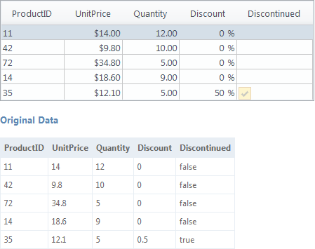
<body>tags of the page, just after @RenderBody():<table id="demo"> <thead> <tr> <th>ProductID</th><th>UnitPrice</th><th>Quantity</th><th>Discount</th><th>Discontinued</th> </tr> </thead> <tbody> <tr> <td>11</td><td>14</td><td>12</td><td>0</td><td>false</td> </tr><tr> <td>42</td><td>9.8</td><td>10</td><td>0</td><td>false</td> </tr><tr> <td>72</td><td>34.8</td><td>5</td><td>0</td><td>false</td> </tr><tr> <td>14</td><td>18.6</td><td>9</td><td>0</td><td>false</td> </tr><tr> <td>35</td><td>12.1</td><td>5</td><td>0.5</td><td>true</td> </tr> </tbody> </table> <h4>Original Data</h4> <table id="demo1"> <thead> <tr> <th>ProductID</th><th>UnitPrice</th><th>Quantity</th><th>Discount</th><th>Discontinued</th> </tr> </thead> <tbody> <tr> <td>11</td><td>14</td><td>12</td><td>0</td><td>false</td> </tr><tr> <td>42</td><td>9.8</td><td>10</td><td>0</td><td>false</td> </tr><tr> <td>72</td><td>34.8</td><td>5</td><td>0</td><td>false</td> </tr><tr> <td>14</td><td>18.6</td><td>9</td><td>0</td><td>false</td> </tr><tr> <td>35</td><td>12.1</td><td>5</td><td>0.5</td><td>true</td> </tr> </tbody> </table>This markup will add content for two tables. One will be used for the grid and will show set data types, the second will show the original data.
- After the closing
</div>tag you added in the previous step, enter the following jQuery script to initialize the wijgrid widget and set the grid's data types:<script id="scriptInit" type="text/javascript"> $(document).ready(function () { $("#demo").wijgrid( { allowSorting: true, columns: [ {}, { dataType: "currency" }, { dataType: "number" }, { dataType: "number", dataFormatString: "p0" }, { dataType: "boolean" } ] }); }); </script>This will set the data type of each grid column.
What You've Accomplished
Press F5 to run the application, observe that the data type you set in the script above is reflected in the grid table. In the second table, you can see how the unformatted data would appear. For example, notice how the UnitPrice column is formatted like currency: