Scatter plot charts are used to show relationships between variables. Unlike simple charts and time-series charts, in the XY chart each point has two numeric values. By plotting one of the values against the X axis and one against the Y axis, the charts show the effect of one variable on the other.
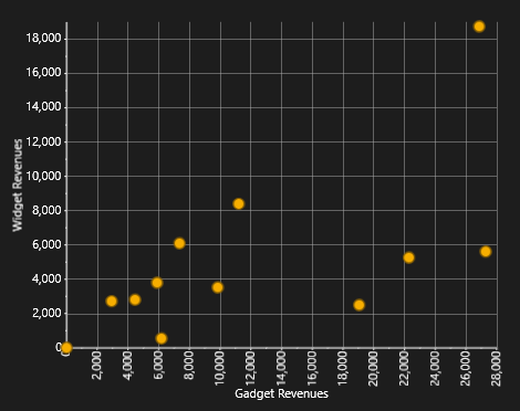
We will continue our C1Chart tour using the same data we created in the Simple Charts topic, but this time we will create an XY chart that shows the relationship between revenues from two products. For example, we might want to determine whether high Widget revenues are linked to high Gadgets revenues (perhaps the products work well together), or whether high Widget revenues are linked to low Gadgets revenues (perhaps people who buy one of the products don’t really need the other).
To do this, we will follow the same steps as in the Simple Charts and Time-Series Charts topics. The main differences are that this time we will add XYDataSeries objects to the chart’s Data.Children collection instead of the simpler DataSeries objects. The Linq statement used to obtain the data is also a little more refined and interesting.
Step 1) Choose the chart type:
The code clears any existing series, then sets the chart type:
| C# |
Copy Code
|
|---|---|
private void Page_Loaded_1(object sender, RoutedEventArgs e) { // Clear current chart c1Chart1.Reset(true); // Set chart type c1Chart1.ChartType = ChartType.XYPlot; } |
|
Step 2) Set up the axes:
Since we’re now creating XY series, we have two value axes (before we had a label axis and a value axis). We will attach titles and formats to both axes as we did before. We will also set the scale and annotation format as before. We will use the AnnoAngle property to rotate the annotation labels along the X axis so they don’t overlap:
| C# |
Copy Code
|
|---|---|
// get axes var yAxis = c1Chart1.View.AxisY; var xAxis = c1Chart1.View.AxisX; // configure Y axis yAxis.Title = "Widget Revenues"; yAxis.AnnoFormat = "#,##0 "; yAxis.AutoMin = false; yAxis.Min = 0; yAxis.MajorUnit = 2000; yAxis.AnnoAngle = 0; // configure X axis xAxis.Title = "Gadget Revenues"; xAxis.AnnoFormat = "#,##0 "; xAxis.AutoMin = false; xAxis.Min = 0; xAxis.MajorUnit = 2000; xAxis.AnnoAngle = -90; // rotate annotations |
|
Step 3) Add one or more data series
Once again, we will use the second data-provider method defined earlier:
| C# |
Copy Code
|
|---|---|
// get the data var data = GetSalesPerMonthData(); |
|
Next, we need to obtain XY pairs that correspond to the total revenues for Widgets and Gadgets at each date. We can use Linq to obtain this information directly from our data:
| C# |
Copy Code
|
|---|---|
// group data by sales date var dataGrouped = from r in data group r by r.Date into g select new { Date = g.Key, // group by date Widgets = (from rp in g // add Widget revenues where rp.Product == "Widgets" select g.Sum(p => rp.Revenue)).Single(), Gadgets = (from rp in g // add Gadget revenues where rp.Product == "Gadgets" select g.Sum(p => rp.Revenue)).Single(), }; // sort data by widget sales var dataSorted = from r in dataGrouped orderby r.Gadgets select r; |
|
The first Linq query starts by grouping the data by Date. Then, for each group it creates a record containing the Date and the sum of revenues within that date for each of the products we are interested in. The result is a list of objects with three properties: Date, Widgets, and Gadgets. This type of data grouping and aggregation is a powerful feature of Linq.
The second Linq query simply sorts the data by Gadget revenue. These are the values that will be plotted on the X axis, and we want them to be in ascending order. Plotting unsorted values would look fine if we displayed only symbols (ChartType = XYPlot), but it would look messy if we chose other chart types such as Line or Area.
Once the data has been properly grouped, summarized, and sorted, all we need to do is create one single data series, and assign one set of values to the DataSeries.ValuesSource property and the other to the XYDataSeries.XValuesSource property:
| C# |
Copy Code
|
|---|---|
// create the new XYDataSeries var ds = new XYDataSeries(); // set series label (displayed in a C1ChartLegend) ds.Label = "Revenue:\r\nWidgets vs Gadgets"; // populate Y values ds.ValuesSource = ( from r in dataSorted select r.Widgets).ToArray(); // populate X values ds.XValuesSource = ( from r in dataSorted select r.Gadgets).ToArray(); // add the series to the chart c1Chart1.Data.Children.Add(ds); |
|
Step 4) Adjust the chart’s appearance
Once again, we will finish by setting the Palette property to quickly configure the chart appearance:
| C# |
Copy Code
|
|---|---|
c1Chart1.Palette = Palette.Module; |
|
The completed chart will show a positive correlation between Gadget and Widget revenues.