The cell is a rectangular object that can be placed onto each section. The cells in MultiRow can be selected or edited by the user in the same way as Excel or DataGridView. The difference compared to other grid controls is that the developer can place the cells of desired size at the desired location.
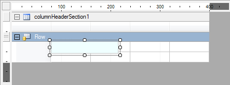
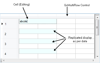
The cells that have been placed on the designer at design time get replicated at run time by the data using the Clone method. The cells placed in the header and footer are displayed as is.
Cell Selection
There are settings to specify whether a cell can be selected, whether cells are in the selected state, and appearance settings to distinguish the selected cells from the cells not currently selected. For details, refer to Selection Mode, Selected Rows and Cells, or Restricting Cell Selection.
Cell Index
Indices are allocated to cells in the order in which they are added to the sections (Cell.Index). At runtime, you can specify a particular cell placed in the row header or column header section using this index. The cell index can be changed using the Cell.Index property or the designer. Cell indices are suitable for batch processing of a specified range of cells or processing of unspecified multiple cells. Use the cell name for specifying a particular cell as shown below.
Cell Name
You can access a specific cell from the Cells collection using the cell name (Cell.Name) as the key.
Using Code
As shown in the code below, this is similar to naming the controls on a form and accessing those controls using the Form.Controls property and control name.
[VB]
Dim textBox1 As New TextBox()
textBox1.Name = "textBox1"
Me.Controls.Add(textBox1)
Me.Controls("textBox1").Text = "Hello"
|
[CS]
TextBox textBox1 = new TextBox(); textBox1.Name = "textBox1"; this.Controls.Add(textBox1); this.Controls["textBox1"].Text = "Hello"; |
A particular cell can be accessed as shown below.
[VB]
Imports GrapeCity.Win.MultiRow

' Create a template
Dim textBoxCell1 As New TextBoxCell()
textBoxCell1.Name = "textBoxCell1"

GcMultiRow1.Template = Template.CreateGridTemplate(New Cell() {textBoxCell1})
GcMultiRow1.RowCount = 3

' Run time operation
GcMultiRow1.Rows(0).Cells("textBoxCell1").Value = "Hello"
GcMultiRow1.SetValue(1, "textBoxCell1", "Hello")
|
[CS]
using GrapeCity.Win.MultiRow;

// Create a template
TextBoxCell textBoxCell1 = new TextBoxCell();
textBoxCell1.Name = "textBoxCell1";

gcMultiRow1.Template = Template.CreateGridTemplate(new Cell[] {textBoxCell1});
gcMultiRow1.RowCount = 3;

// Run time operation
gcMultiRow1.Rows[0].Cells["textBoxCell1"].Value = "Hello";
gcMultiRow1.SetValue(1, "textBoxCell1", "Hello");
|
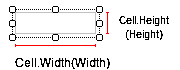
Position and Size
The cell position can be specified relative to the top left corner of the parent section. This is the same as placing a control on the form. The cell size can be specified using the cell height and width. Since the cell is a rectangle, this is enough information to set the position of the cell.
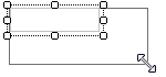
Resizing Cells
The resizing of cells is determined by cell positioning by default. For example, once you have placed the row cells matching the width of the header, if you resize the header at run time, it will automatically be followed by a change in the width of the cell. In the designer, the positioning can be easily specified using built-in snap lines.
Margin and Padding
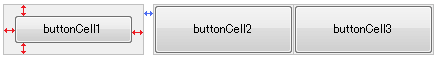
You can specify the margin and padding as part of the style similar to other controls placed on the form. The margin specifies the blank space around the cell area. Since the margin does not affect the cell contents, they are enabled only when you are using snap lines at design time. The padding defines the blank space around the inside of the cell edges. The following image shows a margin and padding of 10 pixels on all four sides of buttonCell1. Blue lines show margins and red lines show padding. The margin and padding of buttonCell2 and buttonCell3 were not changed for comparison purposes.
Inheritance
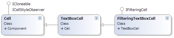
Cells can be inherited to create custom cell types. You can either create new cells from scratch using the basic cells or you can extend the features by inheriting the built-in cells. The cell types thus created can be shared or reused between projects. For example, FilteringTextBoxCell is derived from TextBoxCell to provide filtering functionality, and ColumnHeaderCell (specifically designed for the top-left header) has been derived from HeaderCell.
Common Settings for Cells
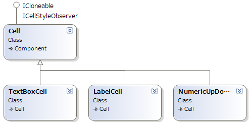
All the cell types have been derived from the common Cell class, just as all the controls have been derived from System.Windows.Forms.Control class. Similar to the controls, the Cell class provides basic features of cells, such as location and size.
Cell Style
The cell styling is not used for individual cells. For example, the settings for background color, image background, and image settings are not only used in a particular cell but are common for a number of cells. These kinds of settings are provided in a common object as the cell style. This structure is similar to the DataGridViewCellStyle which provides style settings for cells in the DataGridView control. The style settings that are applied to specific cells might differ depending on the cells, but you can specify the main style settings for a number of cells.
Header Cells
Header cells are special cells that help execute some important functionalities provided by the grid. For example, you can select cells as well as sort them using the headers. Header cells are basically of 3 types, and correspond to the 3 header locations respectively.
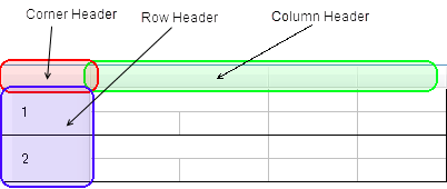
All the header cells are derived from the header cell type and they have common settings.
- Header Type Cells
- Column Header Type Cells
- Row Header Type Cells
- Corner Header Types Cells
Editing
MultiRow implements standard controls from the .NET Framework to provide the editing functionality. For example, System.Windows.Forms.TextBox control is displayed when you try to edit the TextBoxCell. As a result, if you would like to customize the editing features, you can use the same events that are used during the editing of the standard controls.
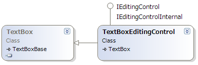
The cell editing feature in MultiRow is defined using the common interface IEditingControl. The following items are defined in this interface: mouse cursor displayed in edit mode, values to be edited, reference to parent GcMultiRow control, current Row number, zoom value, and editing controls.
The following table shows the cell type and the corresponding editing control. Grid events can be used to customize the editing operation for cell types that do not have corresponding editing controls.
| Cell Type | Cell Editing | Control Inherited From |
| ComboBoxCell | ComboBoxEditingControl | System.Windows.Forms.ComboBox |
| DateTimePickerCell | DateTimePickerEditingControl | System.Windows.Forms.DateTimePicker |
| DomainUpDownCell | DomainUpDownEditingControl | System.Windows.Forms.DomainUpDown |
| NumericUpDownCell | NumericUpDownEditingControl | System.Windows.Forms.NumericUpDown |
| MaskedTextBoxCell | MaskedTextBoxEditingControl | System.Windows.Forms.MaskedTextBox |
| RichTextBoxCell | TextBoxEditingControl | System.Windows.Forms.RichTextBox |
| TextBoxCell | TextBoxEditingControl | System.Windows.Forms.TextBox |
Rendering Mode
MultiRow cells support two types of rendering modes, GDI and GDI+, which are essentially same as for the standard .NET Framework controls. GDI is the default rendering mode which provides the same rendering as that used for the editing control. GDI+ is used for Vertical Display or Distributed Display. For details, refer to GDI+ Compatibility Mode.