The toggle button's floating toolbar allows you to change the image, modify the text settings, and disable/enable the toggle button. You can also add the toggle button to the QAT and hot list. The toggle button's floating toolbar consists of the following buttons:
| Actions: Cut, Copy, Paste, or Delete the item. | |
| Change Image: Edit image and image size. | |
| Text settings: Edit Text, Description, and ToolTip properties. | |
| Miscellaneous settings: Enable or disable the toggle button. | |
| Add to Quick Access Toolbar: Add the split button to the QAT. | |
| Add to Hot Item List: Add the split button to the hot item list. |
Actions
Clicking the Actions button opens a list of available actions.

Change Image
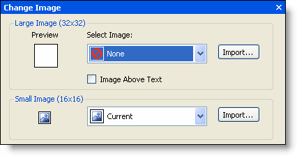
Clicking the Change Image button opens the Change Image dialog box. You can click the Import button to browse for a custom image or you can click the Select Image drop-down arrow to select from a list of large (32x32) or small (16x16) preset images. Note that you also have the option to place the image above the text (default for the large image).

Text settings</2H>
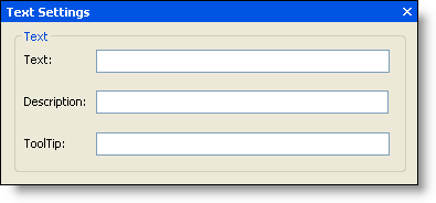
Clicking the Text settings button opens the Text Settings dialog box. In the Text Settings dialog box, you can edit the toggle button's text properties, including the Text, Description, and ToolTip.

Miscellaneous settings
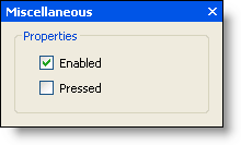
Clicking the Miscellaneous settings button opens the Miscellaneous dialog box. In the Miscellaneous dialog box, you can select the Pressed checkbox to show the toggle button as pressed (orange background). Additionally, you can enable the toggle button (checked by default) or disable the toggle button (unchecked).

Add to Quick Access Toolbar
Clicking the Add to Quick Access Toolbar button adds the toggle button to the QAT. After clicking ![]() , the button switches to
, the button switches to ![]() , which allows you to remove the toggle button from the QAT.
, which allows you to remove the toggle button from the QAT.
Add to Hot Item List
Clicking the Add to Hot Item List button adds the toggle button to the hot item list, which is available by clicking the drop-down arrow adjacent to the QAT. After clicking ![]() , the button switches to
, the button switches to ![]() , which allows you to remove the toggle button from the hot list.
, which allows you to remove the toggle button from the hot list.