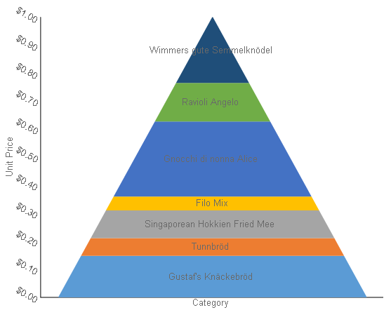
Pyramid
Shows how the percentage of each data item contributes to the whole, with the smallest value at the top and the largest at the bottom. This chart type works best with relatively few data items.
Funnel
Shows how the percentage of each data item contributes to the whole, with the largest value at the top and the smallest at the bottom. This chart type works best with relatively few data items.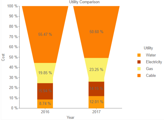
Bubble
Shows each series as a bubble. The y-axis values determine the height of the bubble, while the x-axis displays the category labels.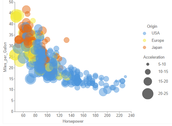
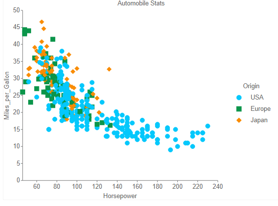
Scatter
Scatter charts present each series as a point or bubble. The y-axis values determine the heights of the points, while the x-axis displays the category labels. Shows the relationships between numeric values in two or more series sets of XY values.
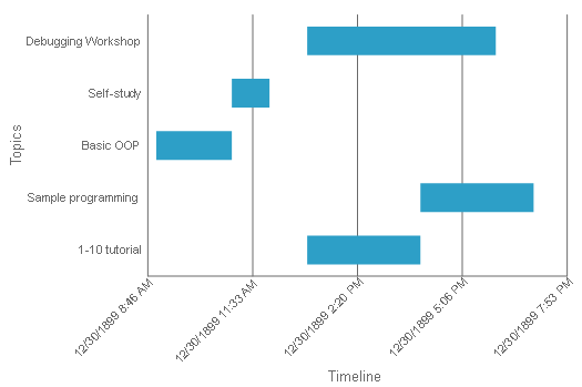
Gantt
This project management tool charts the progress of individual project tasks. The chart compares project task completion to the task schedule.
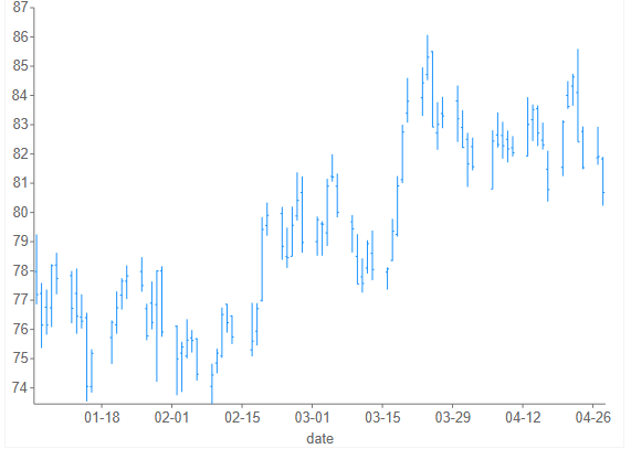
High Low Close
Displays stock information using High, Low, and Close values. High and low values are displayed using vertical lines, while tick marks on the right indicate closing values.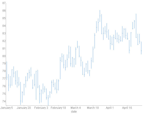
High Low Open Close
Displays stock information using High, Low, Open, and Close values. Opening values are displayed using lines to the left, while lines to the right indicate closing values. The high and low values determine the top and bottom points of the vertical lines.
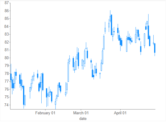
Candlestick
Displays stock information using High, Low, Open and Close values. The height of the wick line is determined by the High and Low values, while the height of the bar is determined by the Open and Close values. The bar is displayed using different colors, depending on whether the price of the stock has gone up or down.