The Chart data region represents your data graphically. It is a data visualization control that is primarily based on slicing data through encodings.
Chart Elements
The Chart elements help you to easily analyze the visual information and interpret numerical and relational data. The following image illustrates the elements that make up the Chart data region.
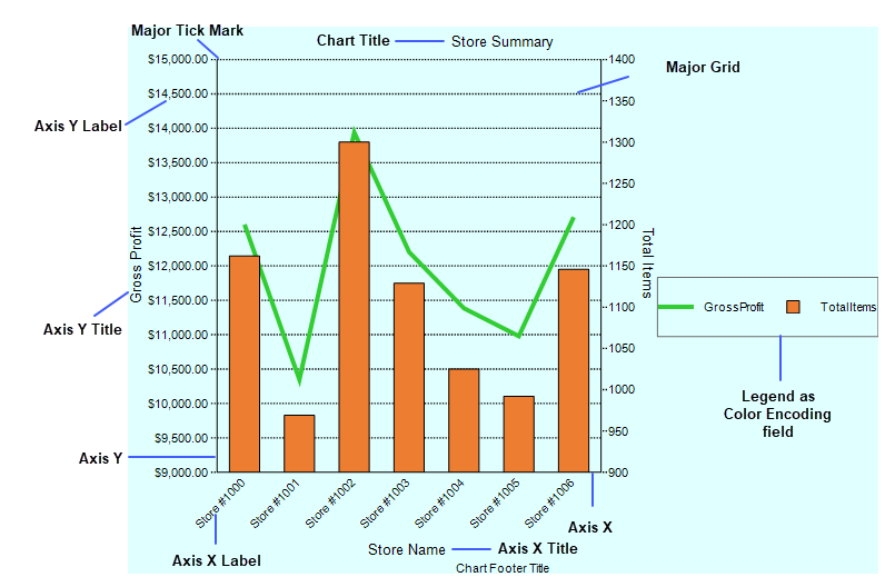
Axis Label: A label along an axis that lets you label the units being shown.
Axis Title: The axis title allows you to provide a title for the information being shown on the axis.
Chart Title: The chart title serves as the title for the chart.
Grid Line: Grid lines can occur on horizontal and vertical axes and normally correlate to the major or minor tick marks for the axes.
Legend: The legend serves as a key to the specific colors or patterns being used to show series values in the chart. To display legends for each plot on a chart, use VALUESNAME as the color field encoding.
Major Tick: Major tick marks can occur on horizontal and vertical axes and normally correlate to the major gridlines for the axes.
Minor Tick: Minor tick marks can occur on horizontal and vertical axes and normally correlate to the minor gridlines for the axes.
Plot area: The Plot Area contains data plotted against X-axis and Y-axis.
Encodings
Encodings convert the data into visual elements. They define how each field from a data set is visualized. There are following encodings that are used in the process of creating charts.
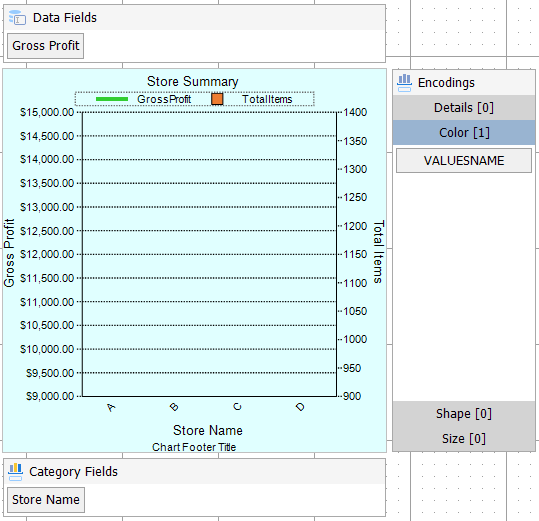
- Category Fields
- The category mapping in Category Fields groups the data set into multiple categories for each unique value (or numerical range) that exists for the specified field.
- Data Fields
- The values mapping in Data Fields specifies which fields should be plotted along the Y-axis. For scatter plot charts, the values property includes mappings for both X and Y using comma delimited notation.
- Details
- The detail mapping slices the data into sub-divisions that can be clustered or stacked next to each other in the plot.
- Color
- The color mapping determines which field should be used to determine color assignations for the plot and legend.
- Shape
- The shape mapping determines which field should be used to determine shape assignations for the plot and legend.
- Size
- The size mapping determines which field to apply a continuous size-based scale to for the plot and legend.
Important Properties
| Property | Description |
| ToolTip | A textual label for the report item used to include Title or ALT attributes in HTML reports. |
| SwapAxes | Represents whether the axes are swapped. |
| Reversed | Represents whether the axis is reversed (top to bottom or right to left). |
| Padding | The amount of padding to place between the text or graphics and the edge of the report item. |
| LabelsAngle | Rotation angle of the axis labels. The angle is measured in degrees with valid values ranging from -90 to 90. |
| ShowNulls | Represents how to show the null or an empty value. |
| Sweep | Sweep of plots for radial plots. |
| InnerRadius | Inner radius in percentage for radial plots. |
| StartAngle | Starting angle of the radial plot. |
| Palette | The color support rgb and rgba format |
| Plots | The plots define the data fields that map to the chart. There can be single or multiple plots in a chart. |
| Tooltip Template | Contains the tooltip template settings. You can choose from the list of predefined settings or set your own in the Expression Editor. |