The Funnel charts enable users to visualize stages in a linear process. This walkthrough illustrates a step-by-step implementation for creating a composite chart with three Y-axis series. The walkthrough is split into the following activities:
- Creating an ActiveReports project in Visual Studio
- Connecting the report to a data source
- Adding a dataset
- Adding a chart data region and define plots
- Configuring the appearance of the chart
- Viewing the report
Note:
- This walkthrough uses the StoreSales table from the Reels database. By default, in ActiveReports, the Reels.mdb file is located in the [User Documents folder]\GrapeCity Samples\ActiveReports 13\Data folder.
- Although this walkthrough uses Page reports, you can also implement this using RDL reports.
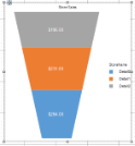
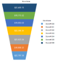
When you complete this walkthrough you get a layout that looks similar to the following at design time and at run time.
Design-Time Layout
Run-Time Layout
To create an ActiveReports project in Visual Studio
- Create a new Visual Studio project.
- In the New Project dialog that appears, select ActiveReports 13 Page Report Application and in the Name field, rename the file as rptFunnelChart.
- Click OK to create a new ActiveReports 13 Page Report Application. By default a Page report is added to the project.
See Adding an ActiveReport to a Project for information on adding different report layouts.
To connect the report to a data source
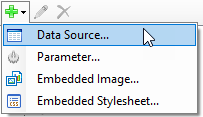
- In the Report Explorer, right-click the Data Sources node and select the Add Data Source option or select Data Source from the Add button.
- In the Report Data Source Dialog that appears, select the General page and in the Name field, enter a name like ChartData.
- On this page, create a connection to the Reels database. See Connect to a Data Source for information on connecting to a data source.
To add a dataset
- In the Report Explorer, right-click the ChartData data source node and select the Add Data Set option or select Data Set from the Add button.
- In the DataSet Dialog that appears, select the General page and enter the name of the dataset as StoreSalesData.
- On the Query page of this dialog, in the Query field enter the following SQL query.
SQL Query Copy CodeSELECT * from StoreSales - Click the Validate DataSet icon
 at the top right hand corner above the Query box to validate the query.
 - Click OK to close the dialog. Your data set and queried fields appear as child nodes to the data source in the Report Explorer.
To add a chart data region and define plots
- From the toolbox, drag a Chart data region onto the design surface of the report.
- In the Select a Chart Type wizard that appears and select the chart type as Column.
- Right-click on the chart and go to Plot Template > Miscellaneous and select Funnel.
- Select the chart plot and go to Properties window.
- Go to Encodings > Values property and click ellipses next to Values property to open ValueAggregateEncodingDesigner Collection Editor.
- Add a new Value field to the collection editor.
- Open its Value collection editor and add a value field and set its expression to
=Fields!TotalSales.Value. - Click OK to save and exit the collection editor. You see that 'Total Sales' field is added under the Data Fields on chart.
- Select the chart plot and go to Properties window.
- Go to Encodings > Details property and click ellipses next to Values property to open DetailEncodingDesigner Collection Editor.
- Add a new Detail field to the collection editor.
- Open its Values collection editor and add a value field and set its expression to
=Fields!StoreName.Value. - Click OK to save and exit expression editor and then again to close the collection editor. You see that 'Store Name' is added as Details encoding on the chart.
- Select 'Store Name' encoding and set following properties:
Property Name Property Values Group Stack SortDirection Ascending SortingField =Fields!StoreName.Value
Let us add legend to the chart. - Select the chart plot and go to Encodings > Color > Values property.
- Click ellipses next to Values property to open the expressions editor.
- Add a value field and set its expression to
=Fields!StoreName.Value
To configure the appearance of the chart
- Select Chart and set Pallet to Office.
- Select 'Chart title' on the chart and set Title to 'Store Sales'.
- Select Category axis and set Lines>ShowLine and Labels>ShowLabels to False.
- Select Value axis and set ShowLine and ShowLabels to False.
- Select the chart plot and set the label settings for the Funnel chart as:
Property Name Property Values Labels>Color White Labels>Template
Specify the template to be displayed for the label.{valueField.value:c} Labels>TextPosition
Specify text position of the label.Center - Select Legends on chart and set Title to 'Store Name'.
To view the report
- Click the Preview tab to view the report at design time.
OR
- Open the report in the Viewer. See Windows Forms Viewer for further information.