The Chart data region shows your data in a graphical representation that often makes it easier for users to comprehend large amounts of data quickly. Different types of charts are more efficient for different types of information, so we offer a wide variety of chart types. This makes it easy and cost effective to add charting to your reports, as there is no need to purchase and integrate a separate charting tool.
To hone in on your needs, when you first drag the Chart report control onto a Page report/RDL report, you can select the broad category of chart type to use: Bar, Column, Scatter, Line, or Dot Plot.
Once you select a chart category, there are a number of dialogs to help you to customize your chart.
Chart Appearance
To open the Chart Appearance dialog, select the Chart on the report, and below the Properties window, click the Chart appearance command. This dialog has the following pages.
Gallery
The Gallery page of the Chart dialog, in basic mode, displays each of the broad categories of chart types, plus subtypes so that you can refine your choice. For even more chart types, click the Advanced button.
Basic Chart Types
Bar Charts
Bar charts present each series as a horizontal bar, and group the bars by category. The x-axis values determine the lengths of the bars, while the y-axis displays the category labels. With a bar chart, you can select from the following subtypes.
- Plain: Compares values of items across categories.
- Stacked: A bar chart with two or more data series stacked one on top of the other that shows how each value contributes to the total.
- Percent Stacked: A bar chart with two or more data series stacked one on top of the other to sum up to 100% that shows how each value contributes to the total with the relative size of each series representing its contribution to the total.
Column Charts
Column charts present each series as a vertical column, and group the columns by category. The y-axis values determine the heights of the columns, while the x-axis displays the category labels. With a column chart, you can select from the following subtypes.
- Plain: Compares values of items across categories.
- Stacked: A column chart with two or more data series stacked one on top of the other that shows how each value contributes to the total.
- Percent Stacked: A column chart with two or more data series stacked one on top of the other to sum up to 100% that shows how each value contributes to a total with the relative size of each series representing its contribution to the total.
Scatter Charts
Scatter charts present each series as a point or bubble. The y-axis values determine the heights of the points, while the x-axis displays the category labels. With a scatter chart, you can select from the following subtypes.
- Plain: Shows the relationships between numeric values in two or more series sets of XY values.
- Connected: Plots points on the X and Y axes as one series and uses a line to connect points to each other.
- Smoothly Connected: Plots points on the X and Y axes as one series and uses a line with the angles smoothed out to connect points to each other.
- Bubble: Shows each series as a bubble. The y-axis values determine the height of the bubble, while the x-axis displays the category labels. This chart type is only accessible in Advanced chart types.
Line Charts
Line charts present each series as a point, and connect the points with a line. The y-axis values determine the heights of the points, while the x-axis displays the category labels. With a line chart, you can select from the following subtypes.
- Plain: Compares trends over a period of time or in certain categories.
- Smooth: Plots curves rather than angled lines through the data points in a series to compare trends over a period of time or in certain categories. Also known as a Bezier chart.
Dot Plot Charts
A Dot Plot chart is a statistical chart containing group of data points plotted on a simple scale. Dot Plot chart are used for continuous, quantitative, univariate data. The dot plot chart has one subtype.
Plain: Displays simple statistical plots. It is ideal for small to moderate sized data sets. You can also highlight clusters and gaps, as well as outliers, while conserving numerical information.
Advanced Chart Types
Area Charts
Area charts present each series as a point, connect the points with a line, and fill the area below the line. The y-axis values determine the heights of the points, while the x-axis displays the category labels. With an area chart, you can select from the following subtypes.
- Plain: Compare trends over a period of time or in specific categories.
- Stacked: An area chart with two or more data series stacked one on top of the other, shows how each value contributes to the total.
- Percent Stacked: An area chart with two or more data series stacked one on top of the other to sum up to 100%, shows how each value contributes to the total with the relative size of each series representing its contribution to the total.
Pie Charts
Pie charts present each category as a slice of pie or doughnut, sized according to value. Series groups are not represented in pie charts. With a pie chart, you can select from the following subtypes.
- Pie: Shows how the percentage of each data item contributes to the total.
- Exploded: Shows how the percentage of each data item contributes to the total, with the pie slices pulled out from the center to show detail.
- Doughnut: Shows how the percentage of each data item contributes to a total percentage.
- Exploded Doughnut: Shows how the percentage of each data item contributes to the total, with the pie slices pulled out from the center to show detail.
Financial Charts
Stock charts present each series as a line with markers showing some combination of high, low, open, and close values. The y-axis values determine the heights of the lines, while the x-axis displays the category labels. With a financial chart, you can select from the following subtypes.
- High Low Close: Displays stock information using High, Low, and Close values. High and low values are displayed using vertical lines, while tick marks on the right indicate closing values.
- Open High Low Close: Displays stock information using Open, High, Low, and Close values. Opening values are displayed using lines to the left, while lines to the right indicate closing values. The high and low values determine the top and bottom points of the vertical lines.
- Candlestick: Displays stock information using High, Low, Open and Close values. The height of the wick line is determined by the High and Low values, while the height of the bar is determined by the Open and Close values. The bar is displayed using different colors, depending on whether the price of the stock has gone up or down.
- Renko: Bricks of uniform size chart price movement. When a price moves to a greater or lesser value than the preset BoxSize value required to draw a new brick, a new brick is drawn in the succeeding column. A change in box color and direction signifies a trend reversal.
- Kagi: Displays supply and demand trends using a sequence of linked vertical lines. The thickness and direction of the lines vary depending on the price movement. If closing prices go in the direction of the previous Kagi line, then that Kagi line is extended. However, if the closing price reverses by the preset reversal amount, a new Kagi line is charted in the next column in the opposite direction. Thin lines indicate that the price breaks the previous low (supply) while thick lines indicate that the price breaks the previous high (demand).
- Point and Figure: Stacked columns of Xs indicate that demand exceeds supply and columns of Os indicate that supply exceeds demand to define pricing trends. A new X or O is added to the chart if the price moves higher or lower than the BoxSize value you set. A new column is added when the price reverses to the level of the BoxSize value multiplied by the ReversalAmount you set. This calculation of pricing trends is best suited for long-term financial analysis.
- Three Line Break: Vertical boxes or lines illustrate price changes of an asset or market. The price in a three line break graph must break the prior high or low set in the NewLineBreak property in order to reverse the direction of the graph.
Other Charts
Other chart types may be used for special functions like charting the progress of individual tasks. You can select from the following subtypes.
- Funnel: Shows how the percentage of each data item contributes to the whole, with the largest value at the top and the smallest at the bottom. This chart type works best with relatively few data items.
- Pyramid: Shows how the percentage of each data item contributes to the whole, with the smallest value at the top and the largest at the bottom. This chart type works best with relatively few data items.
- Gantt: This project management tool charts the progress of individual project tasks. The chart compares project task completion to the task schedule.
Title
Chart title: Enter an expression or text to use for the title.
Font
Family: Choose the font family name.
Size: Choose the size in points for the font.
Style: Choose Normal or Italic.
Weight: Choose from Lighter, Thin, ExtraLight, Light, Normal, Medium, SemiBold, Bold, ExtraBold, Heavy, and Bolder.
Color: Select a Web or custom color for the font.
Decoration: Choose from None, Underline, Overline, and LineThrough.
Palette
Default: The same as Subdued below, the recommended palette for charts.
EarthTones: A palette of autumnal browns, oranges, and greens.
Excel: A palette of muted plums, blues, and creams.
GrayScale: A palette of patterns suitable for printing to a black and white printer.
Light: A palette of pale pinks and peaches.
Pastel: A palette of blues, greens, and purples.
SemiTransparent: A palette of primary and tertiary colors that allows the backdrop to show through.
Subdued: A palette of muted tones of browns, greens, blues, and grays.
Vivid: The same as Subdued, but with richer tones.
Custom: A palette of colors that you define. When you select Custom, you can list colors that are used in the order you specify.
Area
Border
Style: Choose an enumerated style for the border.
Width: Set a width value in points between 0.25pt and 20pt.
Color: Select a Web or Custom color.
Background Fill Color
Fill Color: Select a Web or Custom color.
Gradient: Choose from one of the following gradient styles.
- None: No gradient is used. The Fill Color is used to fill the area and the Gradient End Color property is ignored.
- LeftRight: A gradient is used. The Fill Color property defines the color at the left, and the Gradient End Color property defines the color at the right. The two colors are gradually blended in between these areas.
- TopBottom: A gradient is used. The Fill Color property defines the color at the top, and the Gradient End Color property defines the color at the bottom. The two colors are gradually blended in between these areas.
- Center: A gradient is used. The Fill Color property defines the color at the center, and the Gradient End Color property defines the color at the edges. The two colors are gradually blended in between these areas.
- DiagonalLeft: A gradient is used. The Fill Color property defines the color at the top left, and the Gradient End Color property defines the color at the bottom right. The two colors are gradually blended in between these areas.
- DiagonalRight: A gradient is used. The Fill Color property defines the color at the top right, and the Gradient End Color property defines the color at the bottom left. The two colors are gradually blended in between these areas.
- HorizontalCenter: A gradient is used. The Gradient End Color property defines the horizontal band of color across the center, and the Fill Color property defines the color at the top and bottom. The two colors are gradually blended in between these areas.
- VerticalCenter: A gradient is used. The Gradient End Color property defines the vertical band of color across the center, and the Fill Color property defines the color at the left and right. The two colors are gradually blended in between these areas.
Gradient End Color: When you choose any gradient style other than None, this property becomes available. Choose a Web or Custom color.
Plot Area
Border
Style: Choose an enumerated style for the border.
Width: Choose a width value between 0.25pt and 20pt.
Color: Select a Web or Custom color.
Background Fill Color
Fill Color: Select a Web or Custom color.
Gradient: Choose from one of the following gradient styles.
- None: No gradient is used. The Fill Color is used to fill the area and the Gradient End Color property is ignored.
- LeftRight: A gradient is used. The Fill Color property defines the color at the left, and the Gradient End Color property defines the color at the right. The two colors are gradually blended in between these areas.
- TopBottom: A gradient is used. The Fill Color property defines the color at the top, and the Gradient End Color property defines the color at the bottom. The two colors are gradually blended in between these areas.
- Center: A gradient is used. The Fill Color property defines the color at the center, and the Gradient End Color property defines the color at the edges. The two colors are gradually blended in between these areas.
- DiagonalLeft: A gradient is used. The Fill Color property defines the color at the top left, and the Gradient End Color property defines the color at the bottom right. The two colors are gradually blended in between these areas.
- DiagonalRight: A gradient is used. The Fill Color property defines the color at the top right, and the Gradient End Color property defines the color at the bottom left. The two colors are gradually blended in between these areas.
- HorizontalCenter: A gradient is used. The Gradient End Color property defines the horizontal band of color across the center, and the Fill Color property defines the color at the top and bottom. The two colors are gradually blended in between these areas.
- VerticalCenter: A gradient is used. The Gradient End Color property defines the vertical band of color across the center, and the Fill Color property defines the color at the left and right. The two colors are gradually blended in between these areas.
Gradient End Color: When you choose any gradient style other than None, this property becomes available. Choose a Web or Custom color.
Series line (Bar Stacked and Percent Stacked, Column Stacked and Percent Stacked types only)
Style: Choose an enumerated style for the series line.
Width: Choose a width value between 0.25pt and 20pt.
Color: Select a Web or Custom color.
3D Effects
These properties are enabled when you select the 3D checkbox on the Gallery page.
Display the chart with 3D visual effects: Select this check box to enable all of the following properties.
Horizontal rotation: Move the slider to rotate the chart to left and right. All the way to the left (-90°) shows the chart from the left side, while all the way to the right (90°) shows it from the right side. The default value is 20°.
Vertical rotation: Move the slider to rotate the chart up and down. All the way to the left (-90°) shows the chart from the bottom, while all the way to the right (90°) shows it from the top. The default value is 20°.
Wall thickness: Move the slider to change the thickness of the walls at the axes. The default value is 0% and the range of values is 0% (left) to 100% (right). If the chart type is pie or doughnut, this property is ignored.
Perspective: Move the slider to change the perspective from which the chart is displayed. The default value is 0% and the range of values is 0% (left) to 100% (right). If you select Orthographic Projection, this property is ignored.
Shading: Select the type of shading to apply to the chart. The default value is Real.
- None: Colors are uniform.
- Simple: Colors are darkened in areas where the light source does not hit them.
- Real: Colors are darkened in areas where the light source does not hit them, and lightened in areas where the light source is strongest.
Orthographic Projection: Select this check box to use orthographic or "true drawing" projection. This type of projection is ignored with pie and doughnut chart types.
Clustered: With chart types of bar and column, select this check box to cluster series groups. Other chart types ignore this setting.
Display bars as cylinders: With chart types of bar and column, select this check box to display cylinders instead of bars or columns.
Defaults (button): Click this button when you want to set all of the 3D effect properties back to their default values.
Chart Data
See the Chart Data Dialog topic for all of the pages and tabs available for customizing your chart data.
Chart Legend
To open the Chart Legend dialog, select the Chart on the report, and below the Properties window, click the Chart legend command. This dialog has the following pages.
General
Show chart legend: Clear this check box to disable the legend. This also disables all of the other properties on this page.
Use Smart Settings: Check this option to apply smart settings or clear this checkbox to activate the properties given below.
Layout: Choose the layout style for the legend.
- Column: This option displays legend items in a single vertical column.
- Row: This option displays legend items in a single horizontal row.
- Table: This option displays legend items in a table of vertical columns, and is best when you have a large number of values.
Position: Select an enumerated value to determine the position of the legend relative to the chart area. The default value is RightCenter.
Display legend inside plot area: Select this check box to display the legend inside the plot area along with your data elements.
Style
The Style page of the Chart Legend dialog allows you to control the Font, Border, and Fill properties for the legend.
Font
Family: Choose the font family name.
Size: Choose the size in points for the font.
Style: Choose Normal or Italic.
Weight: Choose from Lighter, Thin, ExtraLight, Light, Normal, Medium, SemiBold, Bold, ExtraBold, Heavy, and Bolder.
Color: Select a Web or custom color for the font.
Decoration: Choose from None, Underline, Overline, and LineThrough.
Border
Style: Choose an enumerated style for the border.
Width: Enter a width value between 0.25pt and 20pt.
Color: Select a Web or Custom color.
Background Fill Color
Fill Color: Select a Web or Custom color.
Gradient: Choose from one of the following gradient styles.
- None: No gradient is used. The Fill Color is used to fill the area and the Gradient End Color property is ignored.
- LeftRight: A gradient is used. The Fill Color property defines the color at the left, and the Gradient End Color property defines the color at the right. The two colors are gradually blended in between these areas.
- TopBottom: A gradient is used. The Fill Color property defines the color at the top, and the Gradient End Color property defines the color at the bottom. The two colors are gradually blended in between these areas.
- Center: A gradient is used. The Fill Color property defines the color at the center, and the Gradient End Color property defines the color at the edges. The two colors are gradually blended in between these areas.
- DiagonalLeft: A gradient is used. The Fill Color property defines the color at the top left, and the Gradient End Color property defines the color at the bottom right. The two colors are gradually blended in between these areas.
- DiagonalRight: A gradient is used. The Fill Color property defines the color at the top right, and the Gradient End Color property defines the color at the bottom left. The two colors are gradually blended in between these areas.
- HorizontalCenter: A gradient is used. The Gradient End Color property defines the horizontal band of color across the center, and the Fill Color property defines the color at the top and bottom. The two colors are gradually blended in between these areas.
- VerticalCenter: A gradient is used. The Gradient End Color property defines the vertical band of color across the center, and the Fill Color property defines the color at the left and right. The two colors are gradually blended in between these areas.
Gradient End Color: When you choose any gradient style other than None, this property becomes available. Choose a Web or Custom color.
Chart Axis
Click the Axis X or Axis Y line of the chart to select AxisXLine or AxisYLine, then under the Properties Window, click Property dialog. The Chart Axis dialogs let you set axis properties on the data region with the following pages.
Title
Axis X or Axis Y
X- or Y-Axis title: Enter text to display near the X or Y axis of the chart.
Text alignment: Choose Center, Near, or Far.
Text orientation: Set the text orientation of the label text to Auto, Horizontal, Rotated90, Rotated270, and Stacked.
Font
Family: Choose the font family name.
Size: Choose the size in points for the font.
Style: Choose Normal or Italic.
Weight: Choose from Lighter, Thin, ExtraLight, Light, Normal, Medium, SemiBold, Bold, ExtraBold, Heavy, and Bolder.
Color: Select a Web or custom color for the font.
Decoration: Choose from None, Underline, Overline, and LineThrough.
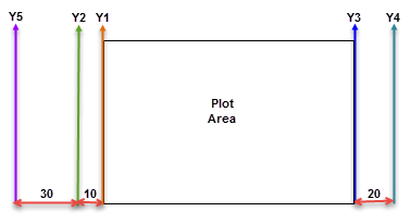
The following are additional properties available for the Y-axis that allow you to plot two or more series along it. Composite charts have two or more series plotted along the Y-axis.
Name: Enter a name for each Y axis that is unique within the chart. Note that you can add a maximum of six Y-axes.
Position: Choose Left or Right.
Margin: Enter the distance between two consecutive Y-axes.
| Name | Position | Margin | Description |
|---|---|---|---|
| Y1 | Left | 0 | Displayed on the left. It is closest to the plot area. |
| Y2 | Left | 10 | Displayed on the left of Y1. The distance between Y1 and Y2 is 10. |
| Y3 | Right | 0 | Displayed on the right. It is closest to the plot area. |
| Y4 | Right | 20 | Displayed on the right of Y3. The distance between Y3 and Y4 is 20. |
| Y5 | Left | 30 | Displayed on the left of Y2. The distance between Y2 and Y5 is 30. |
The image below depicts each of the Y-axes from the table above.
Line Style
Axis Line Appearance
Style: Choose from an enumerated style for the axis line.
Color: Select a Web or Custom color.
End Cap: Choose either None or Arrow as the End Cap style, or enter an expression using Expression Editor dialog.
Labels
Show x- or y-axis labels: Select this check box to show labels along the axis and to enable the rest of the properties on this page.
Format code: Select a format code from the list or use a custom .NET formatting code to format dates or numbers. For more information, see MSDN's Formatting Types topic.
Labels Text Orientation: Set the text orientation of the label text to Auto, Angled, Horizontal, Rotated90, Rotated270, and Stacked.
Font
Family: Choose the font family name.
Size: Choose the size in points for the font.
Style: Choose Normal or Italic.
Weight: Choose from Lighter, Thin, ExtraLight, Light, Normal, Medium, SemiBold, Bold, ExtraBold, Heavy, and Bolder.
Color: Select a Web or custom color for the font.
Decoration: Choose from None, Underline, Overline, and LineThrough.
Major Grid Lines
Show major grid lines: Select this check box to show grid lines for the axis.
Interval: Set the interval at which you want to show major grid lines or tick marks or both.
Border
Style: Choose one from the enumerated styles for the border.
Width: Enter a width value between 0.25pt and 20pt.
Color: Select a color for the border.
Tick mark: Choose one of the following values to determine whether and where to display major tick marks. The style and interval of the tick marks are set with the above properties.
- None: No tick mark is displayed.
- Inside: Tick marks are displayed inside the axis.
- Outside: Tick marks are displayed outside the axis.
- Cross: Tick marks are displayed crossing the axis.
Minor Grid Lines
Show minor grid lines: Select this check box to show minor grid lines for the axis.
Interval: Set the interval at which you want to show minor grid lines or tick marks or both.
Border
Style: Choose one from the enumerated styles for the border.
Width: Enter a width value between 0.25pt and 20pt.
Color: Select a color for the border.
Tick mark: Choose one of the following values to determine whether and where to display minor tick marks. The style and interval of the tick marks are set with the above properties.
- None: No tick mark is displayed.
- Inside: Tick marks are displayed inside the axis.
- Outside: Tick marks are displayed outside the axis.
- Cross: Tick marks are displayed crossing the axis.
Scale
Minimum: Leave this value blank to allow the data to determine the minimum value to use.
Maximum: Leave this value blank to allow the data to determine the maximum value to use.
Logarithmic scale: Select this check box to display axis data as a percentage of change instead of as absolute arithmetic values.
Numeric or time scale values: Select this check box to indicate that the data on the X axis is scalar so that the chart fills in missing numbers or dates between data values. This property is only available on the X axis.
Other
Cross at: Leave this value blank to allow the chart type to determine where the axis should cross the other axis, or you can enter a custom value.
Side margins: Select this check box to add padding between the data and the edges of the chart.
Interlaced strips: Select this check box to display alternating light and dark strips between major intervals specified on the Major Grid Lines page. If none are specified, a default value of 1 is used.
Reversed: Select this check box to reverse the direction of the chart. This will have different effects depending on chart type.
Reference Line (Y Axis only)
Value: Enter a value.
Line/Border
Style: Choose one from the enumerated styles.
Width: Set a width of the axis line.
Color: Select a color for the axis line.
Legend Label: Enter a label for the legend to display in the viewer.