You can create Page and RDL reports with composite charts using the ActiveReports Chart data region. A composite chart consists of two or more series plotted along the Y-axis, where each series can display a different chart type. In ActiveReports, a composite chart may have up to six Y-axis series. You can combine the following chart types:
- Column: Plain, Stacked, Percent Stacked
- Area: Plain, Stacked, Percent Stacked
- Line: Plain, Smooth
This walkthrough illustrates a step-by-step implementation for creating a composite chart with three Y-axis series. The walkthrough is split into the following activities:
- Creating an ActiveReports project in Visual Studio
- Connecting the report to a data source
- Adding a dataset
- Adding a chart data region and define plots
- Defining axes for plots
- Configuring the appearance of the chart
- Viewing the report
Note:
- This walkthrough uses the StoreSummary table from the Reels database. By default, in ActiveReports, the Reels.mdb file is located in the [User Documents folder]\GrapeCity Samples\ActiveReports 13\Data folder.
- Although this walkthrough uses Page reports, you can also implement this using RDL reports.
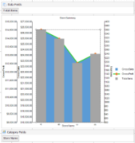
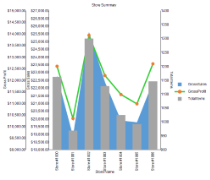
When you complete this walkthrough you get a layout that looks similar to the following at design time and at run time.
Design-Time Layout
Run-Time Layout
To create an ActiveReports project in Visual Studio
- Create a new Visual Studio project.
- In the New Project dialog that appears, select ActiveReports 13 Page Report Application and in the Name field, rename the file as rptCompositeChart.
- Click OK to create a new ActiveReports 13 Page Report Application. By default a Page report is added to the project.
See Adding an ActiveReport to a Project for information on adding different report layouts.
To connect the report to a data source
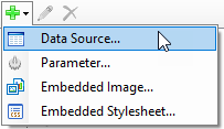
- In the Report Explorer, right-click the Data Sources node and select the Add Data Source option or select Data Source from the Add button.
- In the Report Data Source Dialog that appears, select the General page and in the Name field, enter a name like ChartData.
- On this page, create a connection to the Reels database. See Connect to a Data Source for information on connecting to a data source.
To add a dataset
- In the Report Explorer, right-click the ChartData data source node and select the Add Data Set option or select Data Set from the Add button.
- In the DataSet Dialog that appears, select the General page and enter the name of the dataset as StoreSummaryData.
- On the Query page of this dialog, in the Query field enter the following SQL query.
SQL Query Copy CodeSELECT * from StoreSummary - Click the Validate DataSet icon
 at the top right hand corner above the Query box to validate the query.
 - Click OK to close the dialog. Your data set and queried fields appear as child nodes to the data source in the Report Explorer.
To add the chart data region and define plots
- From the toolbox, drag a Chart data region onto the design surface of the report.
- In the Select a Chart Type wizard that appears, select the chart type as Column.
- Go to the Properties Window, click ellipses button next to Plots property to open the PlotDesigner - Collection Editor. You see that default Plot1 is already added.
- Add two new plots and set their Name as Plot2 and Plot3. Now you have three chart plots - Plot1, Plot2, and Plot3.
- Set the properties of Plot1, Plot2, and Plot3 in the collection editor as follows.
Property Name Property Values
Plot1
Plot2
Plot3
Encodings>Category>Values
Bind field 'StoreName' to X-axis for each plot.=Fields!StoreName.Value
=Fields!StoreName.Value =Fields!StoreName.Value Encodings>Values collection editor
Bind fields 'GrossSales', 'GrossProfit', and 'TotalItems' to Y-axis for each plot, respectively.=Fields!GrossSales.Value =Fields!GrossProfit.Value =Fields!TotalItems.Value Encodings>Color>ShowValuesName
Display Legends for each plot.True True True LineStyle>LineColor
Display selected color as the color of line in respective plots.Black LimeGreen Black LineStyle>LineStyle
Display selected style as the style of line in respective plots.Solid Solid Solid LineStyle>LineWidth
Display selected width as the width of line (in pts) in respective plots.1pt 3pt 1pt - Click OK to save and exit the collection editor.
- Right click Plot 1 and select Plot Template > Area > Area.
- Right click Plot 2 and select Plot Template > Line > Line.
- Right click Plot 3 and select Plot Template to Column > Column.
Define axes for the plots
- From Report Explorer, select Chart.
- Go to the Properties Window and click ellipses next to PlotArea > Axes property to open the AxisDesigner - Collection Editor. You see that six axes are already added.
- Remove Axis3 (AxisType X for Plot2) and Axis5 (AxisType X for Plot3). So now we have total four axes (one X axis - common for three plots and three Y axes - for three plots).
- Set the properties of the four axes in the collection editor as follows.
Property Name Property Values
Axis1
Axes2
Axes4
Axes6
Common>AxisType
Specify axis type as X or Y.X Y Y Y Common>Plots
Specify plots on respective axes.Plot1, Plot2, Plot3 Plot1 Plot2 Plot3 Title>Title
Specify title to be displayed for each axis.Store Name Gross Sales Gross Profit Total Items Labels>Format
Specify format of the values displayed on each axis.Default c c d Line>LineStyle>LineStyle
Specify axis line styles.Solid Solid Solid Solid Line>LineStyle>ShowLine
Show axis lines on the plot.True True True True Layout>Position
Specify position of axes.Near Near
Near Far Major Grid > ShowMajorGrid
Show or hide major grid lines.True False False False - Click OK to save and exit the collection editor.
To configure the appearance of the chart
- Select Chart and set Pallet to Office.
- Select 'Chart title' on the chart and set Title to 'Store Summary'.
- Select X-axis and set Labels>LabelsAngle to 90 degrees.
Let us set the maximum and minimum values to limit the values for each Y axis plots. This is based on the values in the data set.
- Go to the Properties Window and click ellipses next to PlotArea > Axes property to open the AxisDesigner - Collection Editor. Note that axes get renamed once you reopen the AxisDesigner - Collection Editor.
Property Name Property Values
Axes2
(Y axis for Plot1)Axes3
(Y axis for Plot2)Axes4
(Y axis for Plot3)Scale>Max 27000 15000 1400 Scale>Min 18000 9000 900 Note: You may need to adjust:
- Size of the chart so that all labels are displayed correctly. Select Chart and set Size property to a larger value.
- Page size of the report so that the chart is fully rendered. Select Report and set PageSize property to a larger value.
To view the report
- Click the Preview tab to view the report at design time.
OR
- Open the report in the Viewer. See Windows Forms Viewer for further information.