Column charts present each series as a vertical column, and group the columns by category. The y-axis values determine the heights of the columns, while the x-axis displays the category labels. With a column chart, you can select from the following subtypes.
Column
Compares values of items across categories.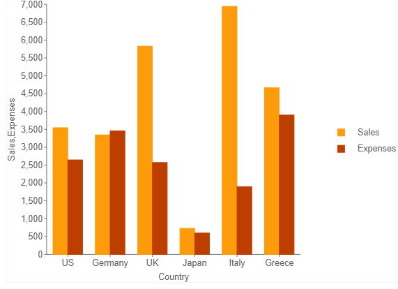
Stacked Column
A column chart with two or more data series stacked one on top of the other that shows how each value contributes to the total.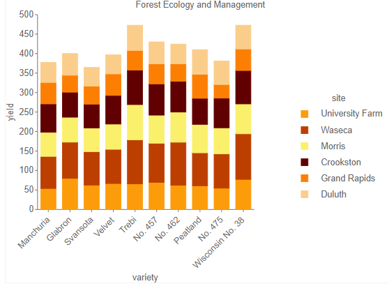
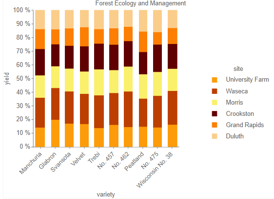
Percent Stacked Column
A column chart with two or more data series stacked one on top of the other to sum up to 100% that shows how each value contributes to a total with the relative size of each series representing its contribution to the total.