Wijmo UI for the Web
Change Bar Color by Value
Building on the Quick Start example, you can change the color of your bars depending on the data value to make your data easier to understand.
Note: Initially, the chart shows the bar.hoverStyle fill color, and then when you mouse out of the bar, it shows the seriesStyle fill color. For this reason, we must set our color values in two places to prevent them from changing on mouse out.
Drop down and copy code
| Change Bar Color Script |
Copy Code |
|---|---|
<script type="text/javascript">
    var fill = "";
    $(document).ready(function () {
        $("#chart").wijbarchart({
            header: {text: "Big Ten Championships"},
            horizontal: false,
            seriesList: [{
                label: "Big Ten Championships",
                legendEntry: false,
                data: {
                    x: ['Illinois', 'Indiana', 'Iowa', 'Michigan', 'Michigan State',
                        'Minnesota', 'Nebraska', 'Northwestern', 'Ohio State',
                        'Penn State', 'Purdue', 'Wisconsin'],
                    y: [230, 167, 105, 351, 84, 178, 3, 69, 185, 57, 69, 183]
                }
            }],
            mouseOut: function (e, data) {
                var y = data.y,
                bar = data.bar;
                if (y < 100) {
                    bar.attr({ fill: "red", stroke: "none" });
                }
                if (y > 100 && y < 200) {
                    bar.attr({ fill: "yellow", stroke: "none" });
                }
                if (y > 200) {
                    bar.attr({ fill: "green", stroke: "none" });
                }
            }
        });
    var bars = $("#chart").data("fields").chartElements.bars;
    $.each(bars, function (i, bar) {
        var node = bar.node,
        data = $(node).data("wijchartDataObj"),
        y = data.y;
        if (y < 100) {
            bar.attr({ fill: "red", stroke: "none" });
        }
        if (y > 100 && y < 200) {
            bar.attr({ fill: "yellow", stroke: "none" });
        }
        if (y > 200) {
            bar.attr({ fill: "green", stroke: "none" });
        }
    })
});
</script>
| |
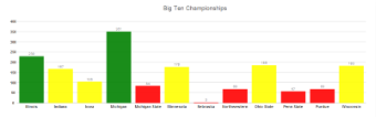
Image Title