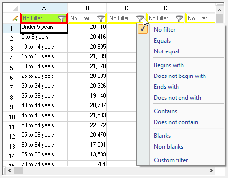
When the control has enhanced filtering turned on, the user can drop-down a list of available filters to apply to the data, as shown in the following figure.
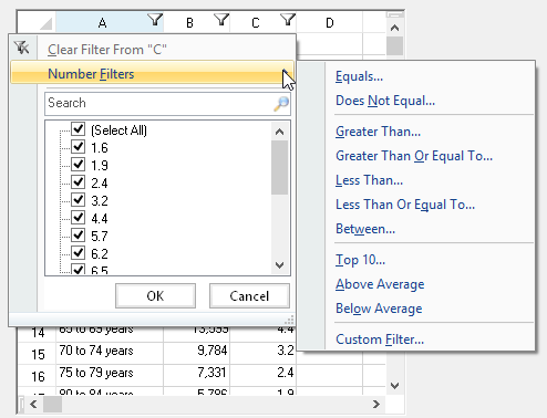
The default filter that is displayed depends on the data in the column. The filter can be a number, text, date, or color filter.
The filters are described in the following table.
| Filter Type | Description |
|---|---|
| Number Filters | |
| Equals | Values in rows are equal to condition |
| Does Not Equal | Values in rows do not equal condition |
| Greater Than | Values in rows are greater than condition |
| Greater Than Or Equal To | Values in rows are greater than or equal to condition |
| Less Than | Values in rows are less than condition |
| Less Than Or Equal To | Values in rows are less than or equal to condition |
| Between | Values in rows are greater than one condition and less than another condition |
| Top 10 | Values in the rows with the ten highest values |
| Above Average | Values in the rows that are above the average of the values in all the rows |
| Below Average | Values in the rows that are below the average of the values in all the rows |
| Custom Filter | Values in rows that meet the conditions of a custom filter |
| Text Filters | |
| Equals | Values in rows equal the condition |
| Does Not Equal | Values in rows do not equal the condition |
| Begins With | Values in rows begin with the specified characters |
| Ends With | Values in rows end with the specified characters |
| Contains | Values in rows contain the specified characters |
| Does Not Contain | Values in rows do not contain the specified characters |
| Custom Filter | Values in rows that meet the conditions of a custom filter |
| Date Filters | |
| Equals | Values in rows equal the condition |
| Before | Values in rows are dates before the condition |
| After | Values in rows are dates after the condition |
| Between | Values in rows are dates between two specified dates for the condition |
| Tomorrow | Values in rows are tomorrow's date |
| Today | Values in rows are today's date |
| Yesterday | Values in rows are yesterday's date |
| Next Week | Values in rows are during next week |
| This Week | Values in rows are during current week |
| Last Week | Values in rows are during last week |
| Next Month | Values in rows are during next month |
| This Month | Values in rows are during current month |
| Last Month | Values in rows are during last month |
| Next Quarter | Values in rows are during next quarter |
| This Quarter | Values in rows are during current quarter |
| Last Quarter | Values in rows are during last quarter |
| Next Year | Values in rows are during next year |
| This Year | Values in rows are during current year |
| Last Year | Values in rows are during last year |
| Year to Date | Values in rows are during current year to present date |
| All Dates in the Period | Values in rows are within a specified period |
| Custom Filter | Values in rows that meet the conditions of a custom filter |
Users can specify wildcards in conditions. The "?" character represents any single character. The "*" character represents any series of characters.
When the user chooses a filter, the control either filters the data to display only the items that match the filter criteria, or the control displays the rows that meet the criteria with one appearance, and the rows that do not meet the criteria with another appearance. For information about setting the styles for rows, see Setting the Appearance of Filtered Rows.
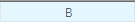
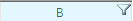
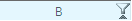
In the control, columns with filters display filter indicators, which indicate whether a filter has been applied, as shown in the following table.
| Row Filtering Indicator | Description |
|---|---|
|
|
Appearance of header cell with no row filtering |
|
|
Appearance of header cell with row filtering allowed but no rows filtered |
|
|
Appearance of header cell with row filtering allowed and some rows filtered |
If you prefer, you can have the control display a filter bar that allows the user to choose the filter to apply. The filter bar is displayed in the control at all times, and choosing a filter from the filter bar makes the filter go into effect immediately. The following figure illustrates a control with a filter bar.
Using Code
- Set the AllowAutoFilter property.
- Set the AutoFilterMode property.
Example
The following example creates an enhanced filter in the first three columns. Add different types of data to see the various filter options.
| C# |
Copy Code
|
|---|---|
| fpSpread1.Sheets[0].Columns[0, 2].AllowAutoFilter = true; fpSpread1.Sheets[0].AutoFilterMode = FarPoint.Win.Spread.AutoFilterMode.EnhancedContextMenu; |
|
| VB |
Copy Code
|
|---|---|
| fpSpread1.Sheets(0).Columns(0, 2).AllowAutoFilter = True fpSpread1.Sheets(0).AutoFilterMode = FarPoint.Win.Spread.AutoFilterMode.EnhancedContextMenu |
|
You can customize the appearance of the filter bar, as described in Customizing the Filter Bar.