To create the simplest FlexGrid for LightSwitch application, start by creating a new LightSwitch application, and then add a data source and a FlexGrid Screen.
Create a FlexGrid for LightSwitch project
To create a new FlexGrid for LightSwitch project, complete the following steps:
- In Visual Studio, select File | New Project.
- Under Installed Templates, select LightSwitch. The .NET Framework 4 must be selected in order to create a LightSwitch application.
- Choose LightSwitch Application for the preferred language, enter a name for the application, and click OK. Your LightSwitch project is created. You'll notice it contains the Data Sources and Screens folders.
- In the Solution Explorer, right-click the project node and select Properties.
- In the Properties window, select the Extensions tab and make sure the Microsoft LightSwitch Extensions and FlexGrid for LightSwitch items are selected and have the Use in new projects fields selected.
Add a Data Source
To add an existing data source to the project, follow these steps:
- In the designer, click Attach to external data source. You can also right-click the Data Sources folder in the Solution Explorer and select Add Data Source.
- In the Attach Data Source Wizard, select Database and click Next.
- Choose Microsoft SQL Server and click Continue.
- Enter a server name, select the database name, and click OK.
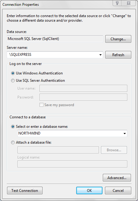
- Open the Tables list and select the Categories, Products, and Suppliers check boxes.
- Click Finish.
Add a FlexGrid Screen
- In the Designer, click the Screen button or right-click the Screens folder in the Solution Explorer and choose Add Screen. The Add New Screen window opens.
- Select FlexGrid Screen.
- Under Provide screen information, select NORTHWINDData.Products from the Screen Data drop-down list. The Screen Name is updated based on the data chosen. The C1FlexGridPage control is automatically added to the screen and bound to the selected data.
The Solution Explorer will look like this:
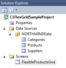
Run the application and you will see an interface similar to the one in Microsoft Excel.
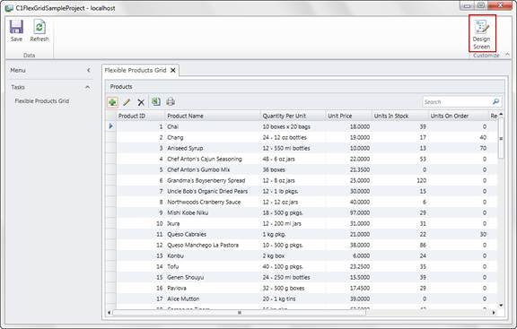
In debug mode, you can click the Design Screen button to customize the page. If you select the C1FlexGridPage from the left-side menu at run time, you can customize various properties, including options specific to ComponentOne's product. In release mode, the Design Screen button is not available.
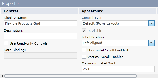
We have not done any customization so far, but we can take a look at the features automatically added by ComponentOne FlexGrid. Click the Cancel button at the top right in Customization Mode to return to the FlexGrid.
Filtering
The right edge of each column header now includes a dropdown filter menu containing the unique values for that column. To filter the column, select the desired items, and then click Apply.
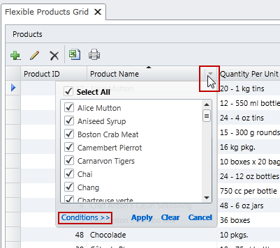
To filter by an expression, click Conditions >> to switch the menu to a form where you can specify simple expressions instead of selecting specific values. See Filtering Data for more information.
Printing
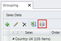
The C1FlexGrid includes a Print button in the command bar. To print this grid at runtime, click the Print button. The Print button sends the current view to the printer, including rows that are scrolled out of view. See Printing a Grid for more information.
Selecting a Range and Copying that Data to the Clipboard
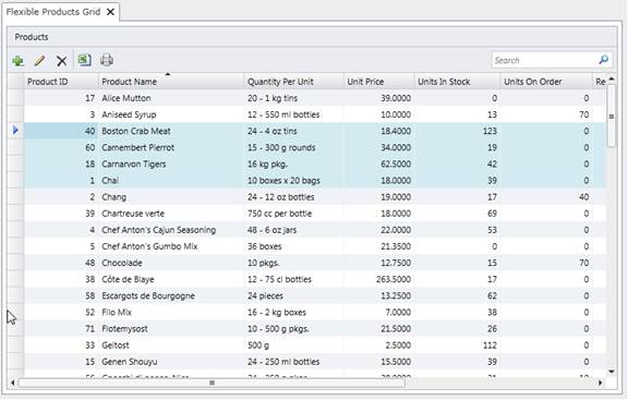
C1FlexGrid allows you to select adjacent columns or cells and copy the data within them to the clipboard.
To select entire rows, click within the record selector column on the far left. To select consecutive rows, use Shift-Click to choose the range. Copy the data to the clipboard using Ctrl-C.
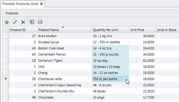
You can select individual cells by clicking on them, or use Shift-Click to select a range. You cannot select columns or rows that are not adjacent to each other.
The following sections describe additional functionality that you can enable without writing any code.