You can change the appearance of a C1DateTimePicker control in XAML or from the Properties window. For this help, we will use an application that contains three instances of the C1DateTimePicker control: one set to EditMode="Date", one set to EditMode="Time", and one set to EditMode="DateTime". The starting XAML markup for the entire application should resemble the following:
<!--LayoutRoot is the root grid where all page content is placed-->
<Grid x:Name="LayoutRoot" >
<Grid.RowDefinitions>
<RowDefinition Height="Auto"/>
<RowDefinition Height="*"/>
</Grid.RowDefinitions>
<!--TitlePanel contains the name of the application and page title-->
<StackPanel x:Name="TitlePanel" Grid.Row="0" Margin="12,17,0,28">
<TextBlock x:Name="ApplicationTitle" Text="ComponentOne DateTimePicker for Windows Phone" Style="{StaticResource PhoneTextNormalStyle}" FontSize="18" />
<TextBlock x:Name="PageTitle" Text="Date and Time" Margin="9,-7,0,0" Style="{StaticResource PhoneTextTitle1Style}" FontSize="72" />
</StackPanel>
<!--ContentPanel - place additional content here-->
<Grid x:Name="ContentPanel" Grid.Row="1" Margin="12,0,12,30" >
<StackPanel Margin="20 40" >
<c1:C1DateTimePicker x:Name="C1DateTimePicker1" EditMode="Date" UseLayoutRounding="False" TimeFormat="T" DateFormat="D">
<c1:C1DateTimePicker.Header>
<TextBlock Text="Edit date" />
</c1:C1DateTimePicker.Header>
</c1:C1DateTimePicker>
<c1:C1DateTimePicker x:Name="C1DateTimePicker2" EditMode="Time" TimeFormat="T">
<c1:C1DateTimePicker.Header>
<TextBlock Text="Edit time"/>
</c1:C1DateTimePicker.Header>
</c1:C1DateTimePicker>
<c1:C1DateTimePicker x:Name="C1DateTimePicker3" AllowDrop="False" DateFormat="D" TimeFormat="T">
<c1:C1DateTimePicker.Header>
<TextBlock Text="Edit date and time" />
</c1:C1DateTimePicker.Header>
</c1:C1DateTimePicker>
</StackPanel> </Grid>
</Grid>
In XAML
Follow these steps:
1. In your application's MainPage.xaml page, locate the first set of <c1:C1DateTimePicker> tags. Insert BorderThickness="5" Background="#FFA6FCB6" BorderBrush="#FF29ACEB" Foreground="#FF0C3EC4" in the tag to customize the appearance of the control. The markup should resemble the following:
<c1:C1DateTimePicker EditMode="Date" UseLayoutRounding="False" DateFormat="D" BorderThickness="5" Background="#FFA6FCB6" BorderBrush="#FF29ACEB" Foreground="#FF0C3EC4">
2. Locate the <c1:C1DateTimePicker.Header> tags and insert Foreground="FF29AECB" into the tag so that the markup resembles the following:
<c1:C1DateTimePicker.Header>
<TextBlock Text="Edit date" Foreground="#FF29ACEB" />
</c1:C1DateTimePicker.Header>
3. Repeat the first two steps with the next two sets of <c1:C1DateTimePicker> and <c1:C1DateTimePicker.Header> tags so that all three controls will share the same color scheme.
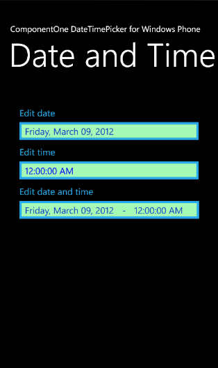
4. Run your application. The application should resemble the following image:
From the Properties Window
Follow these steps:
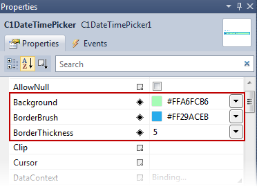
1. Click on the first C1DateTimePicker control in your application to view the Properties for that control. The Properties window should display the name of the control: C1DateTimePicker1.
2. Locate the Background, BorderBrush, and BorderThickness properties and set them as follows:
•Background: #FFA6FCB6
•BorderBrush: #FF29ACEB
•BorderThickness: 5
The Properties window should resemble the following image:
3. Locate the Foreground property and set it to "#FF0C3EC4". This property sets the color of the text.
4. Repeat these steps with the next two instances of the C1DateTimePicker control. All three controls should have the same color scheme when you run your application, as in the following image: