Wijmo UI for the Web
Clustering Data
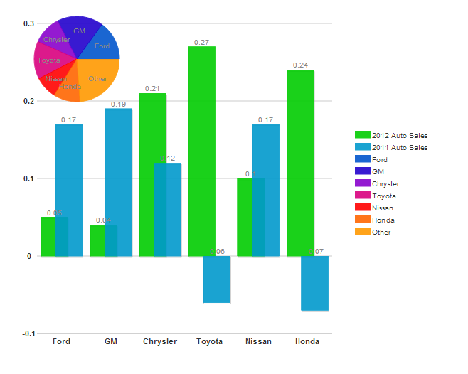
This concept applies only to the column and bar types of series.
While a column or bar chart supports more than one series for the Y axis, you can only use one set of data for the X axis. In this way, you can report, for example, multiple years of sales data on the Y axis for each auto manufacturer on the X axis. When you provide such data, the chart shows the data in clusters, with a cluster of columns representing all of the data for Honda, and another cluster representing Nissan, and so on.
There are a couple of ways that you can code this type of chart.
List all of the X axis data in each seriesList
| Redundant X Data |
Copy Code |
|---|---|
<script id="scriptInit" type="text/javascript">
  $(document).ready(function () {
    $("#wijcompositechart").wijcompositechart({
        clusterOverlap: 50,
        seriesList: [
        {
            type: "column",
            label: "2012 Auto Sales",
            data: {
                x: ['Ford', 'GM', 'Chrysler', 'Toyota', 'Nissan', 'Honda'],
                y: [.05, .04, .21, .27, .1, .24] }
        },
        {
            type: "column",
            label: "2011 Auto Sales",
            data: {
                x: ['Ford', 'GM', 'Chrysler', 'Toyota', 'Nissan', 'Honda'],
                y: [.17, .19, .12, -.06, .17, -.07] }
        },
        {
            type: "pie",
            center: { x: 100, y: 75 },
            radius: 60,
            data: [
                {label: "Ford", data: 15},
                {label: "GM", data: 17.4},
                {label: "Chrysler", data: 10.9},
                {label: "Toyota", data: 14.3},
                {label: "Nissan", data: 8.5},
                {label: "Honda", data: 10.1},
                {label: "Other", data: 23.8}]
        }]
    });
  });
</script>
| |
That method is a bit rendundant, so here is a shorter way to do it.
Put the X data all in one place
| Default value |
Copy Code |
|---|---|
<script id="scriptInit" type="text/javascript">
  $(document).ready(function () {
    $("#wijcompositechart").wijcompositechart({
        clusterOverlap: 50,
        data: {x: ['Ford', 'GM', 'Chrysler', 'Toyota', 'Nissan', 'Honda']},
        seriesList: [
        {
            type: "column",
            label: "2012 Auto Sales",
            data: { y: [.05, .04, .21, .27, .1, .24] }
        },
        {
            type: "column",
            label: "2011 Auto Sales",
            data: { y: [.17, .19, .12, -.06, .17, -.07] }
        },
        {
            type: "pie",
            center: { x: 100, y: 75 },
            radius: 60,
            data: [
                {label: "Ford", data: 15},
                {label: "GM", data: 17.4},
                {label: "Chrysler", data: 10.9},
                {label: "Toyota", data: 14.3},
                {label: "Nissan", data: 8.5},
                {label: "Honda", data: 10.1},
                {label: "Other", data: 23.8}]
        }]
    });
  });
</script>
| |
Wijmo offers several options to let you control how these data clusters appear: