Wijmo UI for the Web
Add Curve Fittings
Building on the Quick Start example, you can add gridMajor and gridMinor objects, which contain styles for the axis grid lines.
Drop down and copy code
| Show Grid Lines Script |
Copy Code |
|---|---|
<script id="scriptInit" type="text/javascript">
    $(document).ready(function () {
    $("#wijcompositechart").wijcompositechart({
        axis: {y: {text: "Total Hardware"}},
        hint: {
            content: function () {return this.label + '\n ' + this.y + '';}
            },
        header: {text: "Hardware Distribution"},
        seriesList: [{
            type: "column",
            label: "West",
            data: {
                x: ['Desktops', 'Notebooks', 'AIO', 'Tablets', 'Phones'],
                y: [5, 3, 4, 7, 2] }
        },
        {
            type: "column",
            label: "Central",
            data: {
                x: ['Desktops', 'Notebooks', 'AIO', 'Tablets', 'Phones'],
                y: [2, 2, 3, 2, 1] }
        },
        {
            type: "column",
            label: "East",
            data: {
                x: ['Desktops', 'Notebooks', 'AIO', 'Tablets', 'Phones'],
                y: [3, 4, 4, 2, 5] }
        },
        {
            type: "pie",
            center: { x: 150, y: 150 },
            radius: 60,
            data: [
                {label: "MacBook Pro",data: 46.78},
                {label: "iMac", data: 23.18},
                {label: "MacBook", data: 20.25}
                ]
        },
        {
            type: "spline",
            label: "Steam1",
            data: {
                x: ['Desktops', 'Notebooks', 'AIO', 'Tablets', 'Phones'],
                y: [3, 6, 2, 9, 5]
            },
            markers: {visible: true, type: "box"}
        },
        {
            type: "bezier",
            label: "Steam2",
            data: {
                x: ['Desktops', 'Notebooks', 'AIO', 'Tablets', 'Phones'],
                y: [1, 3, 4, 7, 2]
            },
            markers: {visible: true, type: "diamond"}
        }]
    });
  });
</script>
| |
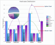
Chart with Curve Fittings