Legends refer to the labels in a chart that help users in understanding the plotted data. A legend entry in a chart refers to the name of the data category that is plotted in the chart. Each legend entry in a chart possesses a unique color for better data visualization.
In order to configure chart with legends in a worksheet, refer to the following tasks:
Add Legends to Charts
You can define legends in charts in order to show descriptions of the data lying the rows and columns of a worksheet and faciliate users in understanding the information plotted in a chart.
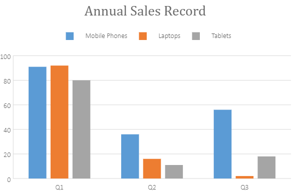
A basic image with three legend entries : Mobile Phones, Laptops and Tablets is shown below:

When a chart is created in SpreadJS, legends appear on the bottom of the spreadsheet (by default). However, you can get or set the legends of the chart, change the position of the legend(top, bottom, left or right), and control whether to show the legend in the chart using the legend method and LegendPosition enumeration.
Using Code
This code shows how to configure legends in the chart.
| JavaScript |
Copy Code
|
|---|---|
|
// Configure Legend |
|
Customize Legend Style
SpreadJS also provides support for customizing the border style and the background color of the legend.
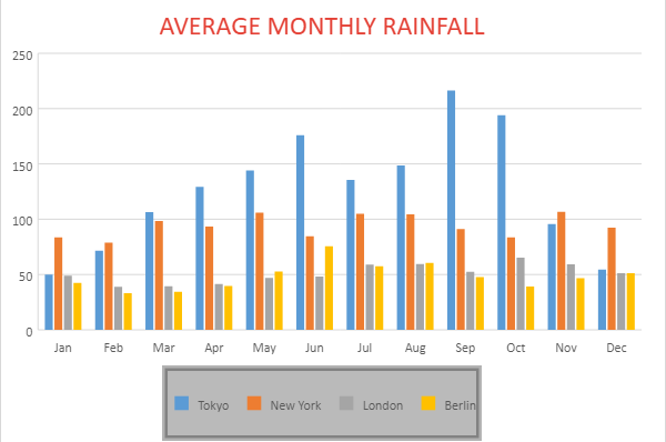
An example screenshot is shared below that shows a chart depicting average monthly rainfall for different geographical regions with legends (representing region names) formatted with custom border style.

Using Code
The example code shared below shows how to customize the legend border style.
| JavaScript |
Copy Code
|
|---|---|
|
// Configure Legend borderStyle and backColor |
|