Spread.Sheets Documentation
Creating Combo Chart
Spread.Sheets Documentation > Developer's Guide > Customizing the Appearance > Understanding Chart > Working with Chart Types > Creating Combo Chart

A Combo chart combines two or more chart types in a single chart, hence making it easier for users to interpret and understand data. This chart is ideal when you want to visualize different type of data that is completely unrelated (for instance: price and volume) or when you need to plot one or more data series on the secondary axis.

The data arranged in columns or rows of a worksheet can be plotted in a Combo chart. You can create a combo chart in two ways: 1) By creating a column chart and 2) By adding a series and setting its chart type. For instance, by adding a line chart.

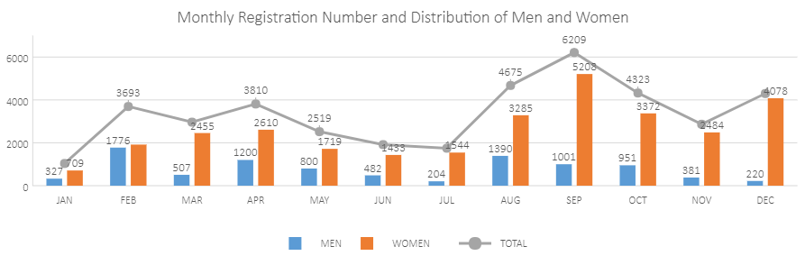
In the example shown below, monthly registration number and distribution (which are two different types of data) of men and women is depicted with the help of a combo chart.
       

Using Code

This code shows how to add a combo chart in a spreadsheet.

JavaScript
Copy Code

var spread;

function initSpread(spread) {
            var chartType = [{
                type: GC.Spread.Sheets.Charts.ChartType.columnClusterd,
                comboType: GC.Spread.Sheets.Charts.ChartType.lineMarkers
            }];
            var sheets = spread.sheets;
            spread.suspendPaint();
            for (var i = 0; i < chartType.length; i++) {
                var sheet = sheets[i];
                initSheet(sheet);
                var chart = initChart(sheet, chartType[i].type);//add chart
                chart.title({ text: "Monthly Registration Number and Distribution of Men and Women" });
                addSeriesLine(chart, chartType[i].comboType);
                changColumnChartDataLabels(chart);
            }
            spread.resumePaint();
        }

        function initSheet(sheet) {

            //prepare data for chart
            var dataArray = [["", "JAN", "FEB", "MAR", "APR", "MAY", "JUN", "JUL", "AUG", "SEP", "OCT", "NOV", "DEC"],
                ["MEN", 327, 1776, 507, 1200, 800, 482, 204, 1390, 1001, 951, 381, 220],
                ["WOMEN", 709, 1917, 2455, 2610, 1719, 1433, 1544, 3285, 5208, 3372, 2484, 4078],
                ["TOTAL", 1036, 3693, 2962, 3810, 2519, 1915, 1748, 4675, 6209, 4323, 2865, 4298]
            ];
            sheet.setArray(0, 0, dataArray);

        }

        function initChart(sheet, type) {
            //add chart
            return sheet.charts.add((sheet.name() + 'Chart1'), type, 30, 120, 900, 300, "A1:M3", GC.Spread.Sheets.Charts.RowCol.rows);
        }

        //add a line type to create combo chart
        function addSeriesLine(chart, type) {
            var seriesItem = {};
            seriesItem.chartType = type;
            seriesItem.border = { width: 3 };
            seriesItem.name = 'A4';
            seriesItem.xValues = 'B1:M1';
            seriesItem.yValues = 'B4:M4';
            chart.series().add(seriesItem);
        }

        //show dataLabels
        function changColumnChartDataLabels(chart) {
            var dataLabels = chart.dataLabels();
            dataLabels.showValue = true;
            dataLabels.showSeriesName = false;
            dataLabels.showCategoryName = false;
            var dataLabelPosition = GC.Spread.Sheets.Charts.DataLabelPosition;
            dataLabels.position = dataLabelPosition.above;
            chart.dataLabels(dataLabels);
        }