A tabstrip is a user interface used for navigation. Essentially, a tabstrip is a menu that consists of a series of tabs laid out on a strip.
 Tabstrip
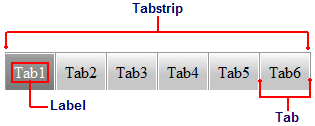
The tabstrip is the container that hosts the tabs of the C1TabStrip control. It is represented by the C1TabStrip class, which determines the overarching appearance and behavior of the control; it's from the C1TabStrip class that you can set the VisualStyle, Alignment, Direction, and ScrollSettings for the control.
A C1TabStrip can be aligned vertically or horizontally.
Tabs
Tabs are the individual menu elements within the tabstrip; the tabs are represented by the C1Tab class. The tabs have three states: normal, selected, and hover. A tab is "normal" when it is unselected and "selected" if it has focus. Tabs are only in "hover" state when a user mouses over them.
The tab object (C1Tab) only represents the tab; it does not represent the content that is attached to the tab. Tabs can be associated with web page content or with one page of a C1MultiPage control. For information on assigning content to tabs, see Using a C1TabStrip for Website Navigation and Using a C1TabStrip for C1MultiPage Navigation.
Labels
By default, the text labels are named "Tab[#]". For example, the first tab you add will be named "Tab1", whereas the second tab will be named "Tab2". You can reset the label using the Text property.
|