Financial charts are useful for displaying stock information using High, Low, Open and Close values. This walkthrough illustrates how to create a Candle chart.
The walkthrough is split up into the following activities:
- Adding a chart control to the report
- Adding a series and data points to the chart
- Setting the chart's properties
 |
Tip: For basic steps like adding a report to a Visual Studio project and viewing a report, please see the Basic Data Bound Reports walkthrough. |
When you have finished this walkthrough, you will have a chart that looks similar to the following.

To add a chart control to the report
- Resize the section in which you want to place the chart.
- Click the ChartControl in the ActiveReports toolbox and draw it onto the report.
To add a series and data points to the chart
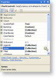
- With the chart control highlighted, click the Series (Collection) property in the Properties Window, then click the ellipsis button that appears.

- In the Series Collection Editor window that appears, Series1 is selected by default.
- Under Series1 Properties, change the Type property to Candle.
- Expand the Properties node and set the BodyDownswingBackdrop property to (Default) so that you can expand the node and change the Color property to Fuchsia.
- Set the BodyUpswingBackdrop property to (Default) so that you can expand the node and change the Color property to DarkViolet.
- Set the BodyWidth property to 5 to make the opening to closing figure bar, the candle, wider than the wick.
- Set the WickLine property to (Default) for a black wick.

- Click the Points (Collection) property, then click the ellipsis button that appears.
- In the DataPoint Collection window that appears, click Add to add a data point
- Set its YValues property to 99; 37; 53; 88.

Note: The first Y value is the high figure or top of the wick; the second is the low figure, or bottom of the wick; the third is the opening figure; the fourth is the closing figure. If the fourth figure is higher than the third, the candle is DarkViolet, the BodyUpswingBackdrop. - Add another data point, and set its YValues property to 115; 22; 101; 35.
- Add another data point, and set its YValues property to 87; 1; 7; 80.
- Add another data point, and set its YValues property to 63; 14; 57; 25.
- Add another data point, and set its YValues property to 130; 25; 25; 120.
- Set its YValues property to 99; 37; 53; 88.
- Click OK to save the data points and close the window.
- Back on the Series Collection Editor window, set the Legend property to (none).
- Remove Series2 and Series3.
- Click OK to return to the report design surface.
To set the chart's properties
Axes
- With the chart control highlighted, click the ChartAreas (Collection) property in the Properties Window, then click the ellipsis button that appears.
- In the ChartArea Collection Editor window that appears, under defaultArea properties, click the Axes (Collection) property, then click the ellipsis button that appears.
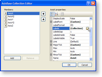
- In the AxisBase Collection Editor window that appears, the AxisX member is selected by default. Under AxisX properties, delete the text from the Title property.
- Click the Labels (Collection) property, then click the ellipsis button that appears. This is where you add the labels that appear along the X axis, the line across the bottom of the chart.

- In the Array Data Editor window that appears, enter the following into the editor, each item on a separate line:
- Monday
- Tuesday
- Wednesday
- Thursday
- Friday
- Click the OK button to return to the AxisBase Collection Editor.
- Select the AxisY member, and under AxisY properties, expand the MajorTick property node and set the Step property to 10. This controls the numeric labels along the Y axis, the line along the left side of the chart.
- Set the LabelsVisible property to True.
- Set the Min property to 0.
- Set the AxisY member's Title property to $,000 and click OK to return to the ChartArea Collection Editor.

- Click OK to return to the report design surface and see the changes reflected in the chart.
Title and Legend
- With the chart control highlighted, click the Titles (Collection) property in the Properties Window, then click the ellipsis button that appears.
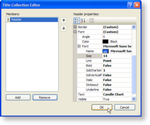
- In the Title Collection Editor that appears, under header properties, change the Text property to Candle Chart.
- Expand the Font property and set the Size to 14.
- Remove the footer title, and click OK to return to the report design surface.

- With the Chart control highlighted, click the Legends (Collection) property in the Properties Window, then click the ellipsis button that appears.
- In the Legend Collection Editor window that appears, set the Visible property to False, and click OK to return to the report design surface and see the completed chart.