The report designer is fully integrated with the Microsoft Visual Studio IDE. In this topic, we introduce the main parts of the designer in Section report, Page report, and RDL report to help you select the one to best suit your specific needs.
Report designer in section reports
In a section report, the designer offers the following features that you can use to create, design and edit a report.
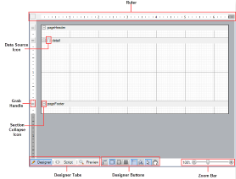
Design Surface
The design surface offers a default report structure that contains a page header, a detail section, and a page footer along with some grey area below these sections. Drag report controls and fields onto these sections to display your data. Use section grab handles to drag a section's height up or down. Right click the report and select Insert to add other types of header and footer section pairs.
DataSource Icon
The DataSource icon is located in the band along the top of the detail section. Click this icon to open the Report Data Source dialog, where you can bind your report to any OLE DB, SQL, or XML data source. See Report Data Source Dialog for more information
Section Collapse Icon
A Section Collapse icon (-) appears on each band adjacent to the section header. When you click the collapse icon the section collapses and an expand icon (+) appears. Please note that section collapse is only available in the Designer tab. All sections of the report are visible in the Preview tab or when the report is rendered.
Rulers
Rulers are located at the top and left of the design view. They help a user visualize the placement of controls in the report layout and how they appear in print. Please note that you have to add the right and left margin widths to determine whether your report fits on the selected paper size. The left ruler includes a grab handle for each section to resize the section height. See Rulers for more information.
Grab Handles
Grab handles on the vertical ruler indicate the height of individual sections. You can drag them up or down to change section heights, or double-click to automatically resize the section to fit the controls in it.
Designer Tabs
The designer provides three tabs: Designer, Script and Preview. You can create your report layout visually in the Designer tab, add script to report events in the Script tab to implement .NET functionality, and see the result in the Preview tab. See Designer Tabs for more information.
Designer Buttons
Designer buttons are located below the design surface next to the designer tabs. Dimension Lines, Hide Grid, Dots, Lines, Snap to Lines, and Snap to Grid buttons help you to align report controls and data regions. The Select Mode and Pan Mode buttons determine whether you select controls on the design surface, or move the visible area of a zoomed-in report. See Designer Buttons for more information.
Zoom Bar
The zoom bar provides a slider that you drag to zoom in and out of the design surface, or you can use the Zoom in and Zoom out buttons at either end of the slider. See Zoom Support for more information.
Report designer in page reports/RDL reports
In a page report or a RDL report, the designer offers the following features that you can use to create, design and edit a report.
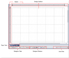
Design Surface
The design surface of a report appears initially as a blank page and grid lines. You can create your own layout and drag report controls and fields onto the design surface to display your data.
Rulers
Use the ruler to determine how your report will look on paper. Please note that you have to add the right and left margin widths to determine whether your report will fit on the selected paper size. See Rulers for more information.
Designer Tabs
The designer provides three tabs: Designer, Script and Preview. You can create your report layout visually in the Designer tab, add script to report events in the Script tab to implement .NET functionality, and see the result in the Preview tab. See Designer Tabs for more information.
Page Tabs(Page Report)
By default, the designer provides two page tabs, Page 1 and New, below the design surface. Each page tab represents a layout page of the report. Page 1 represents the first page of your report, and you can click New to add another page to your report. See Page Tabs for more information.
Designer Buttons
Designer buttons are located below the design surface next to the designer tabs. Dimension Lines, Hide Grid, Dots, Lines, Snap to Lines, and Snap to Grid buttons help you to align report controls and data regions. The Select Mode and Pan Mode buttons determine whether you select controls on the design surface, or move the visible area of a zoomed-in report. See Designer Buttons for more information.
Zoom Bar
The Zoom Bar provides a slider that you drag to zoom in and out of the design surface, or you can use the Zoom in and Zoom out buttons at either end of the slider. See Zoom Support for more information.
Tip: ActiveReports provides some useful keyboard shortcuts for the controls placed on the design surface.
- Arrow Keys: To move control by one grid line.
- [Ctrl] + Arrow Keys: To move control by 1/100 inch (around 0.025 cms)
- [Shift] + Arrow Keys: To increase or decrease the size of the control by one grid line.