Financial charts are useful for displaying stock information using High, Low, Open and Close values. This walkthrough illustrates how to create a Candle chart.
The walkthrough is split up into the following activities:
- Adding a chart control to the report
- Adding a series and data points to the chart
- Setting the chart's properties
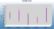
When you complete this walkthrough you get a layout that looks similar to the following at design time and at run time.
To add an ActiveReport to the Visual Studio project
- Create a new Visual Studio project.
- From the Project menu, select Add New Item.
- In the Add New Item dialog that appears, select ActiveReports 12 Section Report (code-based) and in the Name field, rename the file as FinancialChart.
- Click the Add button to open a new section report in the designer.
See Adding an ActiveReport to a Project for information on adding different report layouts.
To add the Chart control to the report
- From the toolbox, drag the Chart data region to the body of the report.
- If the chart wizard appears, click Cancel.
Tip: If you do not want the chart wizard to appear each time you add a chart, clear the Auto Run Wizard checkbox. You can still access the wizard via the command verbs (see below).
- In the Properties window, set the following properties.
Property Name Property Value Location 0, 0in Size 6.5, 3.5in - In the Report Explorer, select Detail1 and go to the properties window to set the Height property to 3.5.On the design surface, select the grey area outside the report and in the Properties window, set the PrintWidth property to 6.5.
To add a series and data points to the Chart
- With the chart control selected, go to the Properties window and click the Series (Collection) property and then click the ellipsis button.
- In the Series Collection Editor that appears, Series1 is selected by default. There, under Series1 properties, change the following.
Property Name Property Value Type Candle Properties>BodyDownswingBackdrop (Default) Properties>BodyDownswingBackdrop>Color Fuchsia Properties>BodyUpswingBackdrop (Default) Properties>BodyUpswingBackdrop>Color DarkViolet Properties>BodyWidth 5 Properties>WickLine (Default) Legend (none) - Click the Points (Collection) property, then click the ellipsis button that appears.
- In the DataPoint Collection window that appears, click Add to add a data point and set its YValues property to 99; 37; 53; 88.
Note: The first Y value is the high figure or top of the wick; the second is the low figure, or bottom of the wick; the third is the opening figure; the fourth is the closing figure. If the fourth figure is higher than the third, the candle is DarkViolet, the BodyUpswingBackdrop.
- Click Add to add another data point and set its YValues property to 115; 22; 101; 35.
- Click Add to add another data point, and set its YValues property to 87; 1; 7; 80.
- Click Add to add another data point, and set its YValues property to 63; 14; 57; 25.
- Click Add to add another data point, and set its YValues property to 130; 25; 25; 120.
- Click OK to save the data points and close the window.
- In the Series Collection Editor under Members, select Series2 and Series3 and click the Remove button.
- Click OK to return to the report design surface.
To configure the appearance of the Chart
- With the chart control selected, go to the Properties window and click the ChartAreas (Collection) property and then click the ellipsis button that appears.
- In the ChartArea Collection Editor that appears, under defaultArea properties, click the Axes (Collection) property, then click the ellipsis button that appears.
- In the AxisBase Collection Editor that appears, set the following properties.
AxisBase
- Under AxisX properties, in the Title property delete the default text.
- Click the Labels (Collection) property, then click the ellipsis button that appears. This is where you add the labels that appear along the X axis, the line across the bottom of the chart.
- In the Array Data Editor that appears, enter the following into the editor, each item on a separate line:
- Monday
- Tuesday
- Wednesday
- Thursday
- Friday
- Click the OK button to return to the AxisBase Collection Editor.
- Under Members, select the AxisY member, and under AxisY properties set the following properties.
Property Name Property Value MajorTick>Step 10 LabelsVisible True Min 0 Title $,000 - Click OK to return to the ChartArea Collection Editor.
- Click OK to return to the report design surface and see the changes reflected in the chart.
- With the chart control selected, go to the Properties window and click the Titles (Collection) property and then click the ellipsis button that appears.
- In the Title Collection Editor that appears, set the following properties.
Titles
- Under header properties, set the Text property to Candle Chart.
- Expand the Font property and set Font Size to 14.
- Under Members, select footer and click the Remove button.
- Click OK to return to the report design surface.
- With the Chart control selected, go to the Properties window and click the Legends (Collection) property and then click the ellipsis button that appears.
- In the Legend Collection Editor that appears, set the following properties.
Legends
- In the Properties window, set the Visible property to False.
- Click OK to return to the report design surface and see the completed chart.
To view the report
- Click the preview tab to view the report at design time.
OR
- Open the report in the Viewer. See Windows Forms Viewer for further information.
See Also