Wijmo UI for the Web
Use Multiple Axes
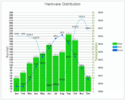
There may be times when you need to chart complex data that requires multiple axes. The wijcompositechart widget allows you to do just that.
Markup
| Sample Markup |
Copy Code |
|---|---|
<div id="wijcompositechart" style="width: 756px; height: 475px"> </div> | |
Script
| Sample Script |
Copy Code |
|---|---|
<script id="scriptInit" type="text/javascript">
    $(document).ready(function () {
        $("#wijcompositechart").wijcompositechart({
            axis: {
                y: [{
                    // main y axis

                    text: "Temperature",
                    compass: "east",
                    autoMin: false,
                    autoMax: false,
                    min: 5,
                    max: 35,
                    textStyle: {
                        fill: "#89A54E"
                    },
                    labels: {
                        style: {
                            fill: "#89A54E"
                        }

                    }
                },
              {
                  // y1 axis

                  text: "Rainfall",
                  autoMax: false,
                  autoMin: false,
                  min: 0,
                  max: 300
              },
              {
                  // y2 axis

                  text: "",
                  compass: "east"
              }],
                x: {
                    text: ""
                }
            },
            stacked: false,
            hint: {
                content: function () {
                    return this.label + '\n ' + this.y + '';
                }
            },
            header: {
                text: "Hardware Distribution"
            },
            seriesList: [{
                type: "column",
                label: "West",
                legendEntry: true,
                data: {
                    x: ['Jan', 'Feb', 'Mar', 'Apr', 'May', 'Jun', 'Jul', 'Aug', 'Sep', 'Oct', 'Nov', 'Dec'],
                    y: [49.9, 71.5, 106.4, 129.2, 144.0, 176.0, 135.6, 148.5, 216.4, 194.1, 95.6, 54.4]
                },
                yAxis: 1
            }, {
                type: "line",
                fitType: "spline",
                label: "East",
                legendEntry: true,
                data: {
                    x: ['Jan', 'Feb', 'Mar', 'Apr', 'May', 'Jun', 'Jul', 'Aug', 'Sep', 'Oct', 'Nov', 'Dec'],
                    y: [1016, 1016, 1015.9, 1015.5, 1012.3, 1009.5, 1009.6, 1010.2, 1013.1, 1016.9, 1018.2, 1016.7]
                },
                yAxis: 2
            }, {
                type: "line",
                label: "South",
                legendEntry: true,
                data: {
                    x: ['Jan', 'Feb', 'Mar', 'Apr', 'May', 'Jun', 'Jul', 'Aug', 'Sep', 'Oct', 'Nov', 'Dec'],
                    y: [7.0, 6.9, 9.5, 14.5, 18.2, 21.5, 25.2, 26.5, 23.3, 18.3, 13.9, 9.6]
                },
                markers: {
                    visible: true,
                    type: "circle"
                }
            }]

        });

    });
</script>
| |
Multiple Axes
The line or spline portion of the wijcompositechart can be used as an area chart as well.
Script
| Sample Script |
Copy Code |
|---|---|
yAxis: 1
            }, {
                type: "area",
                fitType: "spline",
                label: "East",
                legendEntry: true,
                data: {
                    x: ['Jan', 'Feb', 'Mar', 'Apr', 'May', 'Jun', 'Jul', 'Aug', 'Sep', 'Oct', 'Nov', 'Dec'],
                    y: [1016, 1016, 1015.9, 1015.5, 1012.3, 1009.5, 1009.6, 1010.2, 1013.1, 1016.9, 1018.2, 1016.7]
                },
| |
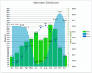
Area Chart with Multiple Axes
BubbleChart with Markers