Wijmo UI for the Web
Main Elements
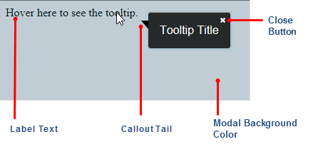
The image below illustrates the main elements of the wijtooltip widget. This image shows how it looks if you set the modal option to true, and the closeBehavior option to sticky.
The modal option disables the rest of the page until the tooltip is dismissed, so it is important to also set the closeBehavior option to sticky, which adds the close button and allows the user to dismiss it. This is handy for situations when you want to ensure that users read and dismiss a tooltip before you allow them to continue.
If you do not want to display the close button, set the closeBehavior option to none, or leave it to the default setting of automatic.
If you do not want to display the callout tail, set the showCallout option to false.