Wijmo UI for the Web
Format All Numeric Values
Wijmo User Guide > Widgets > Chart Widgets > BubbleChart > BubbleChart How To > Format All Numeric Values

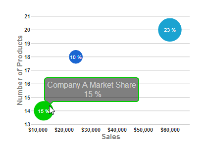
Building on the Quick Start example, you can change the formatting of the numeric values for the axis labels, chart labels, and tooltips.

  1. In the <head> section of your HTML file, replace the script that includes the document ready function with this one, which does the following:
    • Sets the following labels to use special formatting:
      • X axis labels use C0 (currency with no decimals).
      • Labels for each bubble in the chart (chartLabelFormatString) use p0 formatting (percentage with no decimals).
      • Data labels within the hint option that display when you mouse over each bubble use p0 formatting and display the Y1 value along with seriesList labels in tooltips. (Otherwise, the hint would display the Y value instead of Y1.)
    • Changes the chartLabelStyle option to white so that the label on each bubble is easier to see.
    • Hides the legend so that the X axis labels are not crowded.
    • Creates a series with the following properties:
      • Labels used in the tooltips read "Company X Market Share."
      • The Y axis displays the number of products for each company.
      • The X axis displays the sales for each company.
      • The Y1 value sets the size of each company's bubble based on its market share

    Drop down and copy code

    Format Numeric Values Script
    Copy Code
    <script id="scriptInit" type="text/javascript">
    $(document).ready(function () {
        $("#wijbubblechart").wijbubblechart({
            axis: {
                y: {text: "Number of Products"},
                x: {text: "Sales", annoFormatString: "C0"}
            },
            chartLabelFormatString: "p0",
            hint:{
                content: function(){
                    return this.data.label + '\n ' +  Globalize.format(this.y1, "p0") + '';
                }
            },
            legend: {visible: false},
            seriesList: [
            {
                label: "Company A Market Share",
                data: { y: [14], x: [12200], y1: [.15] }
            }, {
                label: "Company B Market Share",
                data: { y: [20], x: [60000], y1: [.23] }
            }, {
                label: "Company C Market Share",
                data: { y: [18], x: [24400], y1: [.1] }
            }]
        });
    });
    </script>
    
  2. No changes are necessary in the <body> section of your HTML file. The basic <div> tag is sufficient to create the chart.
  3. Save your HTML file and open it in a browser. The chart appears like the one in the image below, with all of the numeric data values formatted to show percentages or currency.
See Also

Reference

Widgets