Wijmo UI for the Web
Apply CSS Styles
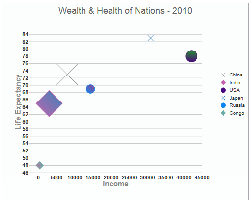
It's easy to change the appearance of the widget to your specification using a few of the wijbubblechart's options. In the following script using the seriesStyles option, the gradient is listed first and then the two fill colors that will be graded. The stroke color is changed last:
SeriesStyles
| Sample Script |
Copy Code |
|---|---|
seriesStyles: [{
    fill: "180-#8F8F8F-#C462AC", stroke: "#8F8F8F"
    }, {
    fill: "45-#C462AC-#2371B0", stroke: "#C462AC"
    }, {
    fill: "90-#4A067D-#0B7D19", stroke: "#4A067D"
    }, {
    fill: "270-#2371B0-#6AABA7", stroke: "#2371B0"
    }, {
    fill: "45-#0C85F0-#852E85", stroke: "#0C85F0"
    }, {
    fill: "180-#6AABA7-#AB6A9C", stroke: "#6AABA7"
    }],
| |
When you run your application, it will look like the following image: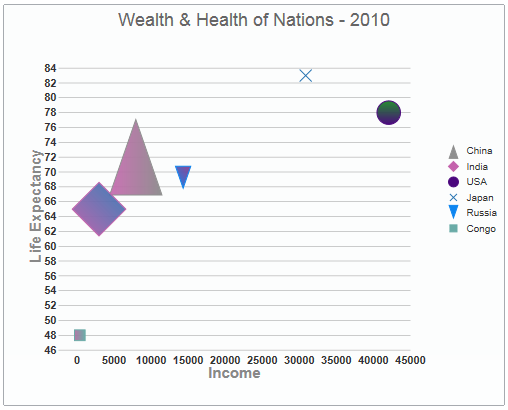
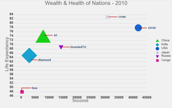
If you'd like to change the marker types, use the seriesList markers property:
SeriesMarkers
| Sample Script |
Copy Code |
|---|---|
seriesList: [{
         label: "China",
         legendEntry: true,
         data: { y: [73], x: [7931], y1: [1340]
},
         markers: {
            type: "cross"
         }
     },
    {
        label: "India",
        legendEntry: true,
        data: { y: [65], x: [2972], y1: [1150] },
        markers: {
            type: "diamond"
        }
    },
    {
        label: "USA",
        legendEntry: true,
        data: { y: [78], x: [42066], y1: [309] },
        markers: { type: "circle" }
    },
    {
        label: "Japan",
        legendEntry: true,
        data: { y: [83], x: [30866], y1: [126] },
        markers: {
            type: "cross"
        }
    },
    {
        label: "Russia",
        legendEntry: true,
        data: { y: [69], x: [14318], y1: [140] },
        markers: {
            type: "circle"
        }
    },
    {
        label: "Congo",
        legendEntry: true,
        data: { y: [48], x: [374], y1: [72] },
        markers: {
            type: "diamond"
        }
| |
When you run your application, it will look like the following image: