You can select columns, rows, cell ranges, and the entire control using touch gestures.
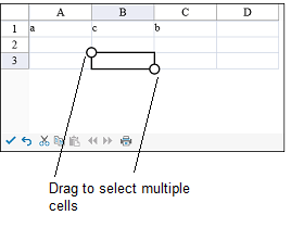
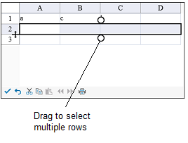
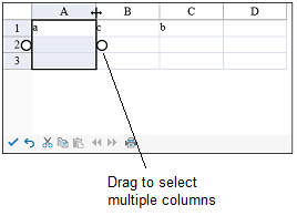
The selection gripper is displayed when touching the cell, column, or row. The gripper is not displayed when using the mouse or keyboard. The selection grippers are displayed on the outside edge of the range (top-left and bottom-right edges, by default). The border is displayed around the selected cell range when using touch operations.
Tap a cell to select the cell and display the selection gripper. Press the cell selection gripper and slide. Release to select a cell range.

Tap a column header (or row header) to select a column (or row). You can then press the selection gripper and slide to select a column range (or row range). Release to complete the selection.


You can select the entire control by tapping the corner header.
You can change the size of the cell range selection by pressing the selection gripper and sliding in any direction. Release to complete the action.
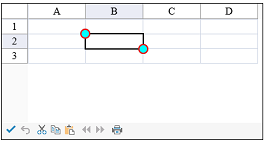
You can customize the gripper appearance using the SelectionGripperThickness, SelectionGripperLineColor, and SelectionGripperBackColor properties as in the following image.

Using Code
Set the SelectionGripperThickness, SelectionGripperLineColor, and SelectionGripperBackColor properties.
Example
This example sets the selection gripper appearance.
| C# |
Copy Code
|
|---|---|
FpSpread1.TouchInfo.SelectionGripperBackColor = System.Drawing.Color.Aqua; FpSpread1.TouchInfo.SelectionGripperLineColor = System.Drawing.Color.Red; FpSpread1.TouchInfo.SelectionGripperThickness = 2; |
|
| VB |
Copy Code
|
|---|---|
FpSpread1.TouchInfo.SelectionGripperBackColor = System.Drawing.Color.Aqua FpSpread1.TouchInfo.SelectionGripperLineColor = System.Drawing.Color.Red FpSpread1.TouchInfo.SelectionGripperThickness = 2 |
|