If the number of allowable values for a column is relatively small, you may want to consider a radio button presentation. At design time, go to the Values property page and set the Presentation property to 1 - Radio Button. Or, in code:
| Example Title |
Copy Code
|
|---|---|
With TDBGrid1.Columns("Country").ValueItems

    .Presentation = dbgRadioButton

End With
|
|
If necessary, adjust the Width property of the column and the RowHeight property of the grid to accommodate all of the items.
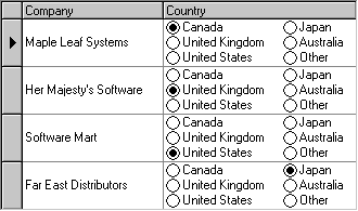
For a given cell, if the underlying data does not match any of the available values, none of the radio buttons will be selected for that cell. However, you can provide a default ValueItem object that will be selected instead.
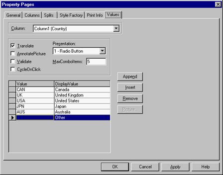
In this example, the last ValueItem has an empty Value property so that any cells where Country = "" will be displayed as Other. Also note that the entire last row in the property page grid is selected. This was done to mark the last ValueItem as the default, which means that Country fields that do not match any of the items will also be displayed as Other.
Selecting a row in the Values property page is equivalent to setting the DefaultItem property of the ValueItems collection at run time:
| Example Title |
Copy Code
|
|---|---|
With TDBGrid1.Columns("Country").ValueItems

    .DefaultItem = 5

End With
|
|
In this example, 5 is the zero-based index of the default item.