The RowDividerStyle and DividerStyle properties enable you to choose different horizontal and vertical lines and their colors. Note that RowDividerStyle is a TDBGrid object property and DividerStyle is both a Column and Split object property. The allowable values for both properties are as follows:
0 - No dividers
1 - Black line
2 - Dark gray line
3 - Raised
4 - Inset
5 - ForeColor
6 - Light gray line
7 - Custom Color
8 - Double Line
For example, setting the RowDividerStyle property to 0 - No dividers eliminates the dividing lines between rows and enables you to cram a bit more data into the available area.
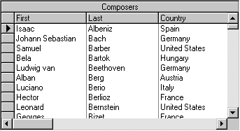
For Column objects, you can set the DividerStyle property to 0 - No dividers, and the HeaderDivider property to False. This enables you to visually group related columns, as shown in the following figure.
For Split objects, setting the DividerStyle property only affects the display of the border drawn at the left edge of the split; it does not change the appearance of column dividers within the split. For example, if a grid has two splits, you can set the DividerStyle property of the rightmost split to 1 - Black line to de-emphasize the thick border that the grid normally draws to indicate split boundaries.
Note: Prior to version 6.0, Split objects did not have a DividerStyle property, and the grid always displayed the divider as a thick black line. The setting 0 - No dividers refers to this default behavior; it does not eliminate the divider.