FinancialChart provides you with 15 chart types to cater to your financial data visualization requirements. You can set the chart type of the FinancialChart control by setting the ChartType property, which accepts values from the FinancialChartType enumeration.
The following table lists all chart types provided by FinancialChart:
The following code snippet sets the ChartType property.
Area Chart
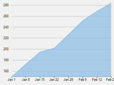
The Area Chart draws each series as connected points of data and the area below the connected points is filled with color to denote volume. Each new series is drawn on top of the preceding series. The series can either be drawn independently or stacked. These charts are commonly used to show trends between associated attributes over time.
ArmsCandleVolume Chart
Created by Richard Arms, the ArmsCandleVolume Chart is a combination of EquiVolume and CandleVolume chart types. The data for this chart type can be defined using the FinancialChart or FinancialSeries Binding property as a comma separated value in the following format: "highProperty, lowProperty, openProperty, closeProperty, volumeProperty". This chart type can only be used at the FinancialChart level, and should not be applied on FinancialSeries objects. Only one set of volume data is currently supported per FinancialChart.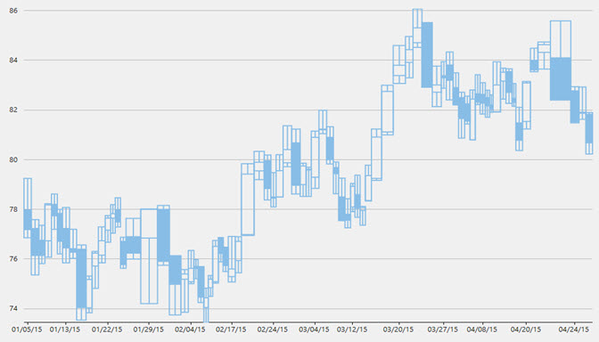
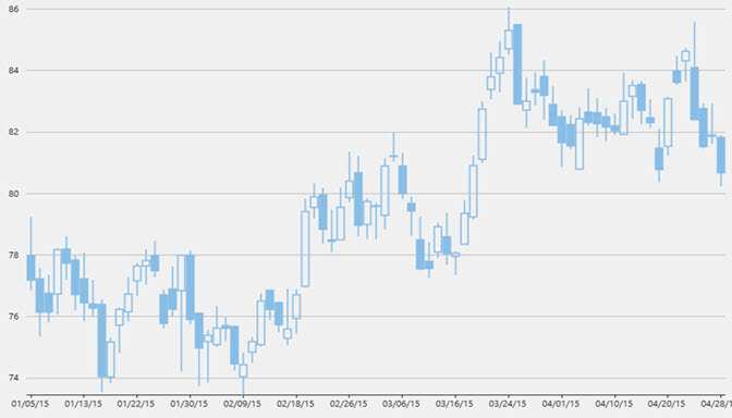
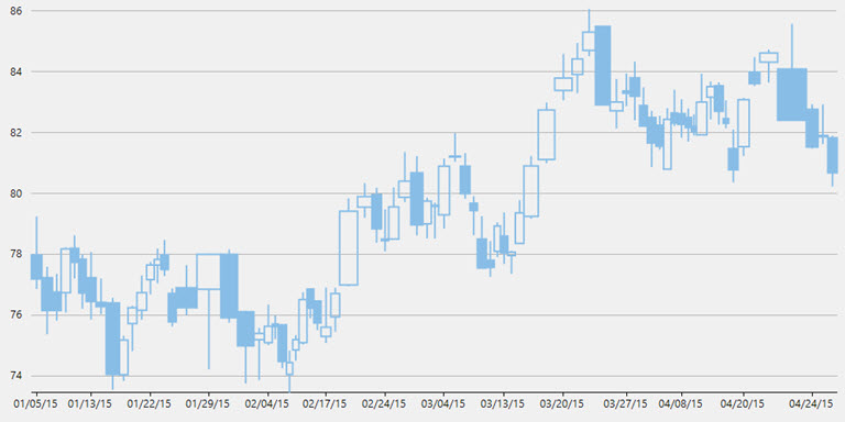
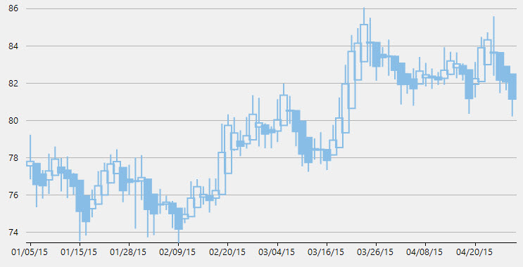
Candlestick Chart
The Candlestick Chart is a special type of HiLoOpenClose Chart that shows the opening, closing, high, and low prices of a given stock. It integrates Bar and Line charts to depict a range of values over time. It consists of visual elements known as candles that are further comprised of three elements: body, wick, and tail.
- The body represents the opening and the closing value, while the wick and the tail represent the highest and the lowest value respectively.
- A hollow body indicates a rising stock price (the closing value is greater than the opening value).
- A filled body indicates a falling stock price (the opening value is greater than the closing value).
The size of the wick line is determined by the High and Low values, while the size of the bar is determined by the Open and Close values. The bar is displayed using different colors, depending on whether the close value is higher or lower than the open value. The data for this chart type can be defined using the FinancialChart or FinancialSeries binding property as a comma separated value in the following format: "highProperty, lowProperty, openProperty, closeProperty".
In a Candlestick, there are five values for each data point in the series.
- x: Determines the date position along the x axis.
- high: Determines the highest price for the day, and plots it as the top of the candle along the y axis.
- low: Determines the lowest price for the day, and plots it as the bottom of the candle along the y axis.
- open: Determines the opening price for the day.
- close: Determines the closing price for the day.
CandleVolume Chart
The CandleVolume Chart is identical to the standard Candlestick Chart except that the width of each bar in CandleVolume charts is determined by the Volume value. The data for this chart type can be defined using the FinancialChart or FinancialSeries binding property as a comma separated value in the following format: "highProperty, lowProperty, openProperty, closeProperty, volumeProperty".
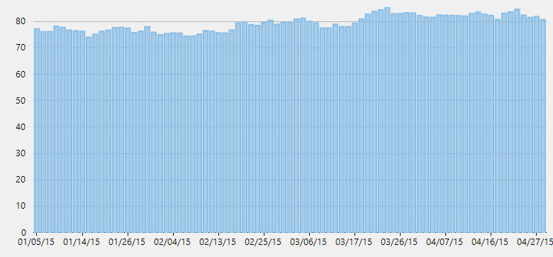
Column Chart
The Column Chart shows each series in the form of bars and enables you to compare values of items across different categories. It displays values of one or more items as vertical bars against Y-axis and arranges items or categories on X-axis.
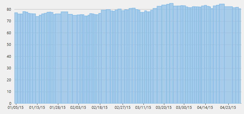
ColumnVolume Chart
The ColumnVolume Chart is identical to the standard Column Chart except that the width of each bar is determined by the Volume value. The data for this chart type can be defined using the FinancialChart or FinancialSeries binding property as a comma separated value in the following format: "yProperty, volumeProperty".
EquiVolume Chart
EquiVolume charts are similar to candlestick charts, but the candlesticks in these charts are replaced with rectangular boxes of varying width (and no wicks). An EquiVolume box includes high and low price components with a third dimension, Volume that determines the width of each box. Color represents whether the close number is higher or lower than the previous box's close.
HeikinAshi Chart
HeikinAshi charts are a variation of Japanese candlestick charts that were designed to remove noise from candlesticks and behave much like a moving average. These charts can be used to identify trends, potential reversal points, and other technical analysis patterns.
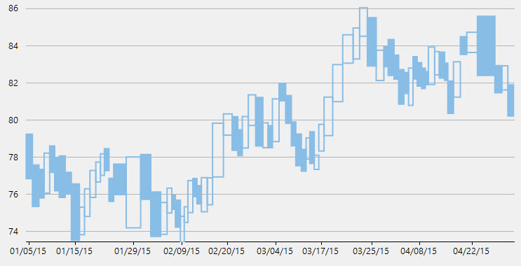
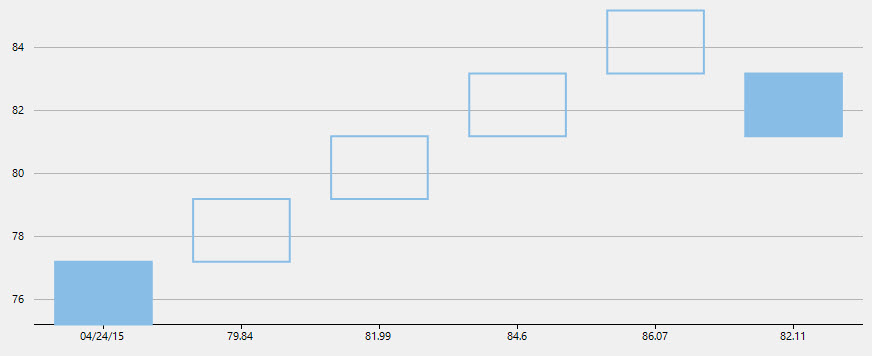
HighLowOpenClose Chart
The HiLoOpenClose Chart combines four independent values to supply high, low, open, and close data for a point in a series. It displays the same information as the Candlestick Chart except that opening values are displayed using lines to the left, while lines to the right indicate closing values.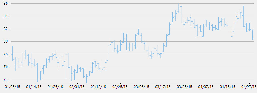
Kagi Chart
A Kagi chart displays supply and demand trends using a sequence of linked vertical lines. The thickness and direction of the lines vary depending on the price movement. If closing prices go in the direction of the previous Kagi line, then that Kagi line is extended. However, if the closing price reverses by the preset reversal amount, a new Kagi line is charted in the next column in the opposite direction. Thin lines indicate that the price breaks the previous low (supply) while thick lines indicate that the price breaks the previous high (demand).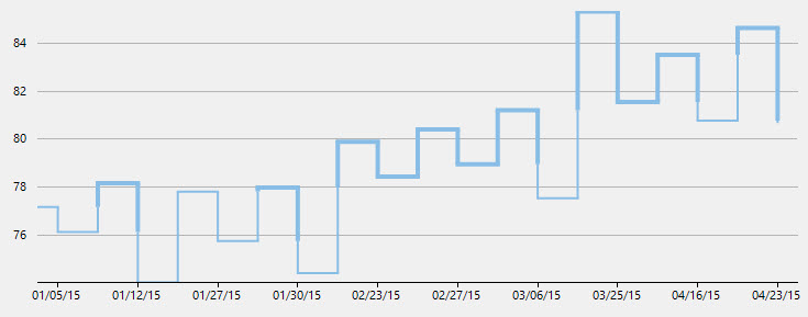
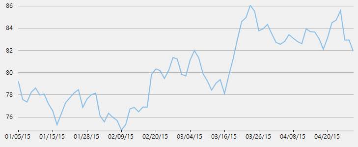
Line Chart
The Line Chart displays trends over a period of time by connecting different data points in a series with a straight line. It treats the input as categorical information that is evenly spaced along the X-axis.
LineBreak Chart
The Line Break Chart uses vertical boxes or lines to illustrate the price changes of an asset or market. Movements are depicted with box colors and styles; movements that continue the trend of the previous box are colored similarly while movements that trend oppositely are indicated with a different color and/or style. The opposite trend is only drawn if its value exceeds the extreme value of the previous n number of boxes or lines, which is determined by the newLineBreaks option.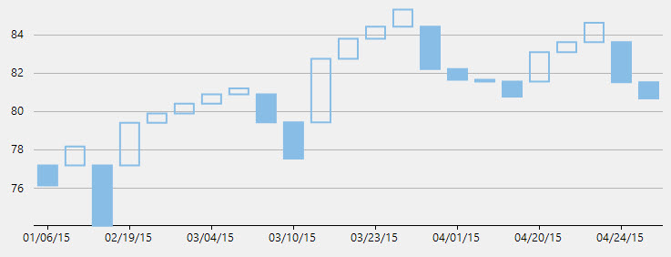
LineSymbols Chart
The LineSymbols Chart is a combination of the Line Chart and the Scatter Chart. The chart displays trends in data at equal intervals and visualizes relationship between two variables related to the same event. It plots data points by using symbols and connects the data points by using straight lines.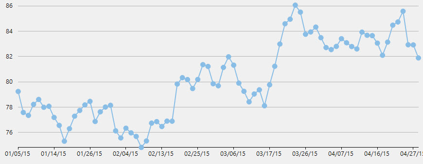
Renko Charts time and focuses on price changes that meet a specified amount.
The Renko Chart ignores time and focuses on price changes that meet a specified amount. It displays the price movement by using bricks of uniform size. When a price moves to a greater or lesser value than the preset boxSize option required to draw a new brick, a new brick is drawn in the succeeding column. The change in box color and direction signifies a trend reversal.
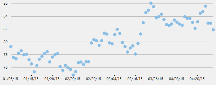
Scatter Chart
The Scatter Chart, which is also known as the XY Chart, depicts relationship among items of different data series. In simple terms, it is a plot of X values and Y values along the two axes. The data points are not connected and can be customized using different symbols. This chart type is normally used to represent scientific data, and can highlight the deviation of assembled data from predicted data or result.
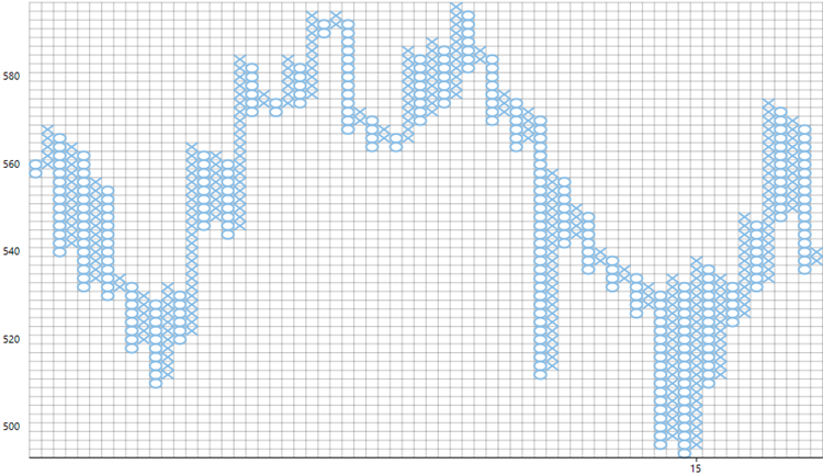
Point and Figure Chart
Point and Figure chart defines price trends through columns of stacked Xs or Os. Unlike time based charts, these charts focus on price movements alone without considering time. While Xs represent rising prices, Os represent falling prices.
You can specify box size, which is the value represented by each X and O. An increase in price, by the amount equal to box size, is recorded by an X. Further increase is recorded by another X stacked above it and so on. Whereas to show an opposite trend, the fall in price by the magnitude of box size is recorded by an O in the new column. It is tedious to record every price change, therefore you can set reversal amount to specify the minimum Xs or Os in a column before a price reversal is recorded. Price reversals occurring before the specified reversal amount are ignored.
FinancialChart supports Traditional, Fixed and Dynamic scaling in Point and Figure chart. While, Traditional scaling uses predefined table of price ranges provided by ChartCraft to determine box size, Fixed scaling allows end users to specify a box size and Dynamic scaling uses the calculated ATR value as box size.