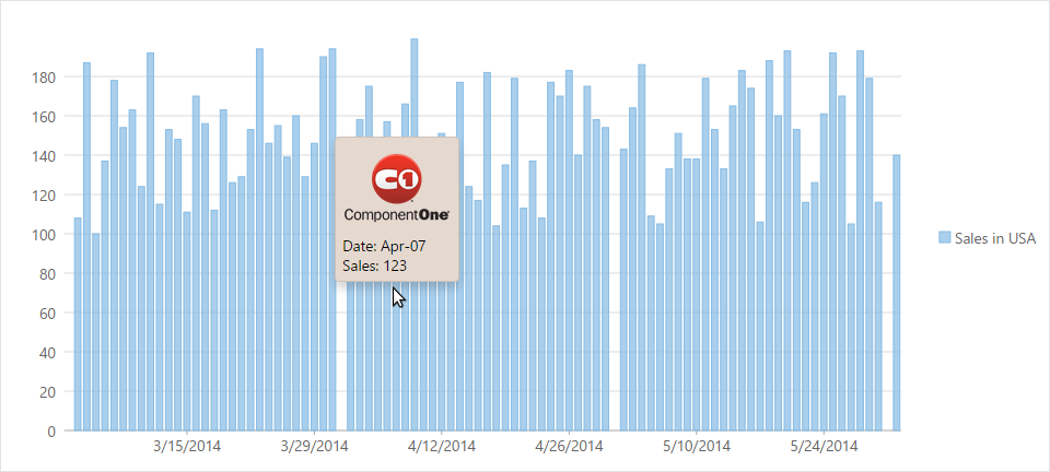
By default, a tooltip generally displays the name of the legend along with the X and Y values of the selected point. FlexChart allows you to display customized tooltips that may contain labels or images by setting the Content property.
The image below shows how a customized tooltip appears on FlexChart.
The following code examples demonstrate how to customize the tooltip.
In Code
To accomplish this, you must first create the content to be added to the tooltip. It can include labels, images and other similar elements.
| Javascript |
Copy Code
|
|---|---|
<script type="text/javascript"> var tooltipContent = function (ht) { return "<img src='../C1.png' alt='Others' />" + '<br/>' + "Date: " + wijmo.Globalize.format(ht.x, 'MMM-dd') + '<br/>' + "Sales: " + ht.y; }; </script> |
|
Assign the view to the chart tooltip as shown below. The following example uses the sample created in the Quick Start section.
| Razor |
Copy Code
|
|---|---|
.Tooltip(tooltip => tooltip.Content("tooltipContent"))
|
|