You can use the ScrollSettings property to specify the following settings for the menu scrollbars:
• Scroll Button Types
You can use the ScrollMode property to specify the type of scroll button. The following scroll button types are available:
• None
The None setting disables the scroll behavior.
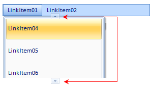
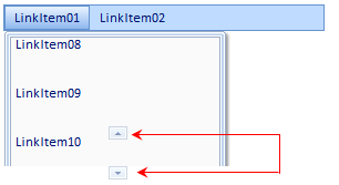
• Buttons
The Buttons setting has two arrow buttons, one for the left and one for the right side of the menu bar or menu item. An arrow button appears in focus when you click on the button.
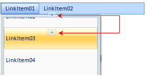
• Buttons Hover
The Buttons Hover setting has the same appearance as the Buttons setting. When you hover over the arrow button the button appears in focus.
• Hover
The Hover setting has no buttons. To make the menu scroll, hover on one of the end sides of the menu bar or menu item.
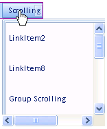
• ScrollBar
The ScrollBar setting includes a horizontal and vertical scrollbar by default.
• Scroll Button Position
You can use the ScrollButtonAlign property to specify whether the buttons appear on both sides, the start side, or the end side.
Both Sides
Start Side
End Side
• Scroll Content Height and Width
You can use the ScrollContentHeight and ScrollContentWidth to specify the height for vertical scrollbars and the width for horizontal scrollbars. To see how to use the ScrollContentHeight property, see Add Scrolling to Vertical Top Level Menu. To see how to use the ScrollContentWidth property, see Add Scrolling to Vertical Sub Menu.
• Scroll Button Orientation
You can use the ScrollOrientation to specify whether the scrolling is horizontal or vertical. For a horizontal menu you would set the ScrollOrientation property to "Horizontal" and for a vertical menu you would set the ScrollOrientation property to "Vertical".
• Scroll Step
The ScrollStep property controls how each menu item moves while scrolling. The lower the step the slower the menu items move. The default scroll step is 4 which means four pixels move in sync while you are scrolling. To make one menu item move at a time, set the ScrollStep to "1".
|