The C1DateEdit control provides enhanced date-time editing capabilities. It derives from C1TextBox, so it supports DateTimeInput with separate fields for year, month, date, and so on, and all options for formatting and parsing date-time values. In addition to that, it enables the user to select date in a drop-down calendar, and also to increment/decrement date fields in DateTimeInput mode with up/down buttons.
The C1NumericEdit control is specialized for numeric input. It also derives from C1TextBox, which enables it with formatting, parsing and validation functionality. In addition to that, it allows the user to increment/decrement the value by a specified amount using the up/down buttons, and to use a drop-down calculator to calculate values.
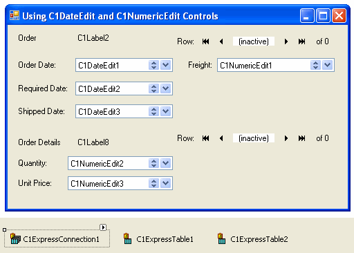
- Create a new Windows Application project. Place the following components on the form as shown in the figure:
- C1ExpressConnection (C1.Data.Express.C1ExpressConnection)
- C1ExpressTable1-2 (C1.Data.Express.C1ExpressTable)
- C1Label1-10 (C1.Win.C1Input.C1Label)
- C1DateEdit1-3 (C1.Win.C1Input.C1DateEdit)
- C1NumericEdit1-3 (C1.Win.C1Input.C1NumericEdit)
- C1DbNavigator1-2 (C1.Win.C1Input.C1DbNavigator)
- From the Properties window, set the following properties for the C1Label controls:
Control Property Value C1Label1 TextDetached True Text Order C1Label3 TextDetached True Text Order Date: C1Label4 TextDetached True Text Freight: C1Label5 TextDetached True Text Required Date: C1Labe6 TextDetached True Text Shipped Date: C1Label7 TextDetached True Text Order Details C1Label9 Name True Text Quantity: C1Label10 Name True Text Unit Price: - Select the C1ExpressConnection1 component, go to the Properties window, open the ConnectionString property combo box. Add the following to the ConnectionString property: Provider=Microsoft.Jet.OLEDB.4.0;Data Source="Documents\ComponentOne Samples\Common\C1NWind.mdb".
- Set the properties of C1ExpressTable1-2 as follows:
Control Property Value C1ExpressTable1 ConnectionComponent C1ExpressConnection1 DbTableName Orders C1ExpressTable2 ConnectionComponent C1ExpressConnection1 DbTableName Order Details Create a master-detail relation between C1ExpressTable1 (master) and C1ExpressTable2 (detail):
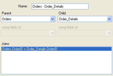
- Press the ellipsis button in the Relations property of the C1ExpressionConnection1 control to open the Relations dialog box.
- In the dialog box, select Orders for Parent, Order Details for Child, add a join with OrderID for both Parent field and Child field, press OK to close the Relations dialog box.
- To bind controls to the data source, set the following properties:
Control Property Value C1DbNavigator1 DataSource C1ExpressConnection1 DataMember _Orders C1DbNavigator2 DataSource C1ExpressConnection1 DataMember _Orders.Orders - Order Details C1Label2 DataSource C1ExpressConnection1 DataField _Orders.OrderID C1DateEdit1 DataSource C1ExpressConnection1 DataField _Orders.OrderDate C1DateEdit2 DataSource C1ExpressConnection1 DataField _Orders.RequiredDate C1DateEdit3 DataSource C1ExpressConnection1 DataField _Orders.ShippedDate C1NumericEdit1 DataSource C1ExpressConnection1 DataField _Orders.Freight C1Label8 DataSource C1ExpressConnection1 DataField _Orders.Orders - Order Details.ProductID C1NumericEdit2 DataSource C1ExpressConnection1 DataField _Orders.Orders - Order Details.Quantity C1NumericEdit3 DataSource C1ExpressConnection1 DataField _Orders.Orders - Order Details.UnitPrice Set up the OrderDate field (control C1DateEdit1) for a simple date input with a drop-down calendar as the main means of entering a date.
- Turn off the DateTimeInput mode setting the DateTimeInput property to False.
- Make the calendar center-aligned relative to the control by setting the DropDownAlign property to Center.
The next control, C1DateEdit2 (RequiredDate field) will serve as a regular date-time input control, in DateTimeInput mode, without a drop-down calendar.
- Set the VisibleButtons property to UpDown.
- To use the long date format, set the FormatType property to LongDate.
The ShippedDate field (control C1DateEdit3) will contain dates in MediumDate format , with up/down buttons and a drop-down calendar. Set its FormatType property to MediumDate.
- Since ShippedDate can be NULL (DBNull), set the EmptyAsNull property to True. Then clearing the control contents will be equivalent to entering null value.
- Suppose we want certain days to appear bold in the drop-down calendar. To do that, expand the Calendar property, select the calendar property MonthlyBoldedDates and add two dates to the array using the Collection Editor dialog box.
Now we will set up controls for numeric input. The C1NumericEdit1 control is bound to the Freight field. To set up the C1NumericEdit1 control:
- Set its FormatType to Currency.
- Then hide the up/down buttons since it does not make much sense for them to be used in a currency value; set the VisibleButtons property to UpDown.
- Set the TextAlign property to Right.
- Also set the DropDownAlign property to Right to make the drop-down calculator right-aligned as well.
The C1NumericEdit2 control is bound to the Quantity field.
- Since the Quantity field does not need a drop-down calculator, hide it by setting the VisibleButtons property to UpDown.
- Since Quantity is an integer number, set the FormatType property to Integer.
- Set the increment for up/down buttons to a certain value you prefer, for example, to 3.
- You can also change the control’s appearance if you feel inclined to, for example, setting the BorderStyle property to FixedSingle.
The last field (C1NumericEdit3) allows the user to enter a currency value UnitPrice using a drop-down calculator.
- Set the FormatType property to Currency.
- As in the C1NumericEdit2 control, set the BorderStyle property to FixedSingle, just to see that you have all the usual appearance options at your disposal.
- Hide the up/down buttons (unnecessary for a currency field) by setting the VisibleButtons property to UpDown.
- To center the drop-down calendar relative to the control, set the DropDownAlign property to Center.
Run the program and observe the following:
- The OrderDate field allows you to enter a date from the keyboard, or open the drop-down calendar and select a date there with the mouse or arrow keys. In the drop-down calendar you can see the buttons for changing the month and year. At the bottom of the calendar you see the Clear and Today button. The Clear button sets the Value to DBNull, and the Today button sets it to the today’s date (that can be overridden in the Calendar.TodayDate property).
- Select a date field in RequiredDate and press the up/down buttons. Notice that you can enter a date without using keyboard.
- In the drop-down calendar in ShippedDate, you can see two bolded dates.
- Opening the drop-down calculator in the Freight and Quantity fields, you can see different button styles in the calculator.