This section provides a visual and descriptive overview of the elements that comprise the C1ComboBox control.
The C1ComboBox control is made up of an editable text box and drop-down list.
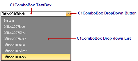
C1ComboBox Text Box
Users can enter text in the C1ComboBox textbox at runtime or you can assign strings to the Text property. If you assign a value to the Text property, the current value in the textbox of the C1ComboBox will changes.
As text is entered into the C1ComboBox textbox, C1ComboBoxItems matching the characters will appear in the drop-down list. For example, if you enter "Sm" in the text box for a C1ComboBox listing customer names, any customer names starting with "Sm" appear in the drop-down list.
C1ComboBox DropDown Button
The default C1ComboBox displays a dropdown style button, but you can choose whether or not to show the button through the VisibleButtons property. In addition to the dropdown button you could also display the Updown button or your own custom button. A modal button can be displayed next to the dropdown, updown, or custom button or you can display it separately. For more information see C1ComboBox Button Appearance.
The size of the button can be modified using the ButtonWidth property.
Drop-down List of C1ComboBoxItems
The drop-down list is made up of C1ComboBoxItems and is only visible at run time. You can access the drop-down list by clicking the trigger button, or drop-down arrow, next to the C1ComboBox text box.
Items can be added to the C1ComboBox at design time through the String Collection Editor. In the String Collection Editor you can type the items line-by-line. Items could also be added dynamically during runtime through the Items property. For an example see, Adding Items to C1ComboBox.