C1FlexGrid includes properties that determine whether certain UI elements are displayed, and how they will appear.
Showing UI Elements
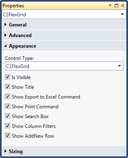
The Appearance group of the C1FlexGrid control includes check boxes that control the visibility of various UI elements at runtime, such as the title bar, export/print commands, search box, column filters, and the new row placeholder.
Only the Show Print Command and Show Column Filters check boxes are specific to C1FlexGrid. The other elements are also present in the built-in LightSwitch Data Grid.
By default, all of these elements are visible.

Customizing Rows, Column Headers, and Grid Lines
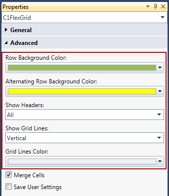
The Advanced group includes properties that can be used to change the default row colors and control the display of row/column headers and grid lines.
To control the display of headers, grid lines, background color, and/or alternating row background color, use the following advanced properties:

If the Merge Cells box is check, then all grid lines should be shown to improve readability (only vertical grid lines are shown by default). A slightly darker grid lines color works best with this combination. Note that you need to turn on the Allow Merging property for individual columns even if Merge Cells is checked here.