Enhance the appearance of the control by using pre-defined themes. The Palette property can be used to specify the theme to be applied on the control.
Note: Remove the Palette property from the code to apply the default theme.
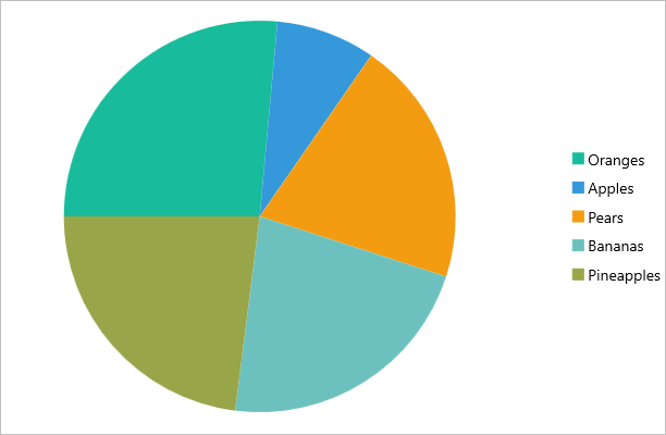
The image below shows how the FlexPie appears when the Palette property is set to Dark.

The following code example demonstrates how to apply theme in C# and XAML. This example uses the sample created in the Quick Start section.
In Code
| C# |
Copy Code |
|---|---|
//setting themes
chart.Palette = Palette.Flatly; | |
In XAML
| XAML |
Copy Code |
|---|---|
<c1:FlexPie x:Name="chart" ItemsSource="{Binding Data}" BindingName="Name" Binding="Value" Palette="Flatly"> | |
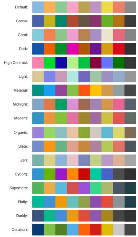
FlexPie comes with pre-defined templates that can be applied for quick customization. Here are the pre-defined templates available in the Palette enumeration.

See Also