Although Xamarin controls match the native controls on all three platforms by default and are designed to work with both: light and dark themes available on all platforms. But, there are several properties to customize the appearance of the FlexPie control. You can change the background color of the FlexPie and the plot area.
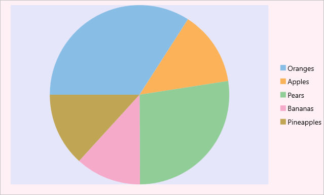
The image below shows the how the FlexPie appears after these properties have been set.
In Code
The following code example demonstrates how to set these properties in C# and XAML. This example uses the sample created in the Quick Start section.
| C# |
Copy Code |
|---|---|
//Customize chart plot area ChartStyle s = new ChartStyle(); s.Fill = Color.Lavender; s.StrokeThickness = 0; chart.PlotStyle = s; //Set background color chart.BackgroundColor = Color.LavenderBlush; | |
In XAML
| XAML |
Copy Code |
|---|---|
<c1:FlexPie x:Name="chart" ItemsSource="{Binding Data}" BindingName="Name" Binding="Value" BackgroundColor="LavenderBlush"> <c1:FlexPie.PlotStyle> <c1:ChartStyle Fill="Lavender" StrokeThickness="0"/> </c1:FlexPie.PlotStyle> </c1:FlexPie> | |
See Also