Tooltips are the labels that appear when users hover over data points on your chart. They appear on FlexChart by default, and can display any combination of data values and text. FlexChart allows you to display content from predefined string values in the tooltip and display custom views that may contain labels or images using the Tooltip.Content property.
The easiest way to display content in Tooltip is by using the Content property. You need to configure the content property as per the type of entry you want to display in tooltip.
The table below lists the pre-defined parameters applicable for tooltip content.
| Parameter | Description |
|---|---|
| x | Shows the X value of the data point. |
| y | Shows the Y value of the data point. |
| value | Shows the Y value of the data point. |
| name | Shows the X value of the data point. |
| seriesName | Shows the name of the series. |
| pointIndex | Shows the index of the data point. |
| Percentage | Shows the percentage of a pie chart slice. (FlexPie only) |
To implement the Content property to display content from predefined string values, use the following code example given below.
| Xaml |
Copy Code |
|---|---|
<c1:FlexChart x:Name="flexChart" BindingX="Name" ToolTipContent="{}{seriesName}{name}{value}"/> | |
To implement the Content property to display custom view, use the following code examples given below. In the code below, Content property accepts a Xamarin layout and displays it in the form of a tooltip, when the user taps at any point on the FlexChart control.
Data Source
| C# |
Copy Code |
|---|---|
public static class ChartSampleFactory { public static IEnumerable<SalesExpensesDownloadsEntity> CreateEntityList() {o List<SalesExpensesDownloadsEntity> entityList = new List<SalesExpensesDownloadsEntity>(); string[] countries = new string[] { "US", "Germany", "UK", "Japan", "Italy", "Greece" }; Random random = new Random(); for (int i = 0; i < countries.Length; i++) { double sales = random.NextDouble() * 10000; double expenses = random.NextDouble() * 5000; double downloads = Math.Round(random.NextDouble() * 20000); entityList.Add(new SalesExpensesDownloadsEntity(countries[i], sales, expenses, downloads, DateTime.Today.AddDays(i))); } return entityList; } } | |
XAML Code
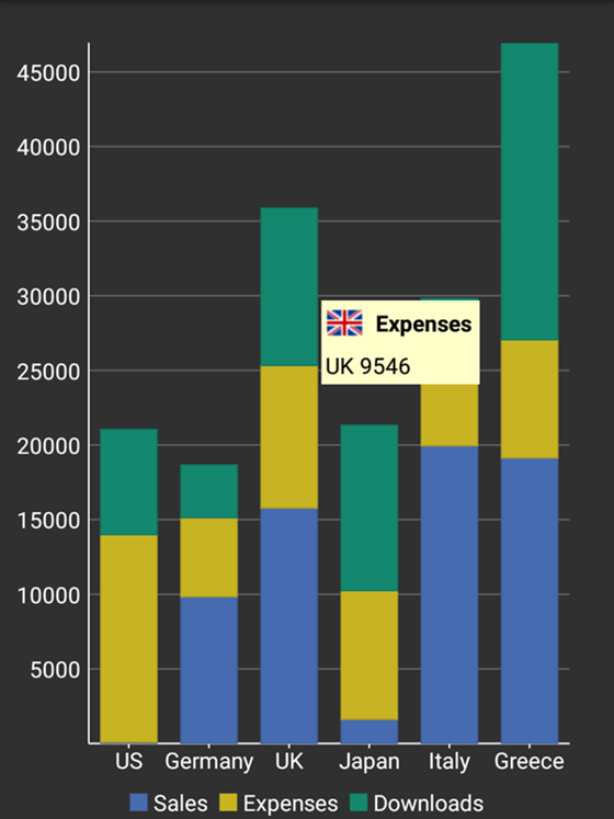
Add the following code in the CustomTooltip.xaml file to initiate the FlexChart control and add tooltips. The images used in this sample are available at the following location: Documents\ComponentOne Samples\Xamarin\XF\FlexChart101\FlexChart101.XF\Images.
| Xaml |
Copy Code |
|---|---|
<ContentPage xmlns="http://xamarin.com/schemas/2014/forms" xmlns:x="http://schemas.microsoft.com/winfx/2009/xaml" x:Class="FlexChart101.CustomTooltipsSample" xmlns:c1="clr-namespace:C1.Xamarin.Forms.Chart;assembly=C1.Xamarin.Forms.Chart" xmlns:common="clr-namespace:FlexChart101;assembly=FlexChart101.XF" x:Name="page"> <ContentPage.Resources> <ResourceDictionary> <common:FlagConverter x:Key="converter" /> </ResourceDictionary> </ContentPage.Resources> <StackLayout> <Grid VerticalOptions="FillAndExpand"> <c1:FlexChart x:Name="chart" ItemsSource="{Binding Data}" BindingX="Name" ChartType="Column" VerticalOptions="FillAndExpand"> <c1:FlexChart.Series> <c1:ChartSeries Binding="Sales" SeriesName="Sales" /> <c1:ChartSeries Binding="Expenses" SeriesName="Expenses" /> <c1:ChartSeries Binding="Downloads" SeriesName="Downloads" /> </c1:FlexChart.Series> <c1:FlexChart.ToolTip> <c1:ChartTooltip IsOpen="false" BackgroundColor="Blue" Padding="0"> <StackLayout BackgroundColor="#FFFFCA" Padding="5"> <StackLayout Orientation = "Horizontal"> <Image x:Name="image" Source="{Binding ValueX, Mode=OneWay, Converter={StaticResource converter}"/> <Label x:Name="label1" Text="{Binding SeriesName}" TextColor="Black" FontAttributes="Bold" FontSize="15"></Label> </StackLayout> <Label x:Name="label2" Text="{Binding DataY, StringFormat='{0:c2}'}" TextColor="Black" FontSize="15" HorizontalOptions="Center"></Label> </StackLayout> </c1:ChartTooltip> </c1:FlexChart.ToolTip> </c1:FlexChart> </Grid> </StackLayout> </ContentPage> | |
In Code
Add the following code in the CustomTooltip.xaml.cs file to bind the FlexChart control to data source.
| C# |
Copy Code |
|---|---|
public CustomTooltips() { InitializeComponent(); this.chart.ItemsSource = ChartSampleFactory.CreateEntityList(); this.chart.Palette = Palette.Zen; this.chart.LegendPosition = ChartPositionType.Bottom; this.chart.Stacking = ChartStackingType.Stacked; chart.Palette = Palette.Cocoa; } | |
The image below shows how a custom view tooltip appears on FlexChart.