The FlexChart field in FlexReport allows you to set a specific chart type using C1.Chart.ChartType property. It allows you to visualize data through thirteen different chart types, which includes Area, SplineArea, Bar, Bubble, Column, Scatter, Line, LineSymbols, Spline, SplineSymbols, Candlestick, HiLoOpenClose, and Funnel. The chart types can be easily selected using the ChartType property in the Properties window of the C1FlexReportDesigner.
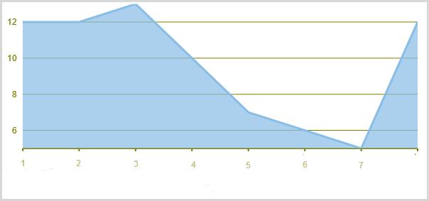
Area chart: An Area chart draws data series by connecting data points against Y-axis and filling the area between the series and X-axis. Each series is drawn on top of the preceding series.
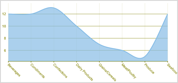
SplineArea chart: A SplineArea Chart is similar to an area chart. The only difference is that it connects data points using splines instead of straight lines and fills the area enclosed by the splines.
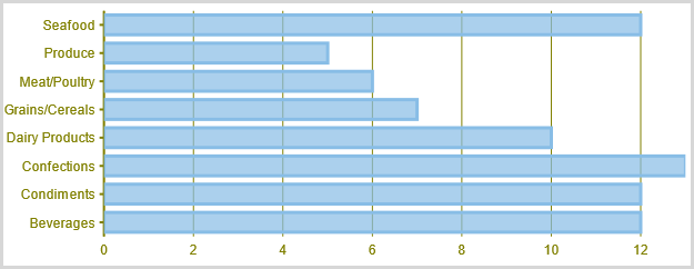
Bar chart: A Bar chart compares values across various categories or displays variations in a data series over time. It represents data series in the form of bars of the same color and width, whose length is determined by its value. Each new series is displays horizontal bars for data series plotted against X-axis and arranges categories or items on Y-axis.
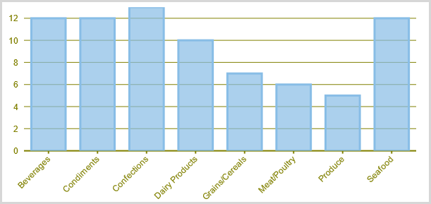
Column chart: . A Column chart, just like the Bar Chart, represents variation in a data series over time or compares different items. It displays values of one or more items as vertical bars against Y-axis and arranges items or categories on X-axis.
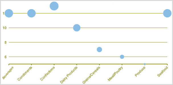
Bubble Chart: A Bubble chart combines two independent values to supply both the point y value and the point sizes. Bubble charts are used to represent an additional data value at each point by changing its size. The Y array elements determine the Cartesian position (as in a XY-Plot chart), and the Y1 element values determine the size of the bubble at each point. The size of the points can be encoded according to area or diameter.
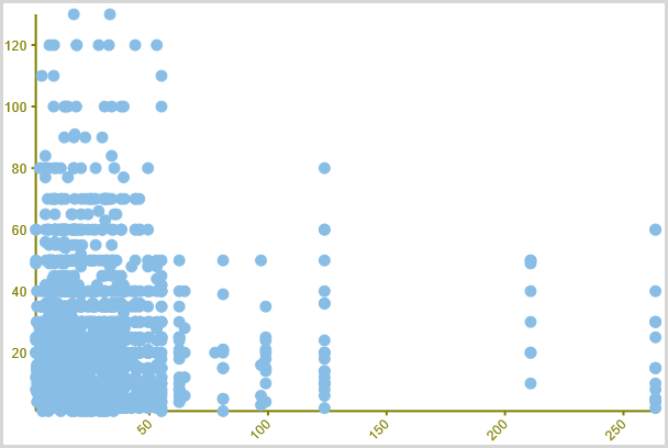
Scatter chart: A Scatter chart uses two values to represent each data point. It depicts relationship among items of different data series. This type of chart is often used to represent scientific data, and can highlight the deviation of assembled data from predicted data or result.
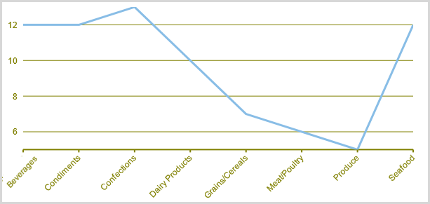
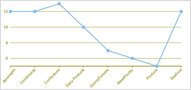
Line chart: A Line chart displays trends over a period of time by connecting different data points in a series with a straight line. It is the most effective way of denoting changes in the values between different groups of data.
LineSymbols chart: A LineSymbols chart is a combination of the Line chart and the Scatter chart. The chart plots data points by using symbols and connects those data points by using lines.
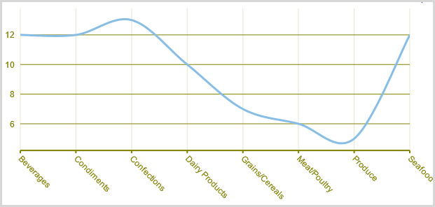
Spline chart: A Spline chart is similar to a line chart except that it connects data points by using splines rather than straight lines. It is specifically used for representing data that requires the use of curve fittings.
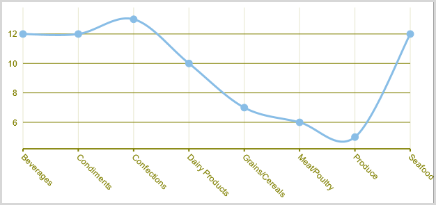
SplineSymbols: A SplineSymbols chart combines the Spline chart and the Scatter chart. The chart plots data points by using symbols and connects those data points by using splines.
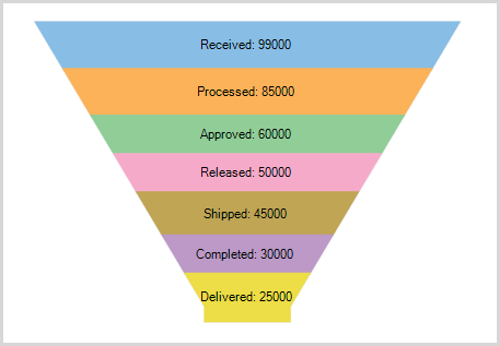
Funnel chart: A funnel chart represents sequential stages in a linear process. This chart can be useful in identifying potential problem areas in processes where it is noticeable at what stages and rate the values decrease.
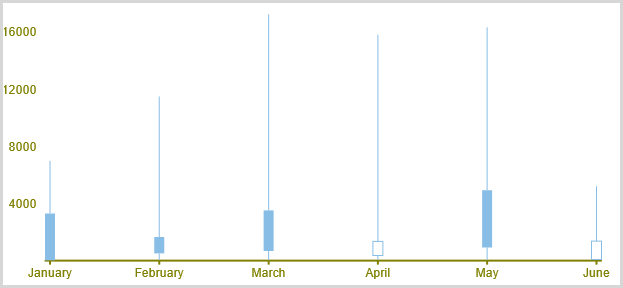
Stock Charts: Stock charts used in financial applications to show the opening, closing, high and low prices of a given stock. The types of stock charts are as follows:
-
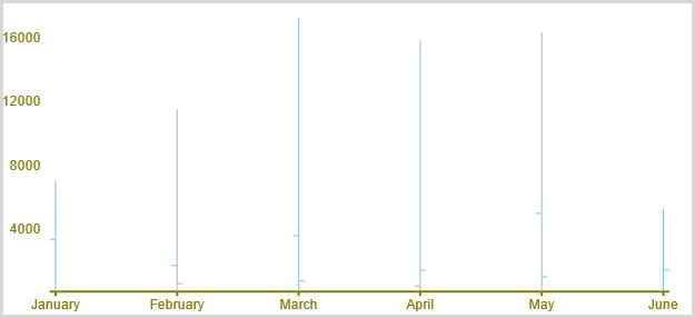
Candlestick chart: A Candlestick chart is a special type of HiLoOpenClose chart that integrates Bar and Line charts to depict a range of values over time. It consists of visual elements known as candles that are further comprised of three elements: body, wick, and tail. The body represents the opening and the closing value, while the wick and the tail represent the highest and the lowest value respectively.
-
HiLoOpenClose: HiLoOpenClose charts combine four independent values to supply high, low, open, and close data for a point in a series. In addition to showing the high and low value of a stock, the Y2 and Y3 array elements represent the stock's opening and closing price, respectively.