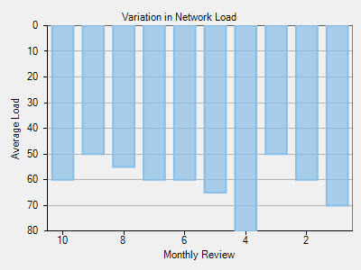
When a dataset contains X or Y values that lie in a large range, the general chart setup sometimes doesn't display the information most effectively. Often, the chart data may look more appealing with the axis reversed.
You can reverse the Axis in FlexChart by using the Reversed property.
Setting the Reversed property for the axis to True reverses the axis. This means that the maximum value along the axis takes the place of the minimum value, and the minimum value along the axis takes the place of the maximum value.
Initially, the chart displays the minimum value on the left of X-axis, and at the bottom of Y-axis. However, the Reversed property for the axis juxtaposes the maximum and minimum values.
Here is the sample code:
