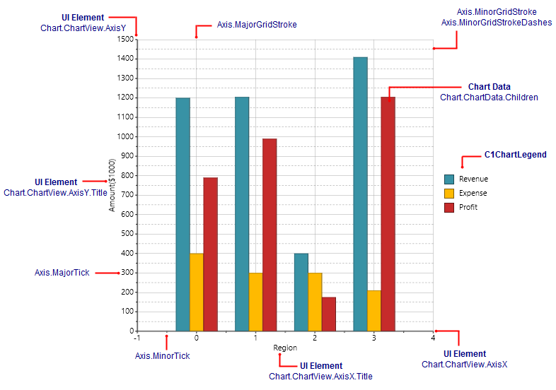
In order to create and format charts using the C1Chart control, it is useful to understand how the main properties map into chart elements. The diagram below illustrates this:
The steps involved in creating a typical chart are:
- Choose the chart type (C1Chart.ChartType property)
C1Chart supports about 40 chart types, including Bar, Column, Line, Area, Pie, Radial, Polar, Candle, and many others. The best chart type depends largely on the nature of the data, and will be discussed later.
- Set up the axes (Chart.ChartView.AxisX and Chart.ChartView.AxisY properties)
Setting up the axes typically involves specifying the axis title, major and minor intervals for the tick marks, content and format for the labels to show next to the tick marks.
- Add one or more data series (Chart.ChartData.Children collection)
This step involves creating and populating one DataSeries object for each series on the chart, then adding the object to the chart.Data.Children collection. If your data contains only one numeric value per point (Y coordinate), use regular DataSeries objects. If the data contains two numeric values per point (X and Y coordinates), then use XYDataSeries objects instead.
- Adjust the chart’s appearance using the Palette property.
The Palette property allows you to select one of over 20 built-in color palettes used to specify colors for the data series. You can also customize your own palette, giving you control over your chart's appearance.
The XAML markup below was used to create the chart in the image:
| XAML |
Copy Code
|
|---|---|
<Chart:C1Chart x:Name="c1Chart1" Height="450" Width="550" ChartType="Column" Palette="Solstice" > <!--Populate the chart with three series--> <Chart:C1Chart.Data> <Chart:ChartData > <Chart:ChartData.Children> <Chart:DataSeries Label="Revenue" Values="1200, 1205, 400, 1410" ></Chart:DataSeries> <Chart:DataSeries Label="Expense" Values="400, 300, 300, 210" ></Chart:DataSeries> <Chart:DataSeries Label="Profit" Values="790, 990, 175, 1205" ></Chart:DataSeries> </Chart:ChartData.Children> </Chart:ChartData> </Chart:C1Chart.Data> <!--Configure axes--> <Chart:C1Chart.View> <Chart:ChartView> <Chart:ChartView.AxisX> <Chart:Axis Title="Region" Height="35" /> </Chart:ChartView.AxisX> <Chart:ChartView.AxisY> <Chart:Axis MinorGridStroke="Black" MinorGridStrokeDashes="9,9" Title="Amount($1000)" /> </Chart:ChartView.AxisY> </Chart:ChartView> </Chart:C1Chart.View> <Chart:C1ChartLegend Visibility="Visible" Position="Right" /> </Chart:C1Chart> |
|